
Practice and Research - Exercise 3.10: Designing the Document
- Dan Woodward

- Feb 4
- 7 min read
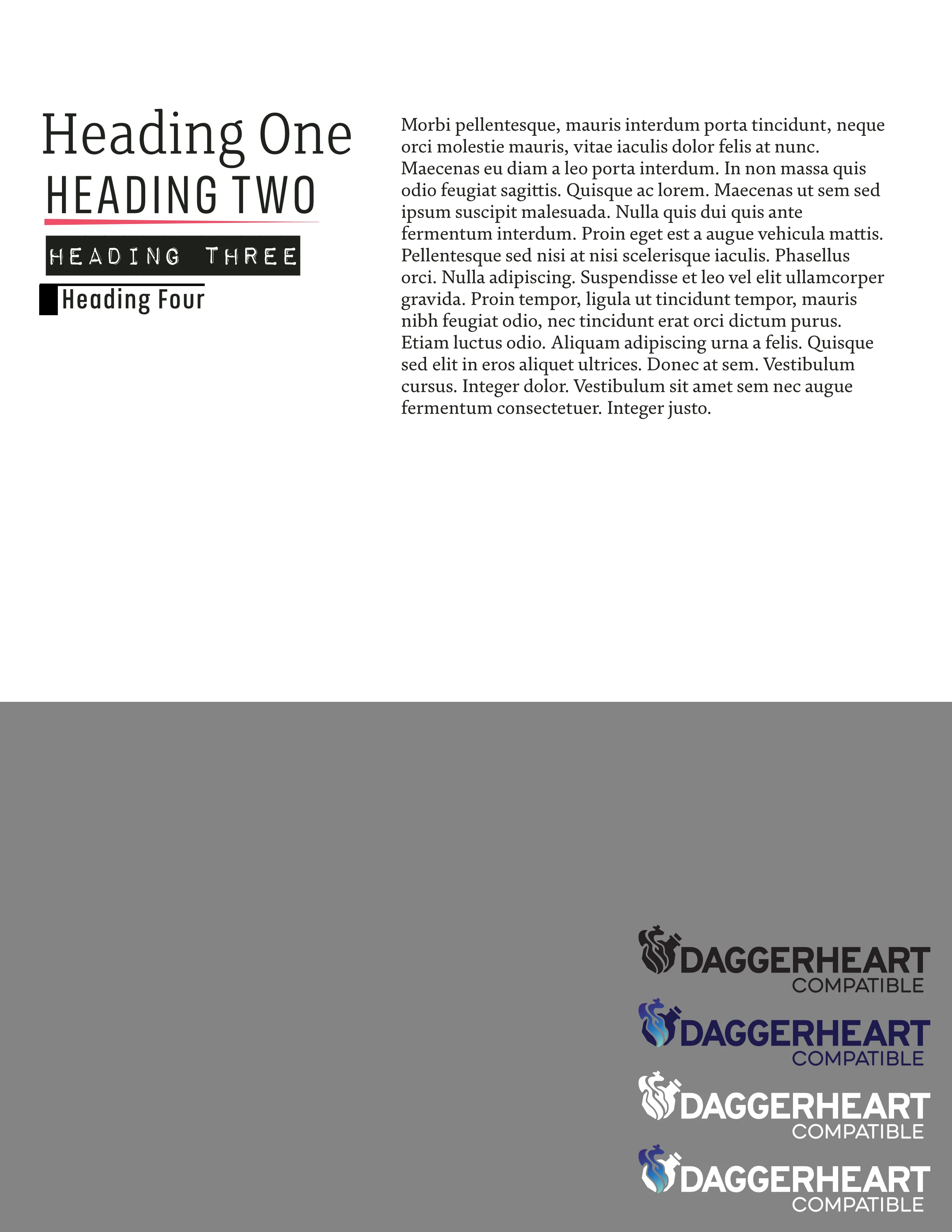
The design of the Campaign Frame document has gone through many different iterations as I have tested and tweak the content and layout. I started by creating some 'Masters' in Affinity. I had watched a useful video [1] that gave me the idea to use a Master page not as a template, but as a place to store different stylised page elements (different headings, quote boxes and the like). So I created one of these along with a generic master. As I would need to add the official Daggerheart logos, I added those as well, using a grey background so that I could make easier decisions on which version would be the most appropriate depending on the context of the page they would be used on.
Originally I had the document set up for facing page spreads, but later I realised that if I was producing this as a pdf, people would like read the document vertically, so I opted for single page spreads, but they remained laid out as if they had a central spine, so if people did print the document back-to-back they would still get a good experience. Originally, I had the master set up with two text columns embedded, but as I started to play with the layout, this became restrictive. I reverted to the page texture and page number. Now that I have the layout more or less settled, I think that I could look for patterns in order to create multiple master pages for different spread layouts (like image at top, bottom, half-column etc.). This would probably be a useful step if I take the design system further for subsequent documents.
Taking the Training Wheels Off
Before I had a chance to complete the document properly, I had the opportunity to use the ruleset in a public game with paying players as part of my part-time work as a paid Game Master on a website called StartPlaying.Games. This constraint meant I needed to present the content quickly and professionally. I also needed to advertise the game to draw players in.
I quickly created an illustration for the campaign on procreate, making design choices that allowed me to get something finished, quickly. For example, I created the treeline, and then blurred it out to abstract any detail, giving the impression of the forest. The blur also helped to sell the fractured glass effect I carried over from the cover mockup.
I shaded the characters simply, and it also gave me an opportunity to play with the overall tone and colour palettes. For the monsters, I experimented with using harsh, distressed halftones to shade them, along with a paper-cut 'aura' to try out how that might convey a bit of a 'punk' feel. I think that I could have gotten away with making them all mono-tone instead of coloured, it would have communicated their otherworldliness even more.
The perspective between the background and foreground elements is completely off, but I am pleased with the composition in general, and the poses of the characters (it's rare for me to use pose reference and for me to still be happy with my efforts!). But it did the job, and had the benefit of being a good placeholder I could use in the main document.

It must have done something right, as I quickly had enough players signed up to get the campaign off the ground! That put pressure on me to give them an overview of the world. The full document was not complete, but the players did not need all of the content in the document, only the stuff pertinent to the world and imagining their characters in it. I had all of that, and I had a good enough layout to present it. I copied the main document and stripped out anything I didn't need. I got rid of the cover, condensing the front page to include the title as well as any necessary legal information.
You can see the first page below, which also illustrates my choices for typography and colours at the time (a pink and acid green, which I felt matched the portal cover choice). The main body typography was more industrial. In the end I felt that this gave it a more Victorian feel than medieval, so I ultimately changed the main document to have a body text that was intentionally inspired by the middle ages.

Condensing everything quickly meant that the layout without spot illustrations was not the easiest to balance. I ended up with too much white space on one page in particular, so I decided to extract the example given to explain a particular mechanic to players, and created a skeuomorphic illustration of a stuck-in note, that housed the same text. It allowed me to use the space much more effectively and intentionally, and was a great opportunity to learn and experiment with this approach. I felt it was so successful, I transferred it back to the main document.

Main layout

For the main layout of the document, I kept with a two-column approach that was similar to what I had seen in the main Daggerheart rulebook. This came from a place of feeling insecure about the pros and cons of different layout options. I am not a graphic designer, so this is not my strength and I do not have a mental library of different examples (not why all those examples work in their own contexts). This is something I would like to be more comfortable with, so that I can create layouts more quickly and be more confident experimenting with different ways to communicate information efficiently and effectively.
I was able to learn how to use Affinity to add decorations to paragraphs, meaning that I could add a stylised coloured stroke underneath every 'Heading 2' styled text. This was a cool thing to learn, and makes the layout more efficient and predictable, rather than relying on separate graphics. This also gave me the confidence later on to adapt my 'Heading 4' text style to have a stroke to the left and above, that made it feel semi-contained like a box. While I am familiar with using text styles in word processing, I realised just how important they were when it came to using desktop publishing software. It made experimenting and changing things much less risks and time consuming.
Large Illustration Pages

I adapted the two column design to create space at the top or bottom of the page for a larger, focused illustration. I did not give myself a fixed rule on the height of the illustration to give myself flexibility with the composition and cropping of the illustration chosen for that page.
I went with a full bleed approach to create a defined separation between the text and image. I am not sure how it will look once the illustrations are finished, and if the separation is too stark I will have to address that challenge, perhaps using an opacity fade. I am pleased with this layout's ability to work in harmony with the subject matter of the page's text, giving the reader an evocative interpretation and example of the content.
Single-Column Illustrations

Where space was going to be more limited, or if it meant the text layout was more effective, I went with illustrations that were constrained into a single column. I could still play with the height here. In the example shown here, you can see that I have chosen a full bleed for the placeholder rough.
On other pages, the space was more limited. when I was planning out where the images would go (using simple 'x' placeholders to help with layout) I focused on the readability of the text first, letting the resulting space define the size of the illustration needed. I had imagined more small sketchy spot illustrations, similar to the Daggerheart main rulebook. When I reminded myself that I was allowed to follow my own rules, I opted for different approaches, including adding smaller, more graphic iconography to fill small spaces. I will go into more detail on the spot illustrations in another learning log.
Text-Wrapped Illustrations

When I was working on the page for the Royal Palace, I had originally envisioned a single column illustration, but it kept creating a mis-match between the successful composition for the image, and the layout of the text fitting neatly.
I went back to my research, looking for ideas on how other graphic designers had solved similar problems. I noticed that sometimes they would break the boundaries of a column-based system, using the text wrap in a way that it followed the contours of an image in order to direct the eye of the read down the page effectively. I decided to try this approach out, and through my experimentation I managed to get all of the text on the page in a way that reads effectively. It also allowed me to get more of the Palace onto the page, making more of the illustration.
Given that the wall of the Palace extends outside the boundary of the rough illustration's composition I will need to solve the challenge of the text going to the bottom of the page, overlapping where the wall would be. Do I need to crop the picture? Perhaps fade the wall out with opacity? Another option could be to make the wall darker and less defined the further away from the focus it goes, and I can make the text a light colour in order to retain the readability and contrast.
Reflections
It took many little tweaks, changes and choices to get the design that I have at the point of writing. Right now, I am happy and settled with what I have. It allows me to concentrate on the illustrations themselves. Once I had placed the map into the document, I realised that the colour scheme was completely jarring, so I changed it to the red/blue combination of the map. This makes the whole thing more cohesive, but it also means the cover needs to change to fit as well.
I am happy that I didn't try to jump in and define everything too rigidly up front. I had fun playing with the text, layout and image placeholders. I think it was useful to have the document live and breathe. I could let ideas and choices stew and cultivate, when I would come back to the document it would be more obvious if the idea was working or not, and each time it gave me a fresh perspective that gave me more inspiration and confidence than I realised at the time!
The layout isn't ground-breaking or innovative, but I do thinks it's good enough. I have also learned a lot by doing it practically, and every time I am getting faster and more efficient. I may not be a graphic designer, but I originally signed up to be a Visual Communications student; my love for comics and tabletop games means that I will benefit from having more Graphic Design skills in my professional toolbox. Not only will it improve the quality of my work, but it means I can apply myself to more things in a competitive industry, and communicate better with the professionals who produce the physical objects (books, boxes, cards, games) that my work will exist in.
References
Matthew Perkins (2021). Designing an RPG book? You need STYLE. [online] YouTube. Available at: https://www.youtube.com/watch?v=viLKE6ELPuI [Accessed 4 Feb. 2026].


Comments