
Practice and Research - Exercise 3.9: Cover Design
- Dan Woodward

- Feb 3
- 2 min read
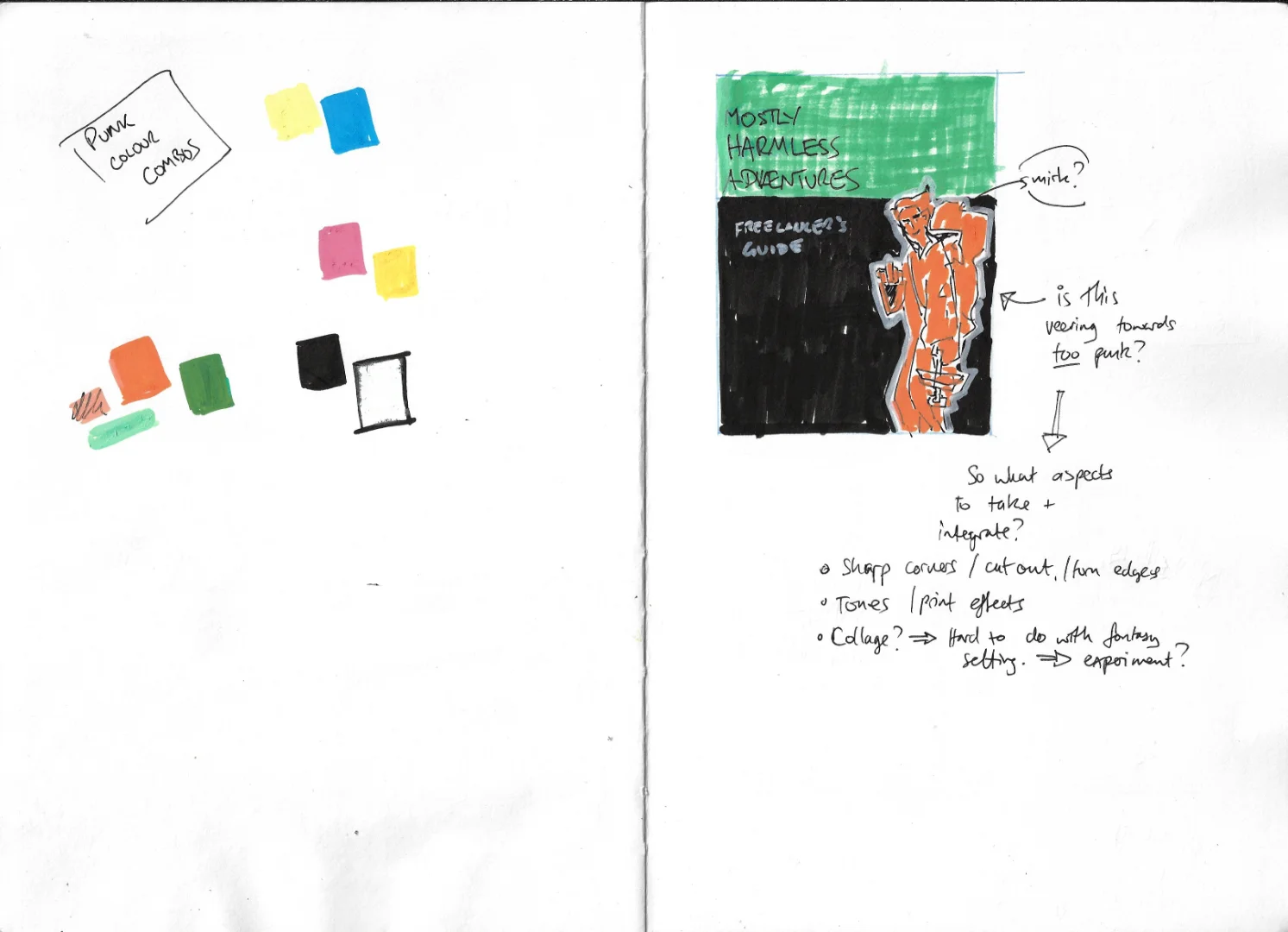
I started to explore ideas for the document's design system based on the map, using my sketchbook to thumbnail different cover ideas. I also wanted to have a limited palette of colours, so tried out a few combinations based on what I had seen during my research. I then chose a few of the thumbnails to develop further.
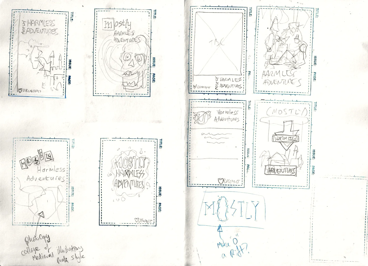
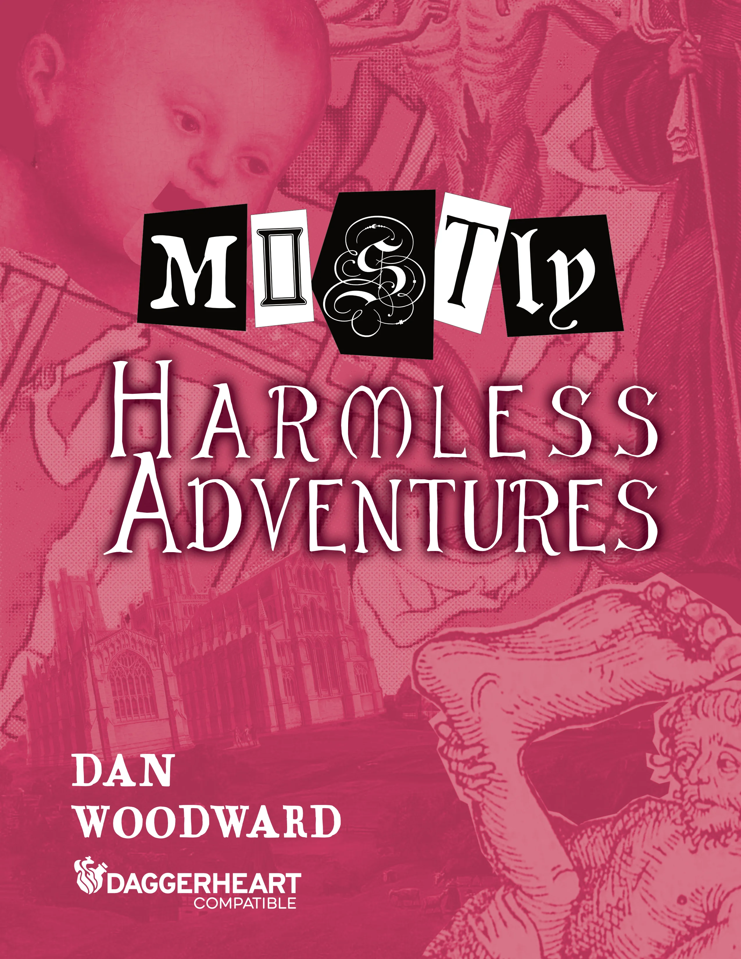
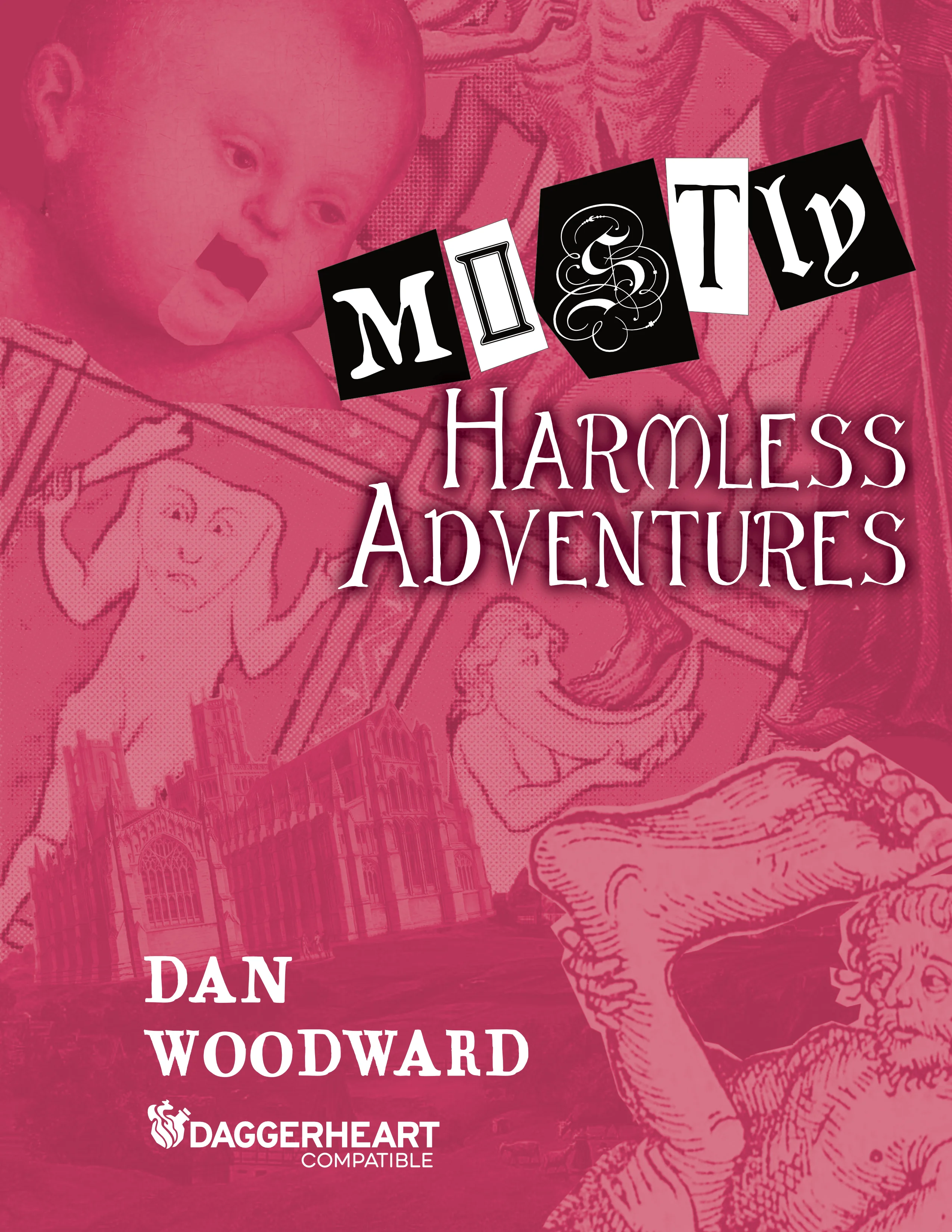
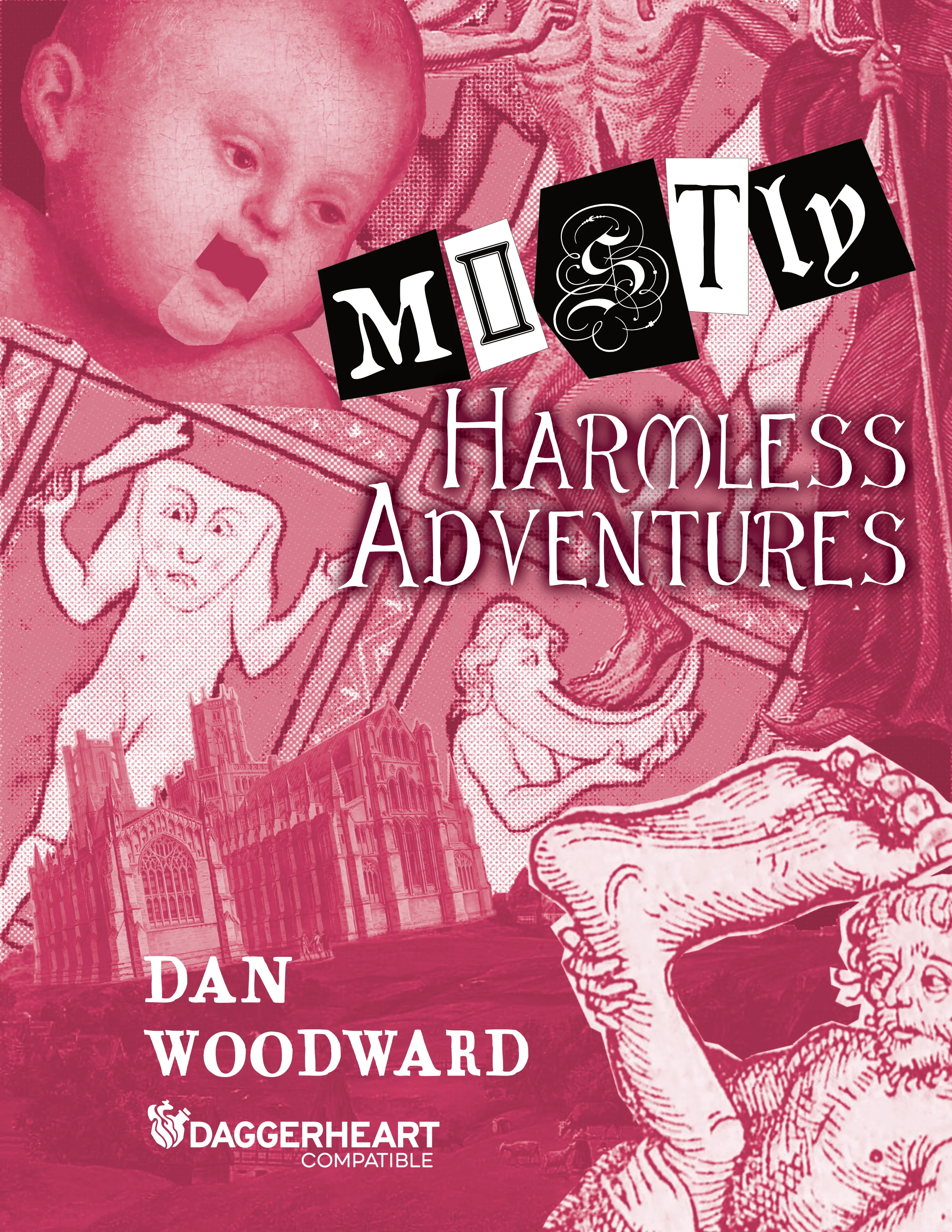
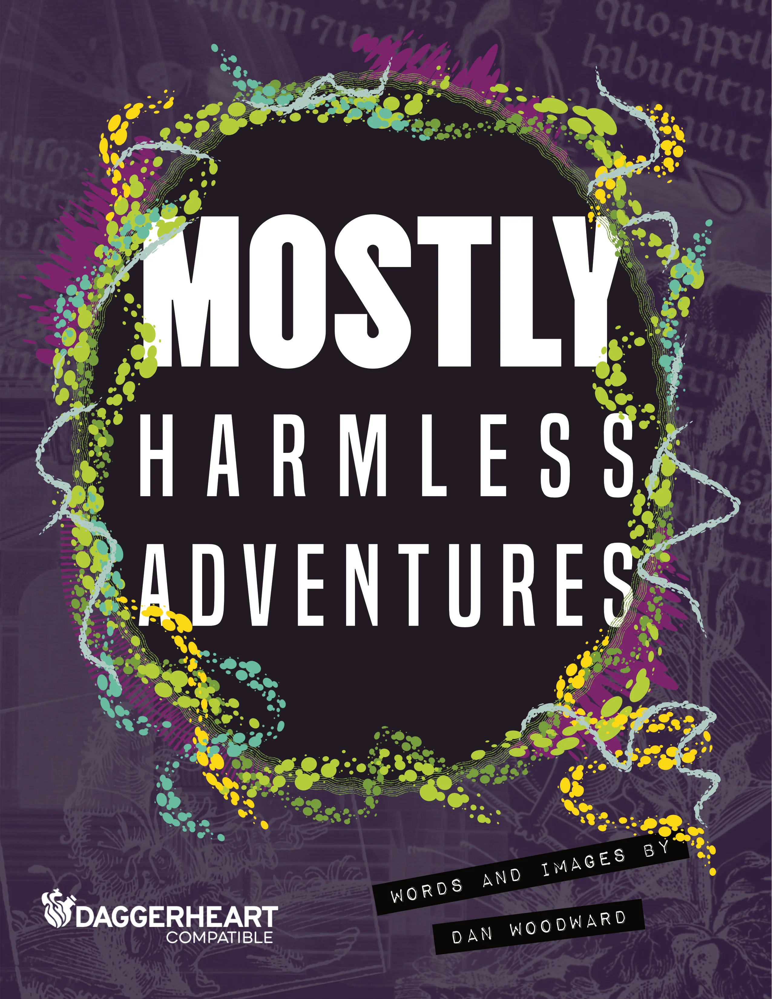
The first idea was based around Terry Gilliam's Monty Python animations. I used publicly available images from the British Library to photo collage a background. For the title, I leant into the punk side of things, emulating text cut from newspapers. However, to align with the medieval fantasy I selected fonts that fit that aesthetic. I played around with the layout to give myself three options. Looking at them again, there might have been a fourth option where the monopod could be more opaque, and the rest of the collage knocked back to be less obtrusive.
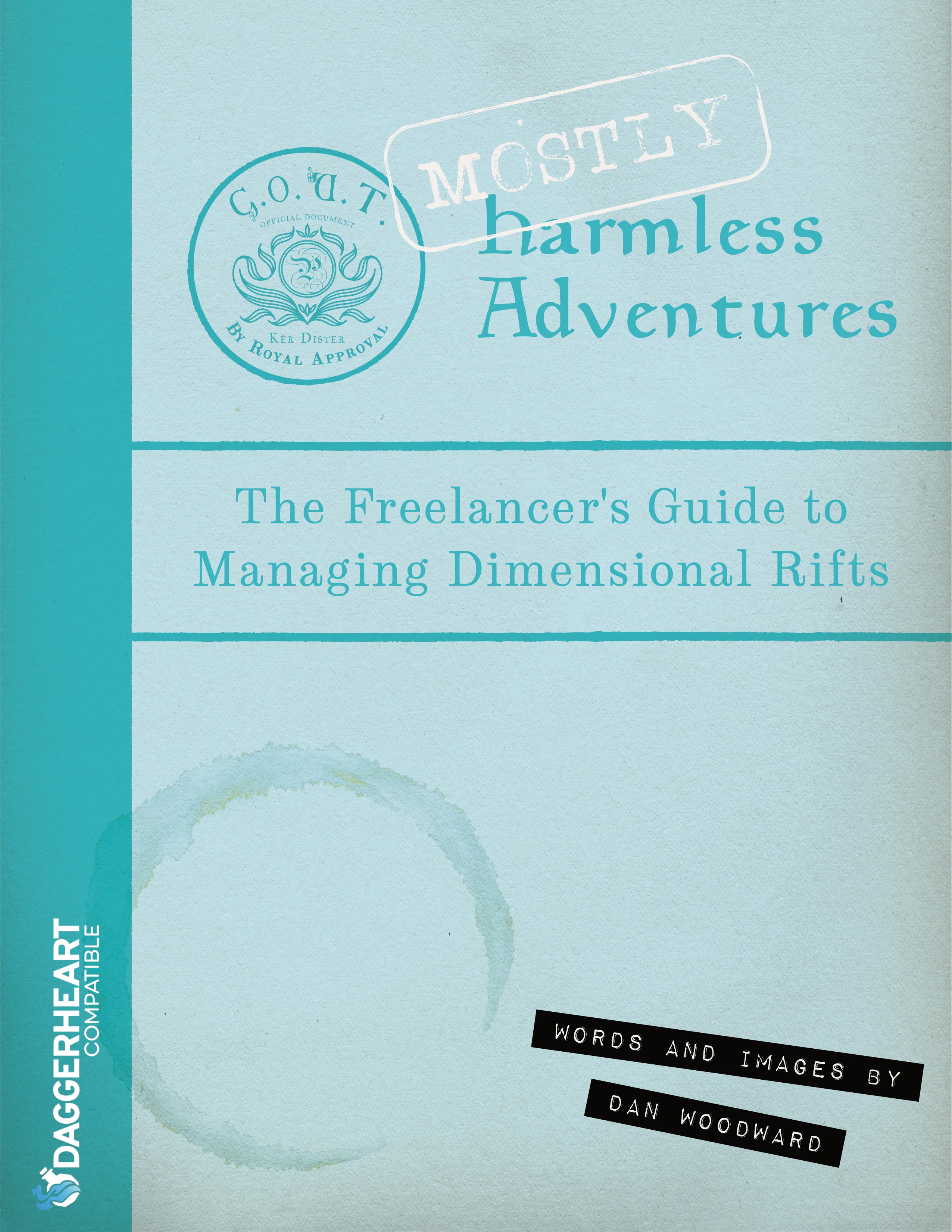
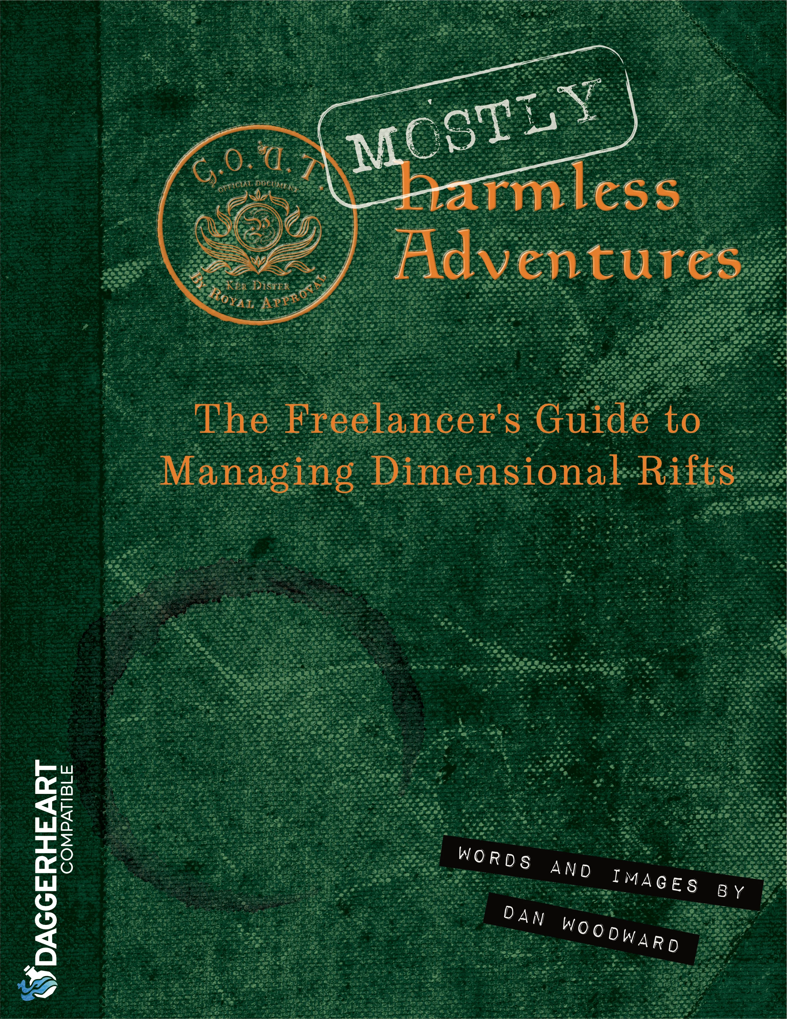
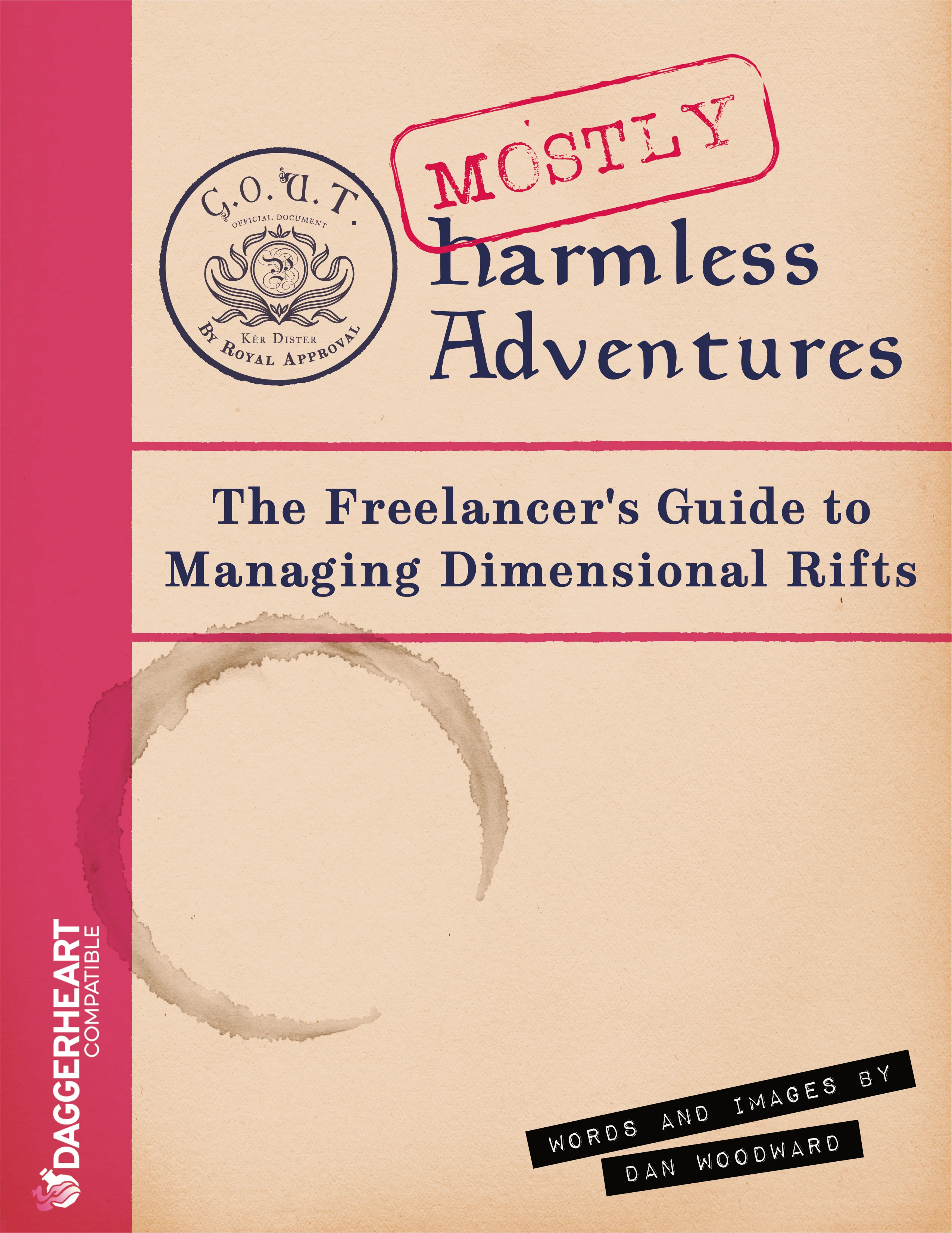
My second option was exploring the idea of the cover making the document look like a manual. I used a stock vector icon to quickly mock up a logo for the institution. I was aiming for an old 'Oxford University Press' vibe, so I also experimented with colour and texture. I felt like this option had a good link to the feel of the map I had made, but I was worried that it might look too authentic (i.e. boring!) and would not be appealingfor purchase when I put it out into the world.
The third option was to make the cover focus on the portal hook from the campaign frame. For the background I used a similar photo collaging approach to the ones above, but inverted the images and knocked them right back. I looked into different typography choices. I had an idea of the magical portals being like fractures in reality so used a stock photo as a basis for a third mockup.
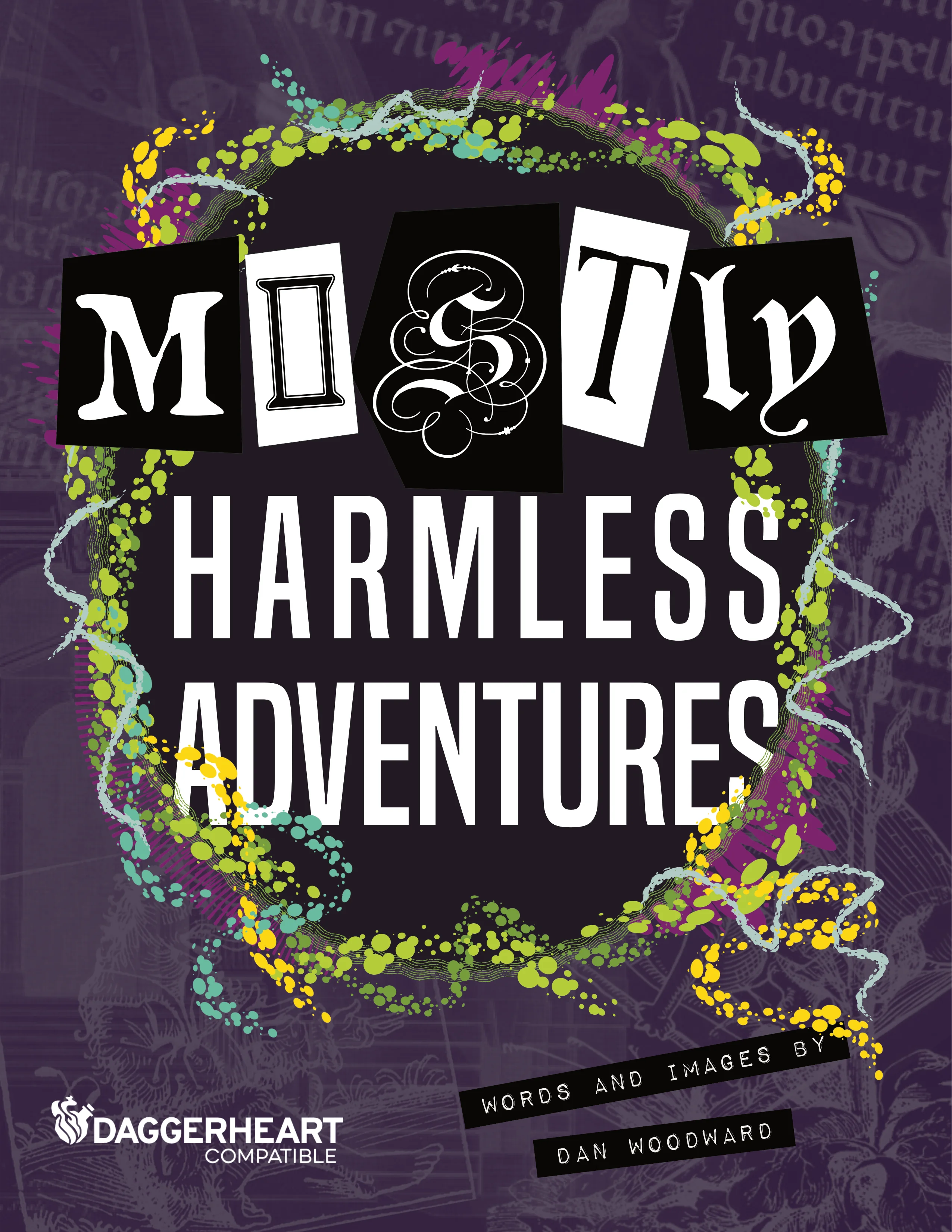
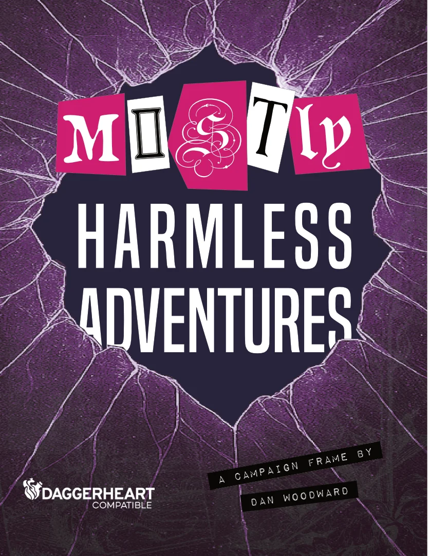
The portal option felt like the strongest choice when considering the cover from a sale list point of view. I deferred doing a final version, using one of the mockups as a placeholder while I created the main campaign frame document. At the point of writing, that document has iterated numerous times; as it has come together I am starting to feel like the second (corporate manual) option is a better fit, so I need to rethink how to make it more appealing while keeping the design approach.


Comments