
Practice and Research - Exercise 3.12: Spot Illustrations - Part 1
- Dan Woodward

- Feb 4
- 5 min read
Once the document layout was settled using placeholder space for images, I noted down in my sketchbook what illustrations I would likely need, alongside a little indication of their size (without being precious this time about specific dimensions)
I then started to sketch out some rough thumbnails with some broad ideas which I could then scan and develop more digitally.
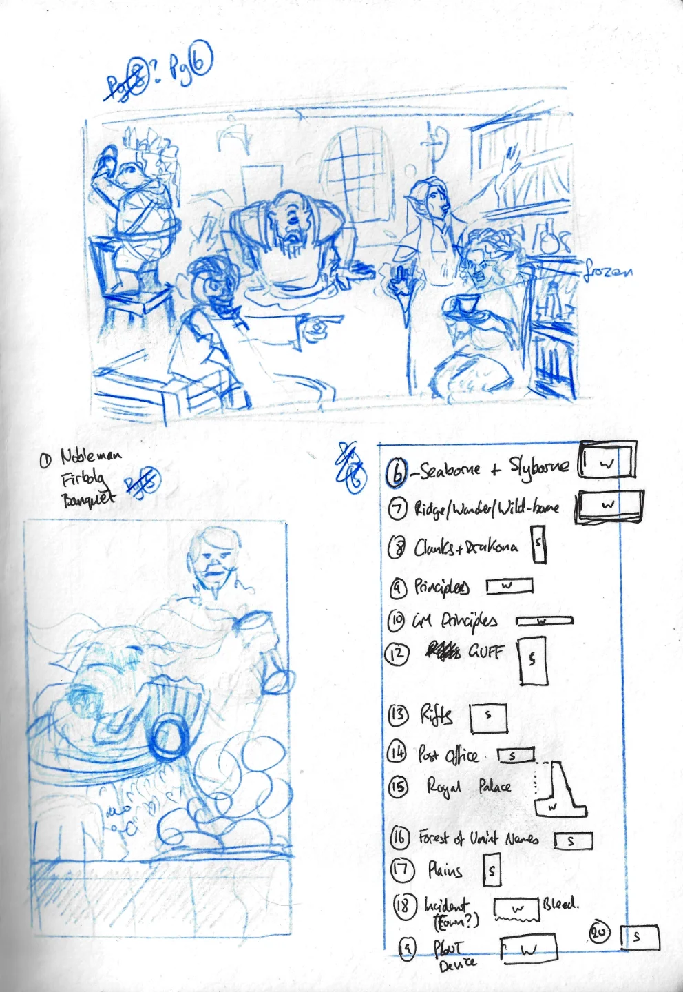
The Seaborne Adventurers
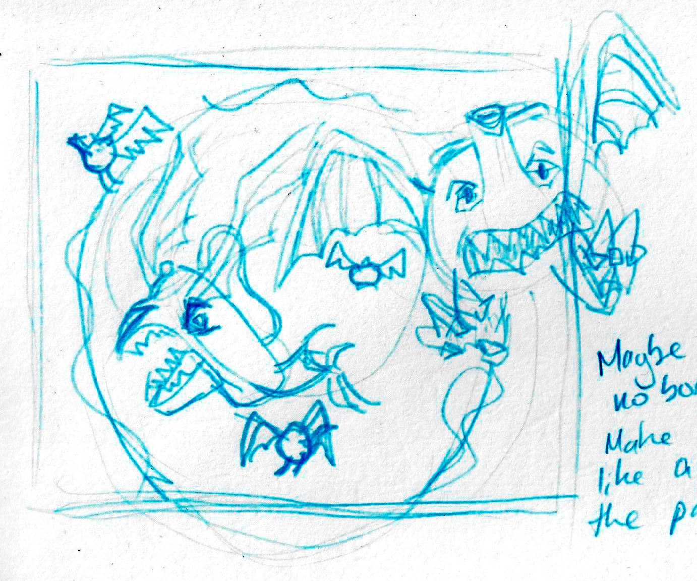
One of the first images I started to develop was a group setting of adventurers from communities that focus on smuggling. I wanted to give the vibe of a dockyard hideout, with a misfit group of loveable rogues. It was also important for me to show how different game classes could be represented from specific communities (it's easy to imagine how a Rogue can be a smuggler, but what about a Druid?).

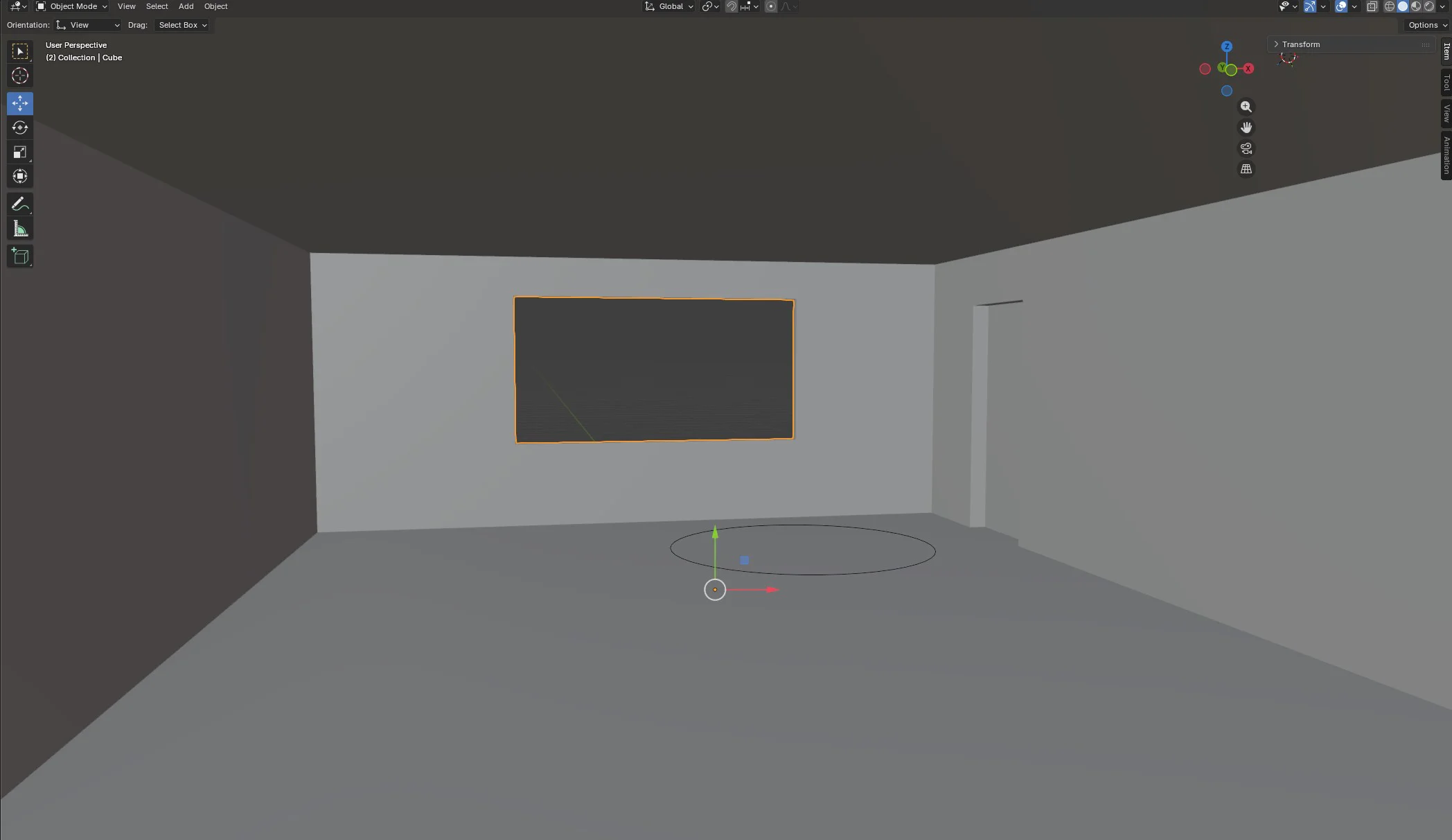
I liked the premise of the thumbnail, but I knew that the layout and perspective were all off. Working with the idea that I needed to 'see' the space to imagine them in it, I went to Blender, and researched enough tutorials to learn how to construct the room's layout through simple shapes and geometry. I didn't try and do anything fancy with the in-built camera and exports, I simply moved the tool's viewpoint until I had the view into the room that I was after - and took a screenshot!
I then cut the characters from my thumbnail and placed them into the screenshot, using Affinity to tweak the individual cut-outs to generally align to the perspective and adjust size where needed to get the right sense of depth.
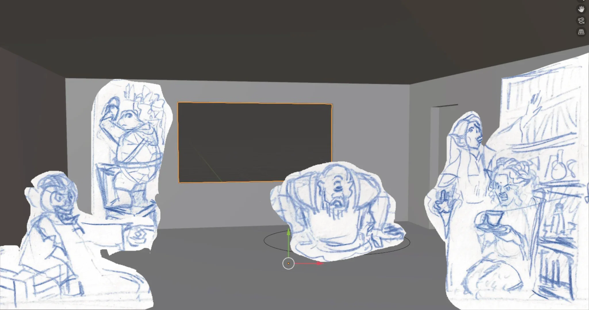
I then used this layout as the basis for my roughs, knocking back their opacity so I could start to sketch in the characters, background, and room items in more detail. This helped me to make choices about what would be in (or out) of the room. I used photo images for the background outside of the window, finding images of tall ships that broadly fit to the perspective I was using, then tweaking where necessary. Trying to draw tall ships from memory was never going to be practical, so this helped a lot. I drew the ships on their own layer, that way if I needed to adjust the perspective or angle, I could move the layer and avoid having to redraw everything.
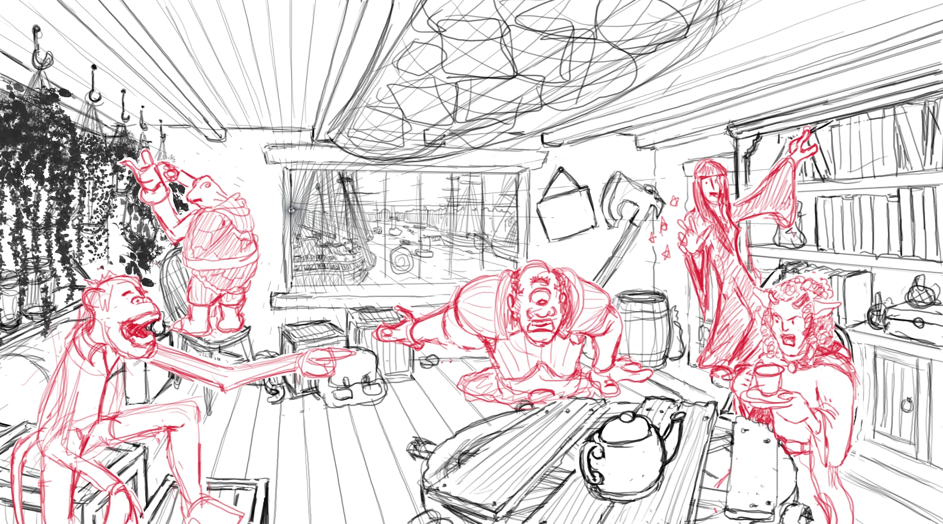
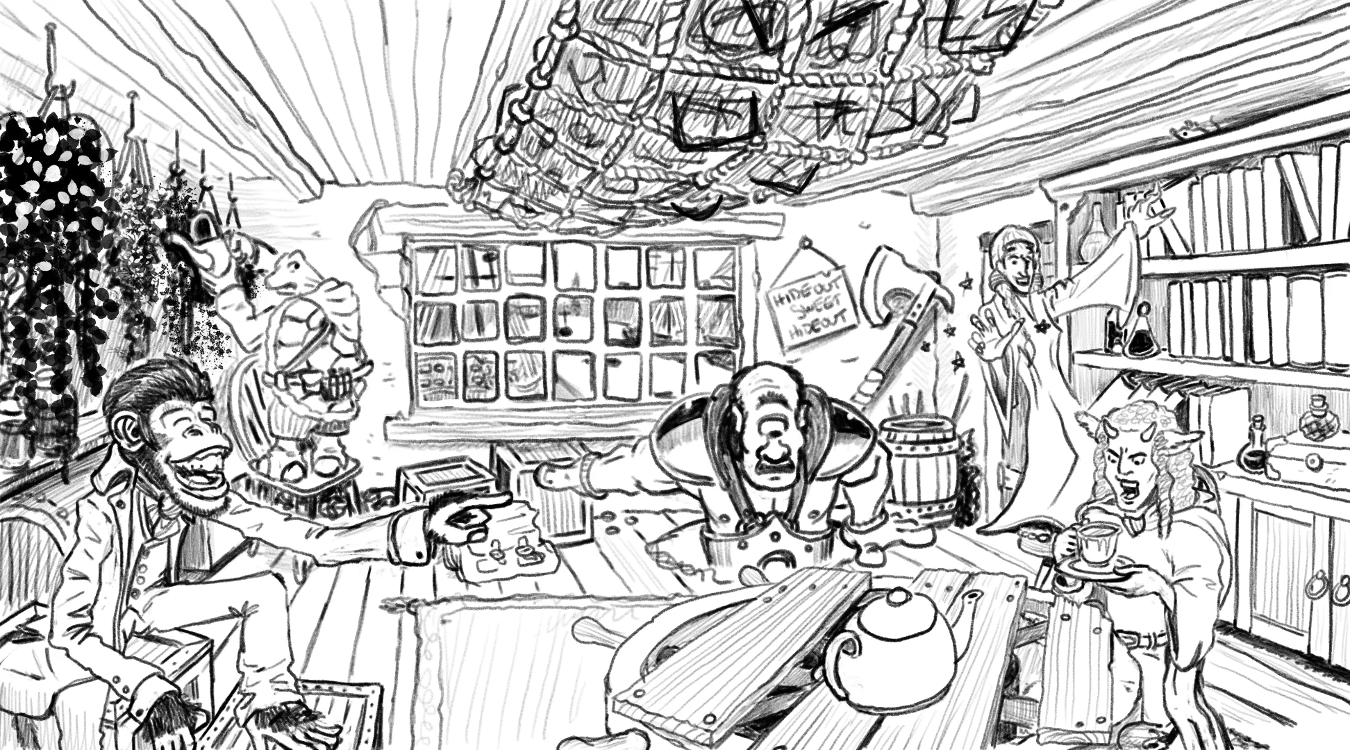
I then re-drew everything to make the pencil stage cleaner and ready for the final linework. There might be a case that the pencils might be good enough, if I can make the colours work with them. There was a part of me that was tempted to try and render the image in full colour, but this also felt like the same trap I fell into creating the Rivenhall illustrations. My tutor concurred that sometimes less is more. I am working out how to use the red and blue colour scheme of the map, along with the use of textures. Perhaps I can give the image a risograph-like treatment, and lean into zine-like qualities like halftones?
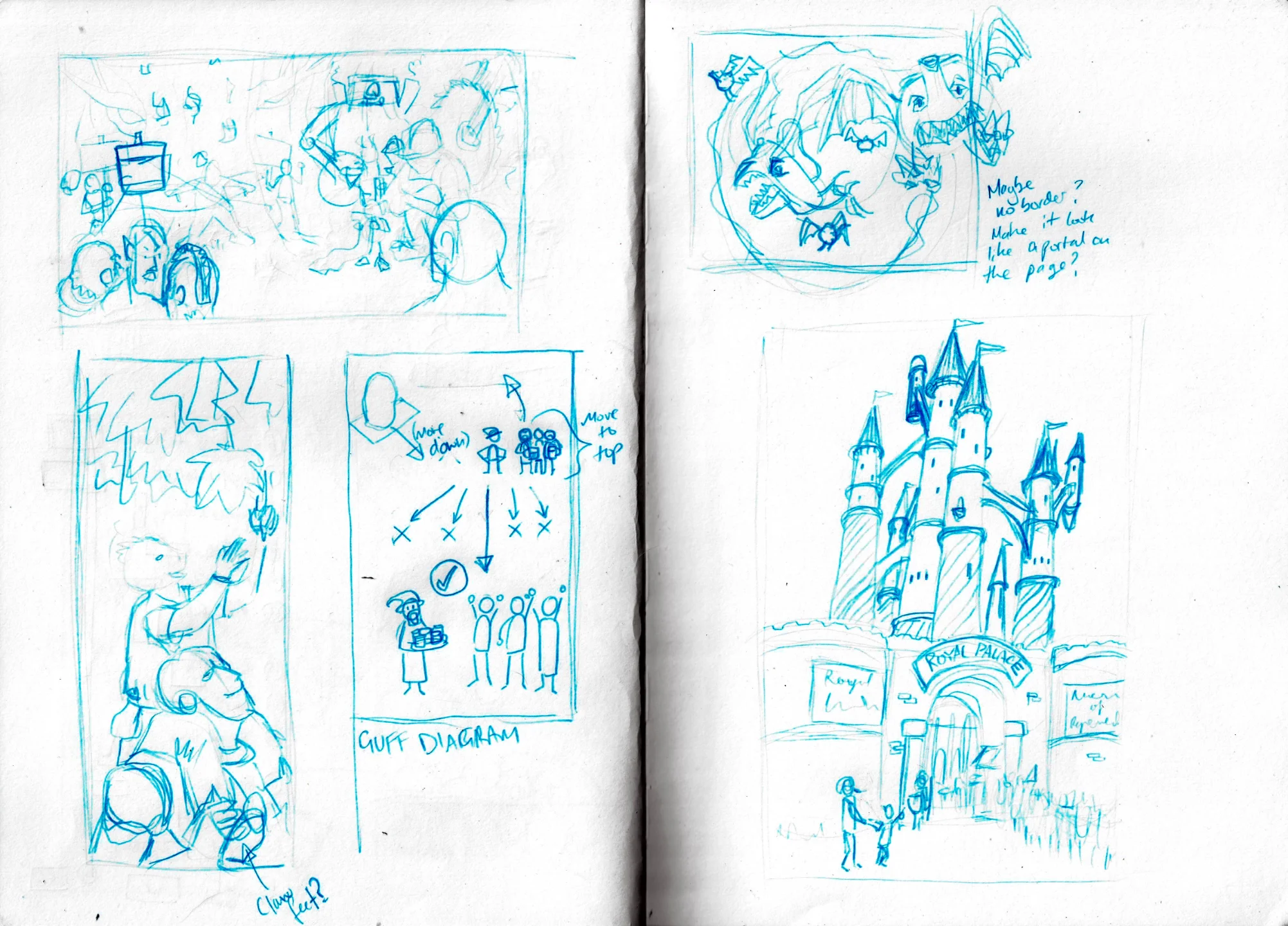
Wildborne Protesters
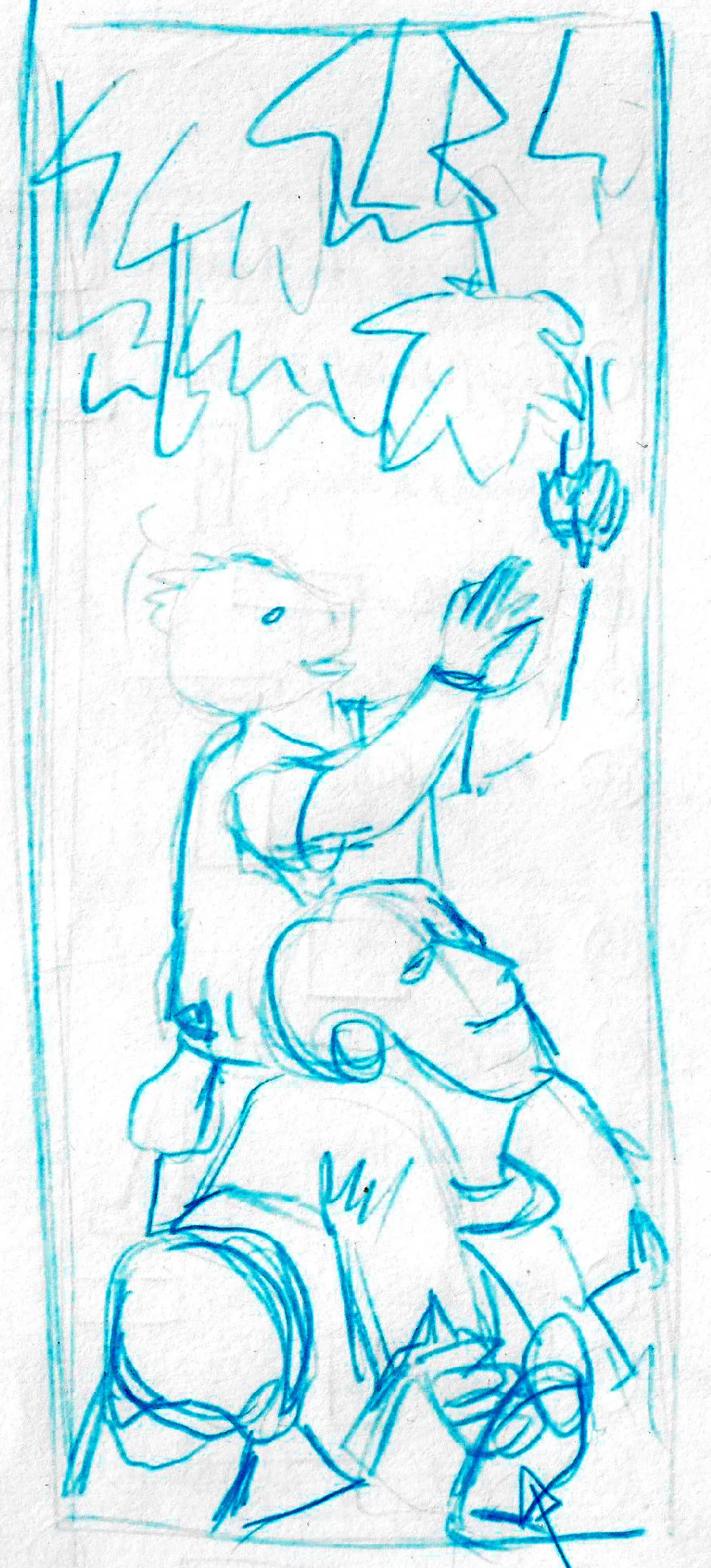
The next illustration describes a community tied to nature. In my head I imagined them as environmental protesters, so created a scene that was an homage to the opening of The Hitchhiker's Guide to the Galaxy, where Arthur Dent lies in front of a bulldozer trying to demolish his house to make way for a bypass. I realised that my thumbnail's proportions were too different from the space allocated for this illustration in the document, so I cut and rearranges the pieces to give myself a new composition and rough layout from which I could sketch.
I did my sketches in layers, so that I could change and adjust each layer without having to redraw other elements. I you can see all of the layers combined at the end of the sequence below:
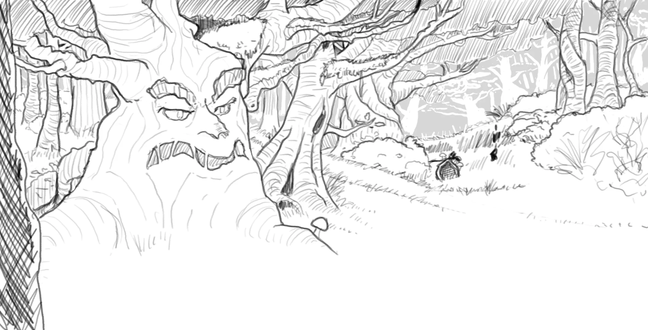
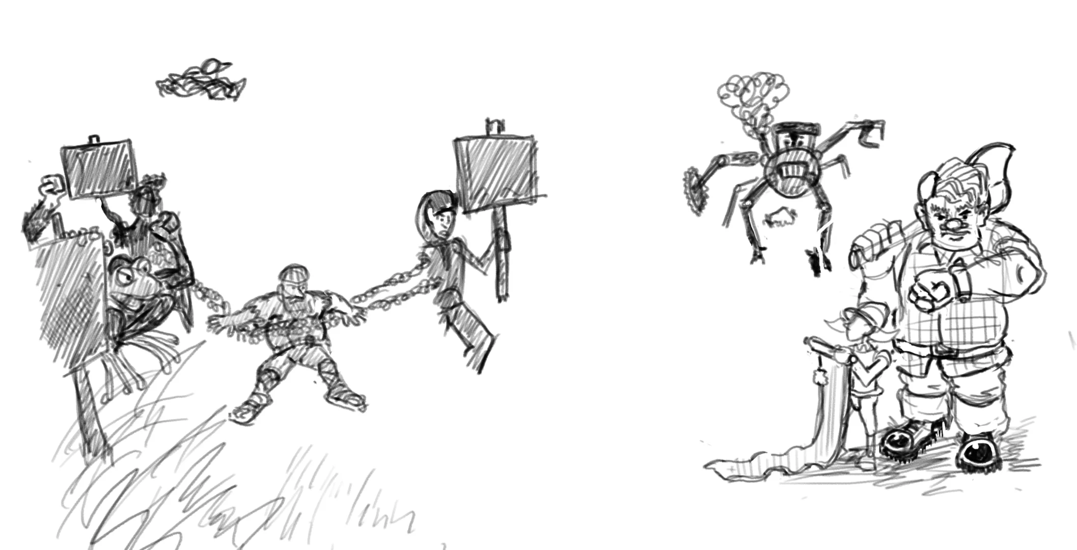
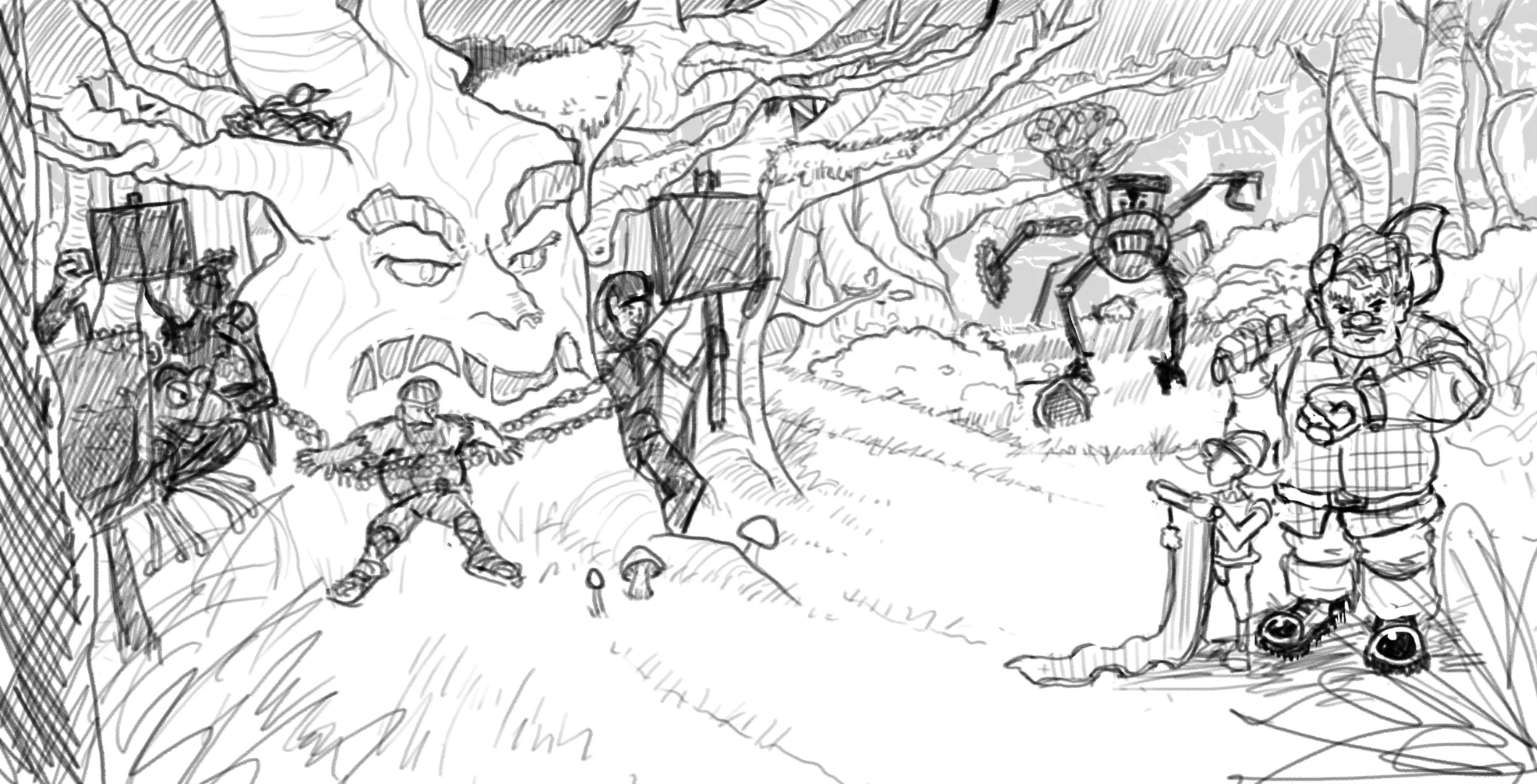
I am pleased with the trees - they feel interesting without being too busy. I reduced the number of foreground characters to make the scene less busy than my thumbnail, and I will use the silhouette of vegetation etc. in the foreground when I complete the final linework.
Graphic Spot Illustrations
My original plan had been to create sketchy small illustration to fill in some small spaces with visual interest. When I came to it, however, I discovered the dimensions to be awkward, and I was flummoxed as to what to draw! Again, I reminded myself that I did not need to obey the same conventions as the Daggerheart rulebook. The two areas happened to be about Player and Game Master Principles respectively. I had the idea to have a more graphic spot illustration in the spaces, much like is used in novels. As the players and the Game Master use different dice to check their success, I was able to create some vector illustrations that depicted the shapes of their dice alongside some ornamental linework. I created the purple by layering the main red and blue colours, and chose an amber colour that worked with the colour scheme. I might be able to use this more when colouring the other illustrations using a risograph-like approach. I added a risograph texture to the shapes, and adjusted the linework to give the impression that it had been drawn.


Letterhead Illustration

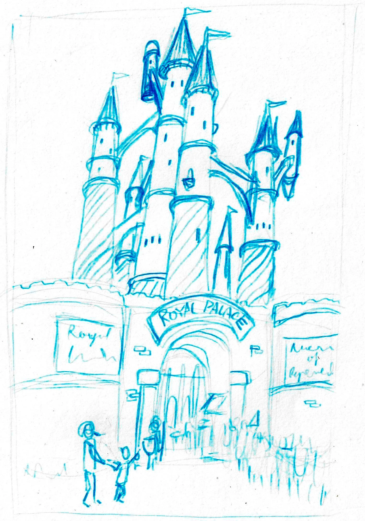
To continue the use of ephemera in the document (similar to how the map had 'stuck-on' elements, and how the Header 2 style is similar to a printed label), I wanted to add an illustration that felt like a letterhead used by an adventurer to receive his assignment (similar to the handout I created).
I imagined that they might use the letter as an improvised notepad, grabbed in the heat of the moment. I also imagined that their travel might have been subsided, so their coach ticket would have been sent along with the letter. I knew this would be anachronistic for a medieval fantast setting, yet it was too fun to pass up! I loved the idea of some anachronisms in this world, in the same way that Terry Pratchett's Discworld had elements similar to the modern world, with a fantasy spin. So why wouldn't there be a horse-drawn bus that goes from town to town?!
I researched historical tickets from British transport networks, and found a style of bus ticket from London in the 1950s that felt like it fit the bill, and allowed me to incorporate some more mid-century elements to the overall aesthetic of the world. The image above is the result, largely created with vectors, with some masking at the edges and distressed using texture images and brushes. It was completely done by hand, and I am surprisingly proud of how authentic it looks! I placed this bus ticket onto a larger illustration which created the letterhead itself. I was able to re-use the logo I had created for the player handout letter, and added a crumpled texture to the shape to look like it had been screwed up in an adventurer's pocket. I used a crumple texture that used halftones - while not being realistic, it did tie it to the style of the map effectively. Because the image went to the full bleed of the bottom edge of the spread, I manually added the page number back on top for reader legibility.

Other Illustrations
At the time of writing I have not been able to take the other illustrations further. However, I did place them into working Affinity files like the others, and all my spot illustrations are directly linked to the main document. That way, as soon as an illustration is updated, the main document has the very latest version of the illustration in it. I am looking forward to working on these illustrations and bringing them all to completion so the product can be released.

Comments