


Practice and Research - Exercise 3.8: Another Map
- Dan Woodward

- 1 day ago
- 7 min read
Trying to merge the elements of my layout research on paper proved a difficult exercise. So rather than getting bogged down trying to conceptualise the overall aesthetic, I decided to try and sculpt it like clay by making a start making things.

To me the best way to get a feel for this new world would be to create the map first again. That way I could transfer what I learned into a design system for the document I needed to create for the PDF. Rather than emulate a simple top-down map like last time, this time I was inspired by the map from the Heart RPG, which took a hand-drawn angled view onto a town. I wondered if I could use this camera angle for a larger area. I liked the way it felt more like a bird-eye view, or the view of a celestial being watching from above.
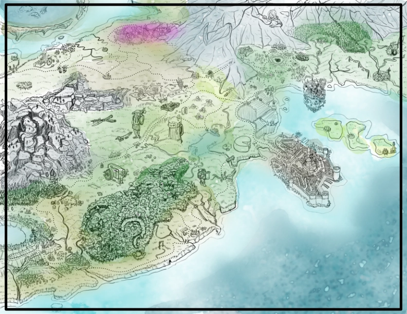
I started by going back to the tool I used last time that procedurally created fantasy maps. I stripped everything down and iterated until I got a coastline that I found visually interesting.

The tool allowed me to view the map in a three-dimensional view, so I used this approach to tweak the camera angle until I had an area and view that I thought would work for my needs. It was a much tighter crop than the top-down view. I remembered that I had told myself that I did not need to define everything up front. It also presented the world as more naïve and sheltered, oblivious to a larger continent.

On top of this foundation I started to add in locations from my text, using the topography to guide where things might logically (or not-so-logically!) go.


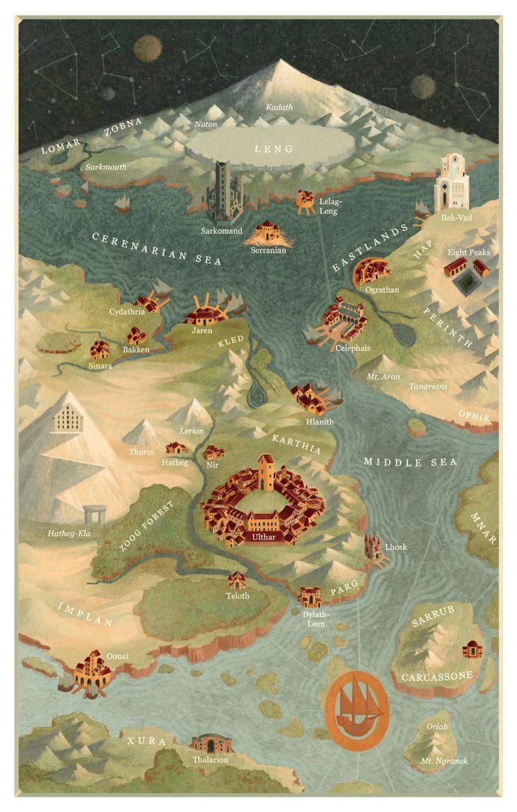
In my research, I had found a commercially available map of Terry Pratchett's Discworld, which was beautifully illustrated. It took a Tolkein-esque approach to its birds-eye view, with larger physical geography rendered with height. My camera view was a bit different to this, but it did make me think that I could convey height to the topography, much in the same way the map from the Heart RPG gave a sense of size to its buildings.
What I enjoyed most, though were the little annotation illustrations, which were full of wit and humour. This linked to the 'sea monsters' of my first map, and seemed like a fun way to add character to the map. Using my annotated rough, I then started to draw my map proper, taking time, care and attention to add the detail.

I was really happy with the map, and I had enjoyed adding in all the little details. I particularly like the way that I was able to convey grassland in a simple way that didn't make the map feel too dense. I wanted to move on, and had to think about how I might add colour to this map. I reflected on how long it had taken for me to draw all the elements, and how I was still unsure about how to incorporate the aesthetics that I had researched. I spent some time doing some more map-specific research to see if I could get ideas on how to colour the map.
I put together two mockups that explored a wash-and-line approach, and another that leaned into a more specifically retro and graphic approach.
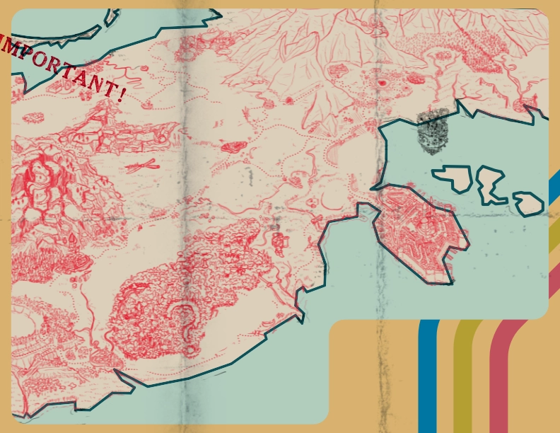
In all honesty, I didn't like either mockup, but the more graphic approach seemed to have more potential for improvement, and it would force me to take a direction that perhaps would force me to try things that were not entirely in my comfort zone for colouring. The red and blue were an element that I liked a lot, and it made me think of the risograph-style zine I had created. I thought that the riso approach could be an interesting one to explore more, and so I started to focus on a more limited palette.
I imagined this map as being an actual issued map, maybe one an adventurer would pin to their wall, and keep in a backpack. What might this look like if it were issued from an institution rather than a typical fantasy map? This made me rethink the amount of detail in the drawn elements of the map. I felt like I needed to simplify things, abstract them to more graphical elements. It also forced me to think about the visual identity of the G.O.U.T. institution - a whole side quest of its own which I will explore in a separate learning log post. The first thing I experimented with was simplifying the smaller towns, villages, and roads with simpler iconography.

This caused me to reflect on how long it had taken me to draw - if I now had to do the line work, how would it blend in with the approach I was taking? I decided to defer that question for the moment, and instead explore how I could use shape and texture to convey some of that information, and reduce the amount of drawing I would need to do. I used vector shapes for the land mass to separate it from the sea, and then created other vector shapes using textures as representation for the the geography. I didn't feel like I could get away with that approach for the forest, so I combined it with some vector lines that conveyed the canopy, but without the amount of drawing I had used for the initial pencils. I was also able to make vector trees and shapes that could be re-used easily, and tweaked to keep the visual interest high.
I started to tweak the colours, making the border the same hue as the red, but darker and less saturated. I used a paper texture and stains to give the map a worn and well-used feel.


I added more elements in using this graphic approach, and looked for ways to simplify and avoid drawing. This led me to adding the 'found' objects. I started with the colourful volcanic pools, reimagining them as a polaroid photo. I used an attribution-free image of a real volcanic spring, and then passed it through photographic filters to give it a 70s polaroid feel. I replicated the look and feel of a shiny polaroid picture and then 'stuck' it to the map using tape textures. Instead of drawing the Green Man, I found an image of the mythical character for common use in the British Library archives, and I passed that through filters to make it look printed, colourising it to be green. Imagining this was a piece of an envelope that has been torn and stuck on the map, I also created a simple stamp that I could overlay on top to give it an authentic feel.
I added in the top-most mountain range. My first attempt just created a generic mass, similar to the one on the left of the map. So I thought about how painters represent maps through brush angles. I experimented by finding rock-like textures, compressing their aspect ratio to narrow them, and then angling the textures to align with the mountain face. I repeated this on the opposite side, using a slightly different texture and opposing angle to represent the other side of the mountain. I was extremely happy with this approach, and it really made the area look like a photograph of mountains without me having to draw any detail.

I felt like it was very difficult to do the same for the westerly mountains. I did not envisage them as Alpine mountains - more like shattered columns, being pushed out of the mantle. I experimented with adding additional shapes on top of the base layer, and then accentuated the effect by adding in a shadow layer to add depth. This worked, but meant that I had to replicate the shadows on other mountainous areas for things to gel well together. At the top of the map, I created a photo collage of mushrooms using free images of different fungi, then cut them out and manipulated them to create a 'forest' of fungi. I then passed this through filters to give it a printed zine feel in the same red colour as the rest, and placed it onto the map.

I added in the capital city Kêr Dister onto the peninsula. This required some drawing, which I did using vector shapes where possible. For the city layout proper I took inspiration from maps in my research and abstracted them to two-dimensional shapes that could also be created with vectors.

The map was in a good place, but I still wanted some of the funny details I had before. I realised that I didn't have to make these look like they were an existing part of the map. I put myself in the shoes of the adventurer - like explorers of history, it was logical that they would annotate their map with information. So I drew in the other elements, making it look like it had been done with pen-in-hand. I didn't have to worry about it looking neat or perfect - any error just made it look more authentic.

I had somehow come out of the other end of this process with a distinct visual language and identity that had managed to combine the disparate influences. I was pleased with the result, and that this really felt like my visual voice coming through. I could start exploring how this might now translate to the design system of the Campaign Frame document.
References
Booth, C. (2010). Transit Maps. [online] Transit Maps. Available at: https://transitmap.net/.
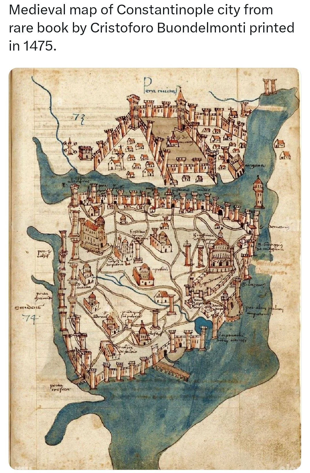
Buondelmonti, C. (1475). Map of Constantinople. [Digital] Pinterest. Available at: https://i.pinimg.com/1200x/a4/af/3d/a4af3d650a49b3b650db83b1ea239d0b.jpg.
Mitchell, I. and Moureau, M. (n.d.). The Mappa Discworld. [online] Discworld Emporium. Available at: https://www.discworldemporium.com/product/the-mappa-discworld/ [Accessed 1 Feb. 2026].
unknown (n.d.). Fantasy Map. [Digital] Pinterest. Available at: https://i.pinimg.com/1200x/d1/3c/a0/d13ca0190df3125673121cf6182a3aec.jpg.
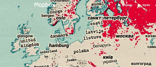
unknown (n.d.). Graphic Map of Europe. [Digital] https://blogger.googleusercontent.com/. Available at: https://blogger.googleusercontent.com/img/b/R29vZ2xl/AVvXsEjkzh0DwwNTOfOyyd_7tT13DxiZytuwxFgibezMAp3v1pzFOGZo9khnxy48Qe1JpYNssYJzCTlGLGUyjzHkIlZ4i1JZ7zOmF_V0KUPJSxcIBp9MmTP3VnBe7DcFOk8fZRsJ3iGMtA/s523/logo.gif.

Comments