Practice and Research - Research 3.7: Translating Tone to Style
- Dan Woodward

- Feb 1
- 2 min read
My new direction is taking me to something I call "Mostly Harmless Adventures". Inspired by the absurd and satirical, it channels the wit and humour of writers like Douglas Adams and Terry Pratchett. I still plan on creating a Daggerheart Campaign Frame document that I can put out into the world as a PDF.
Instinctively, I knew what this new setting felt like. However, pulling that apart to assemble the ingredients was easier said than done! I did my best to break down some key elements so that I could delve a little deeper and give myself a foundation to build on as I iterated along the way.
Employee Manual
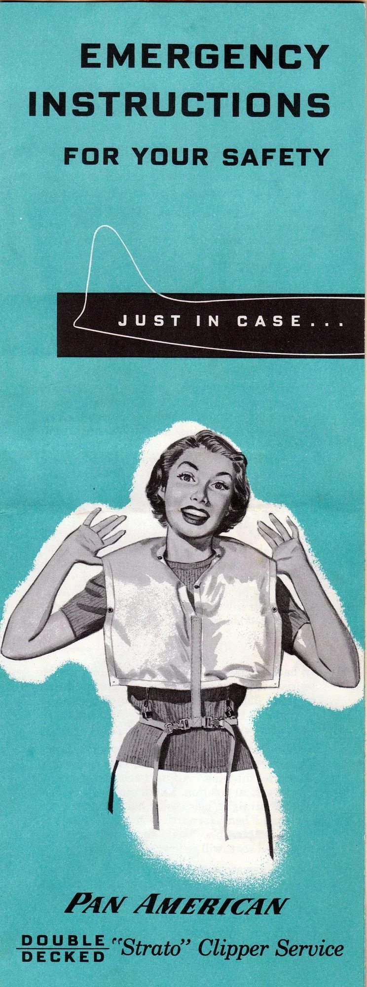
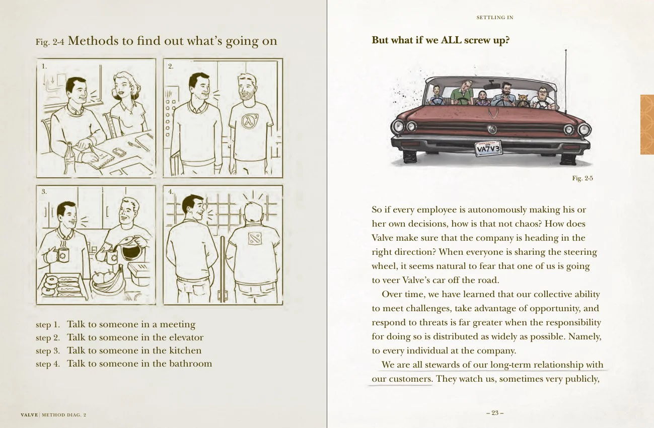
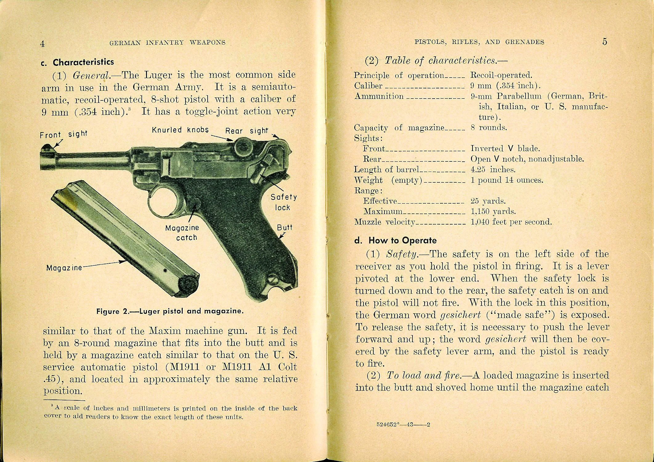
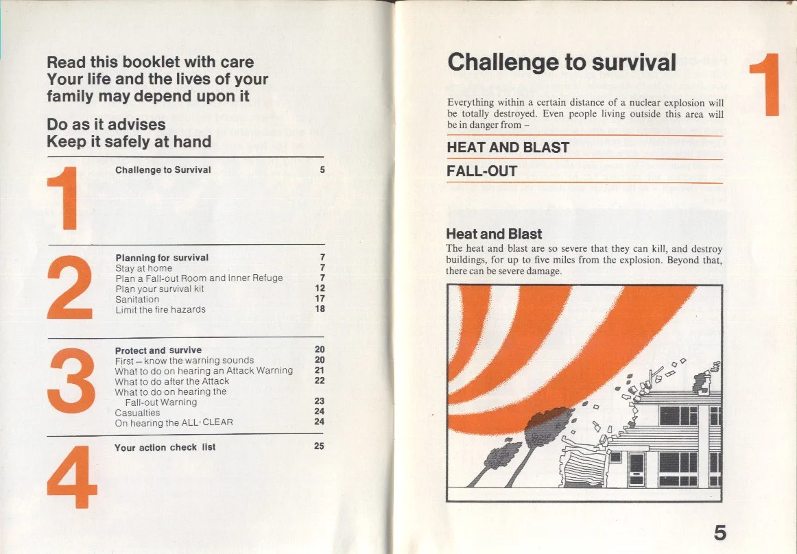
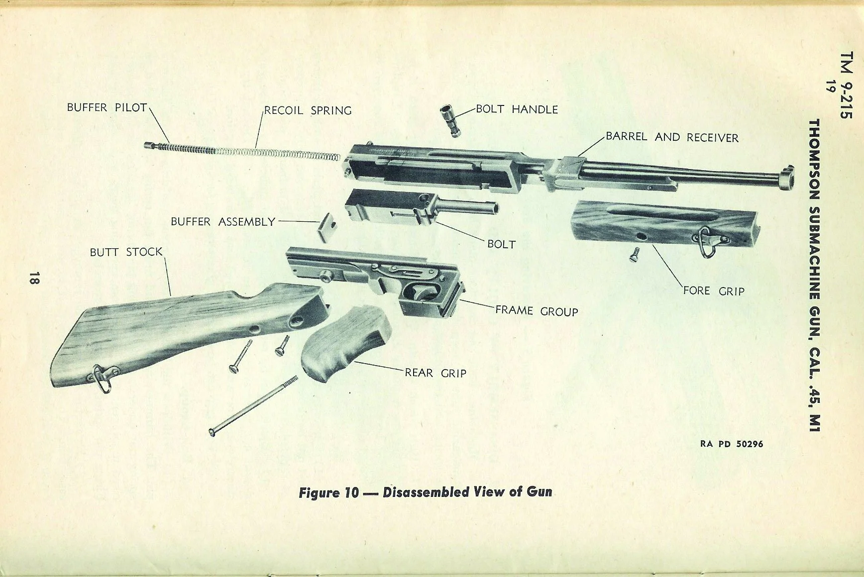
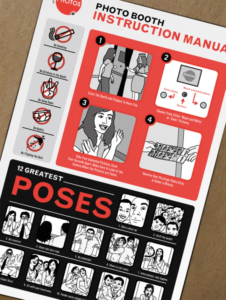
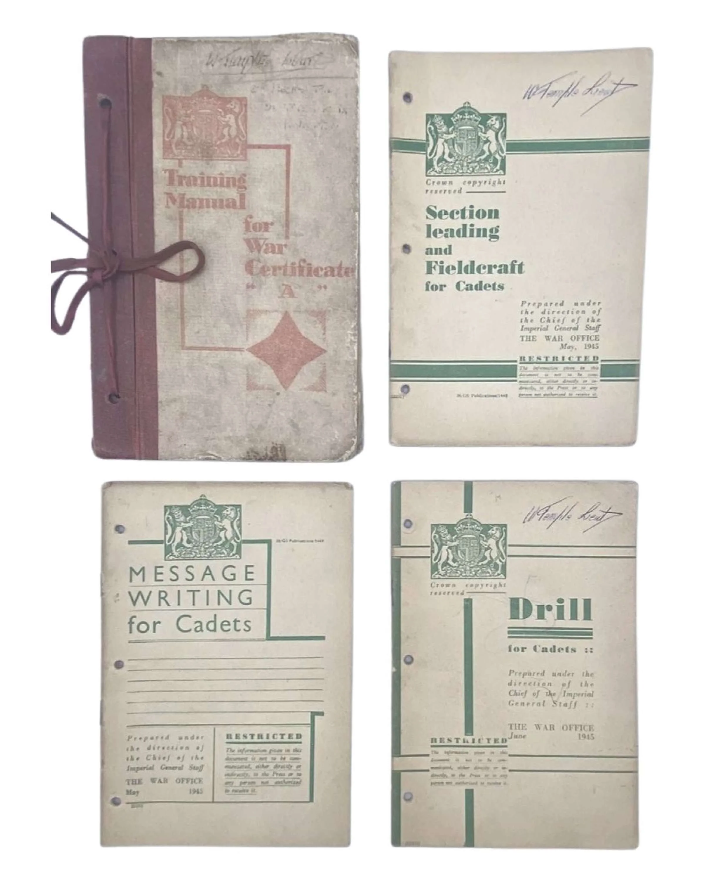
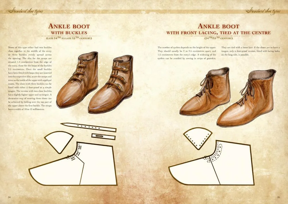
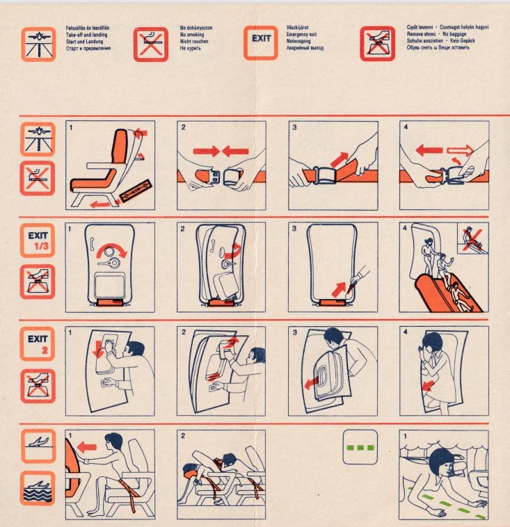
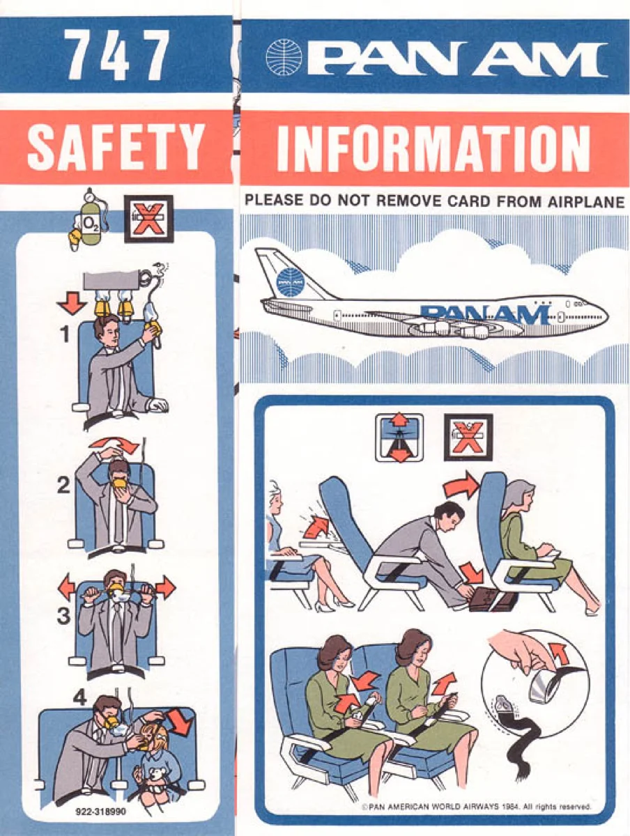
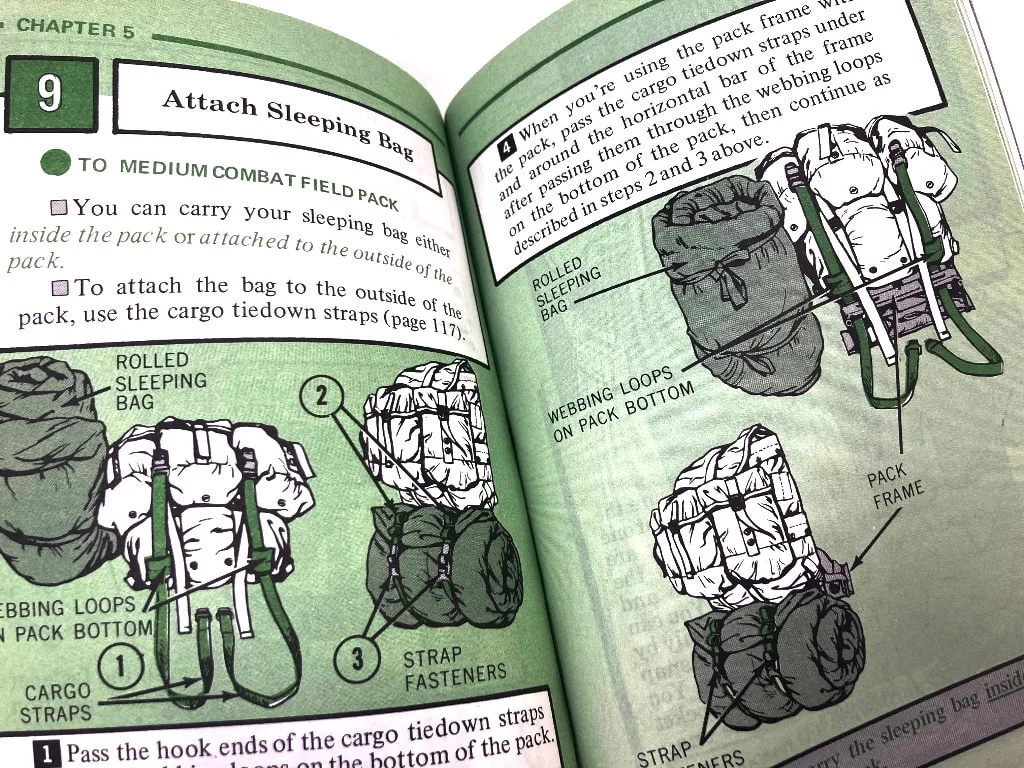
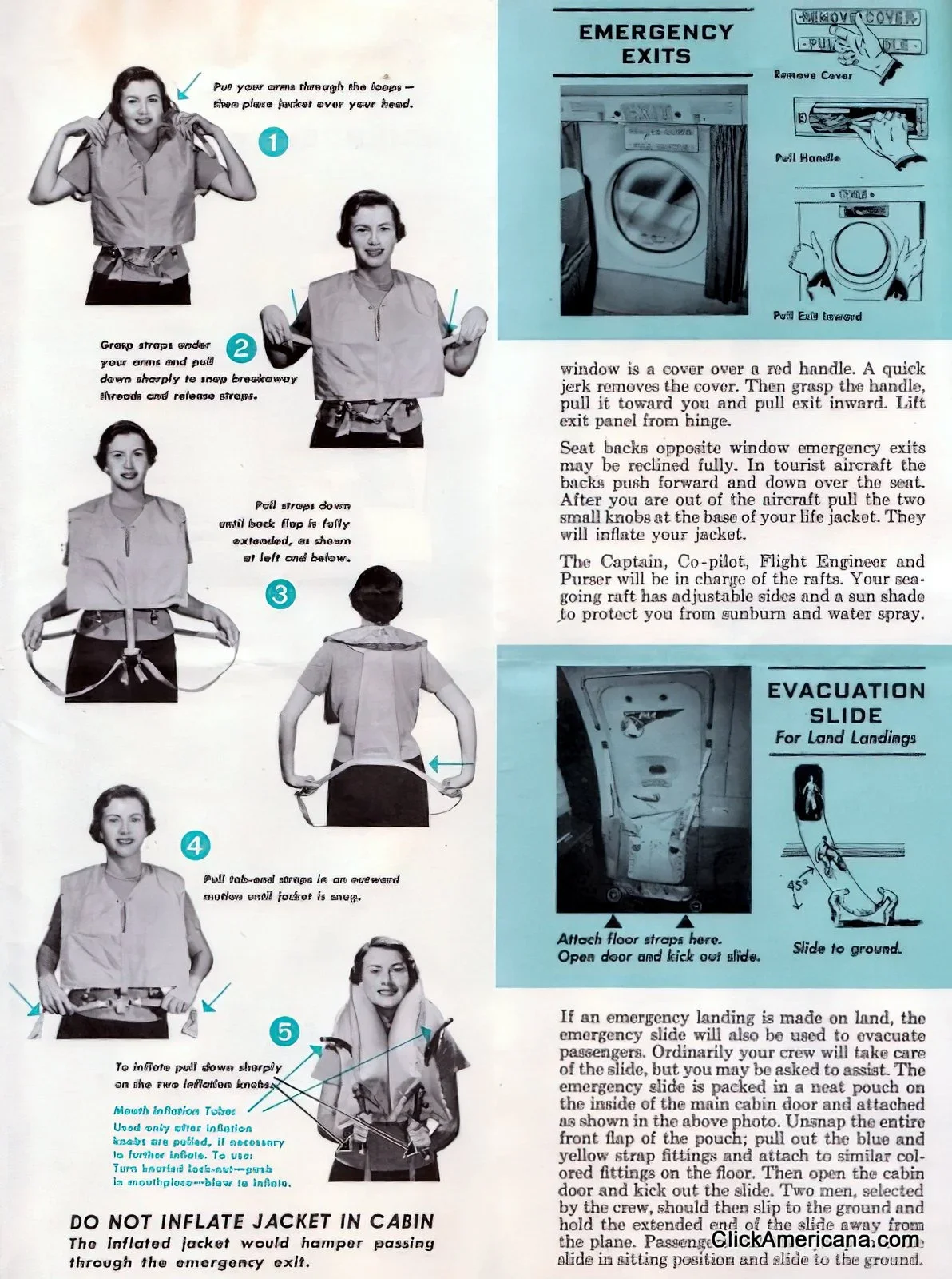
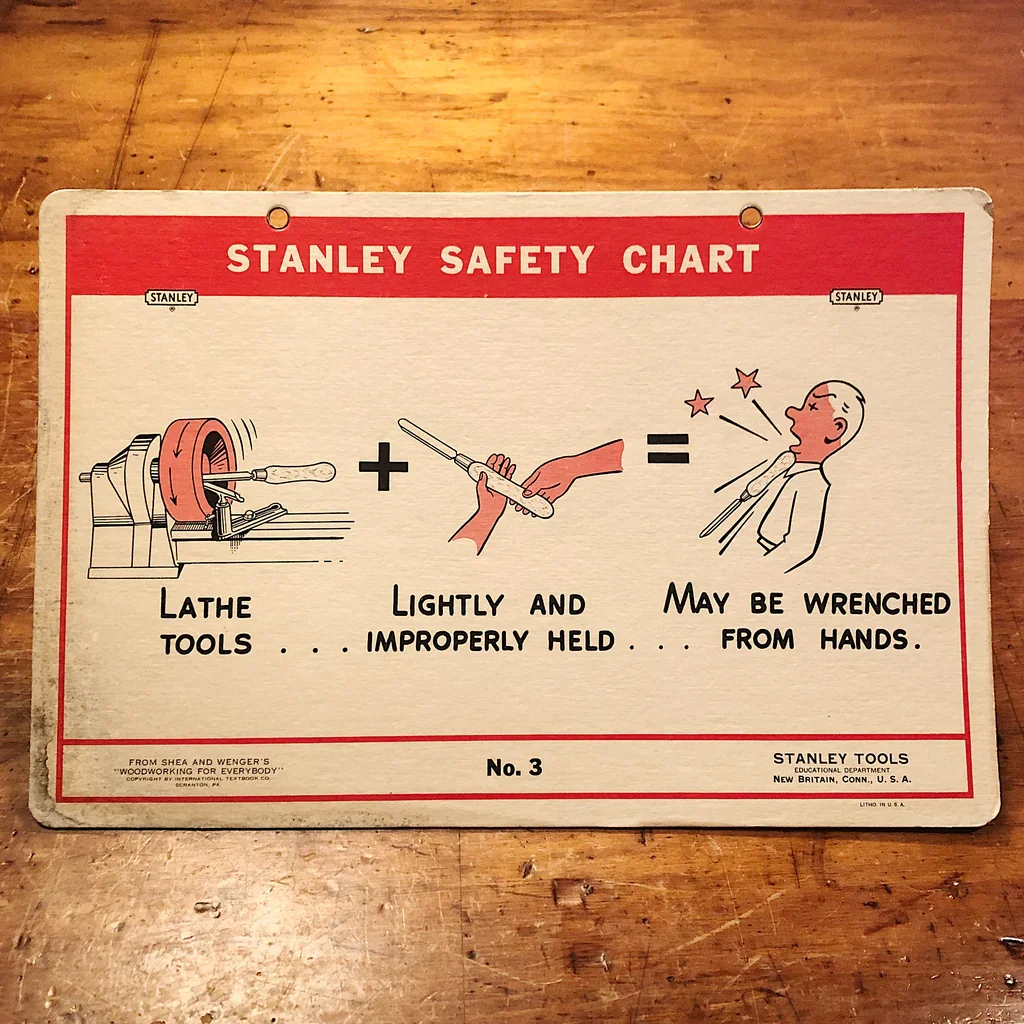
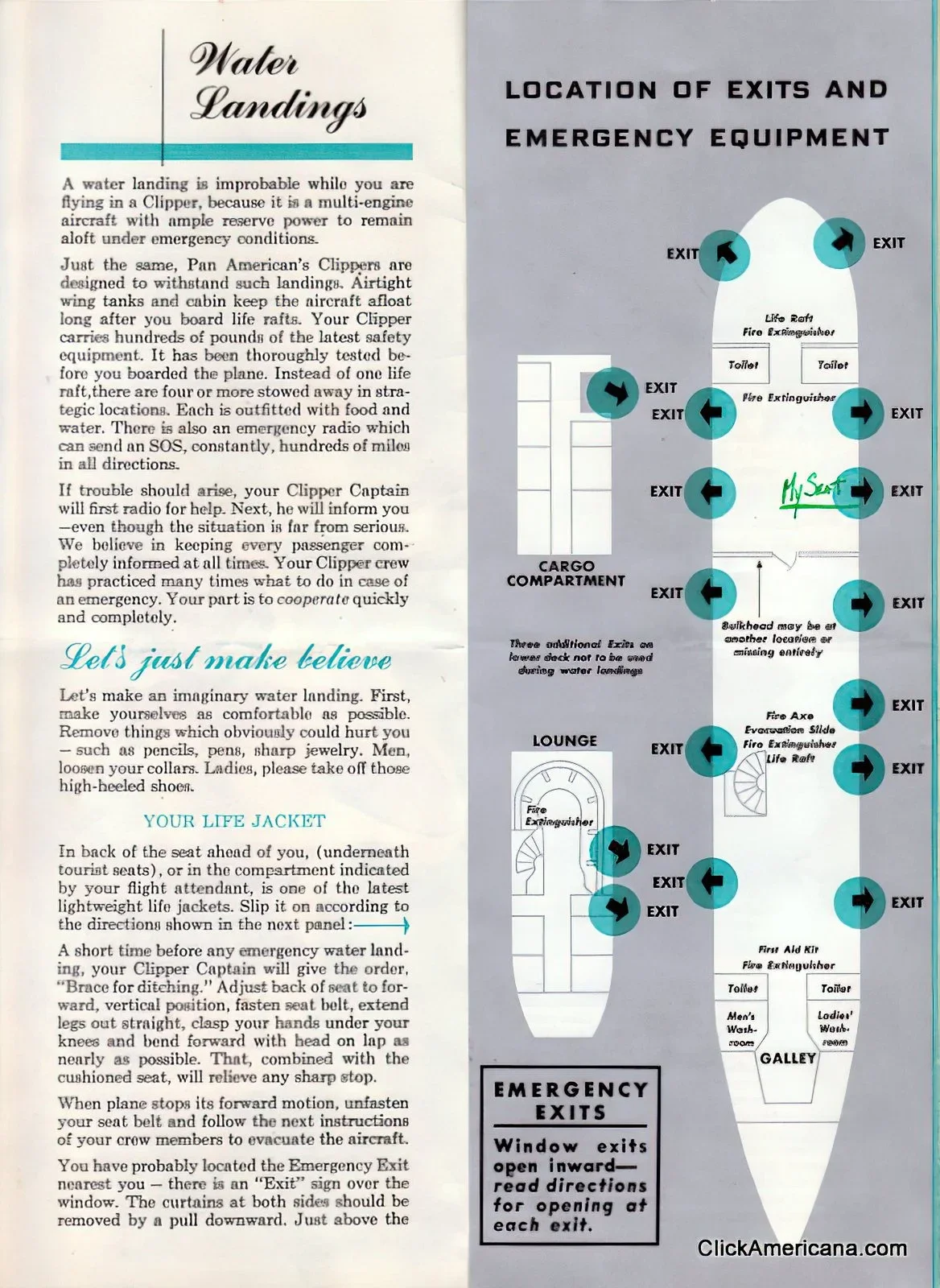
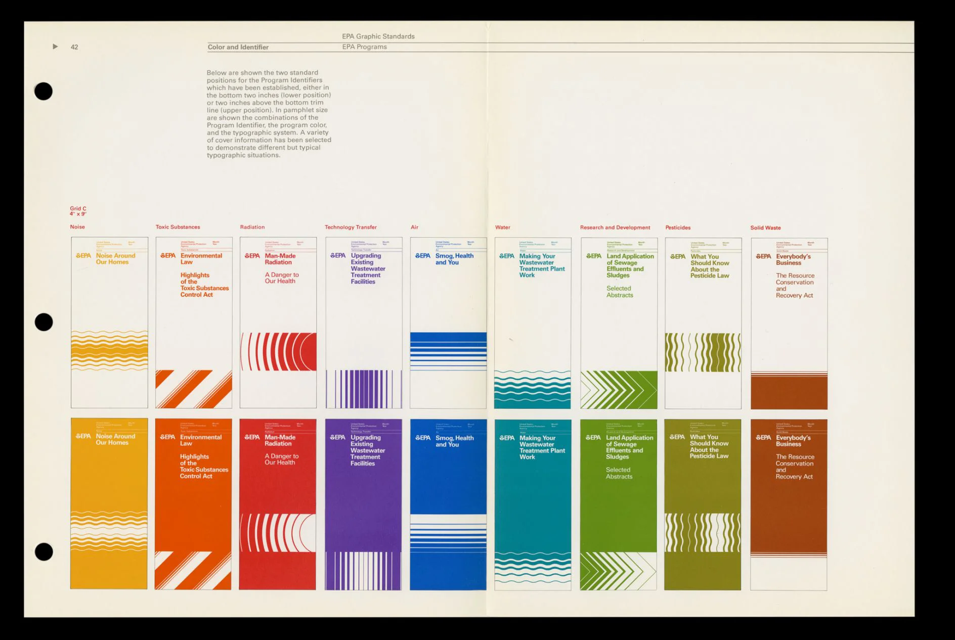
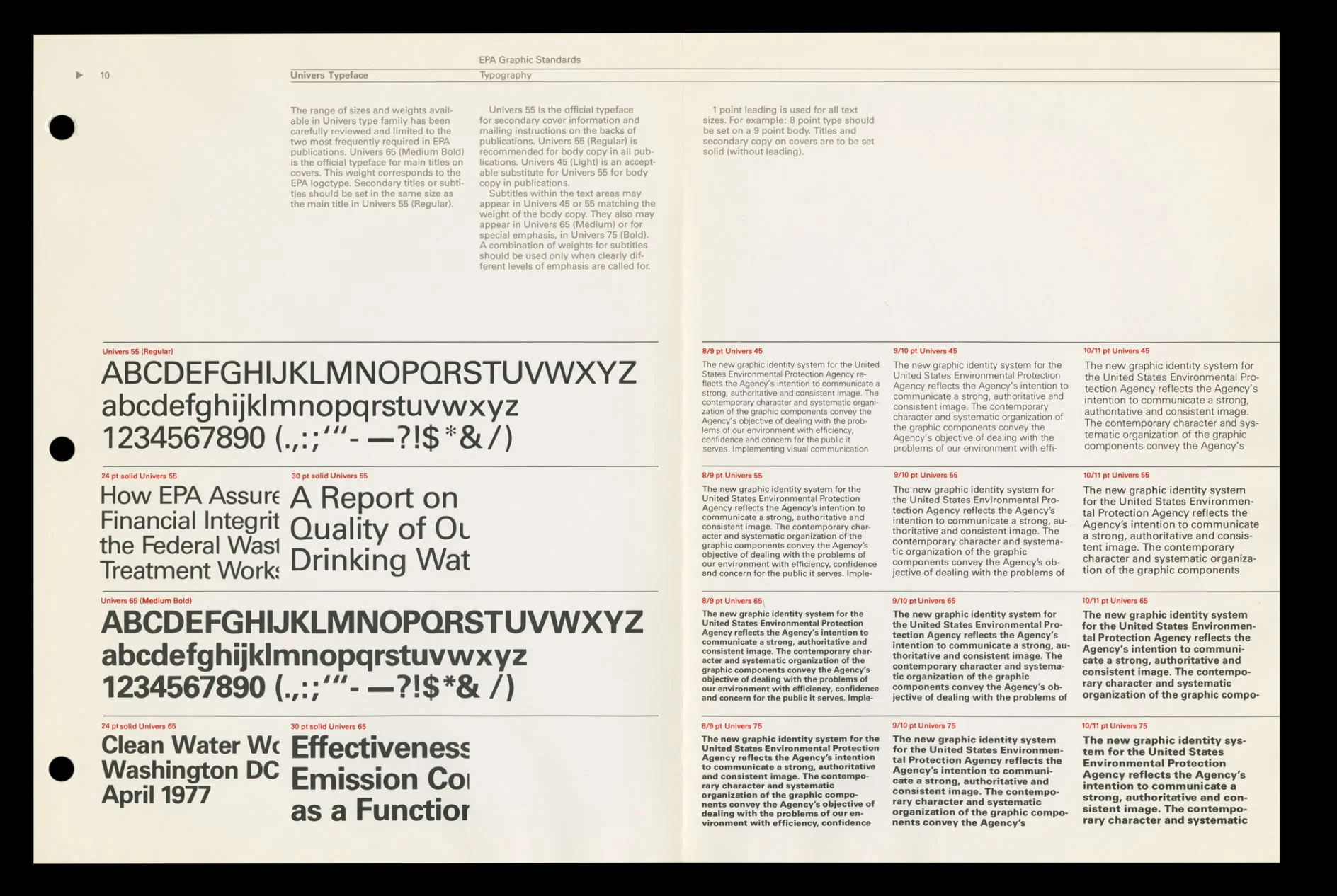
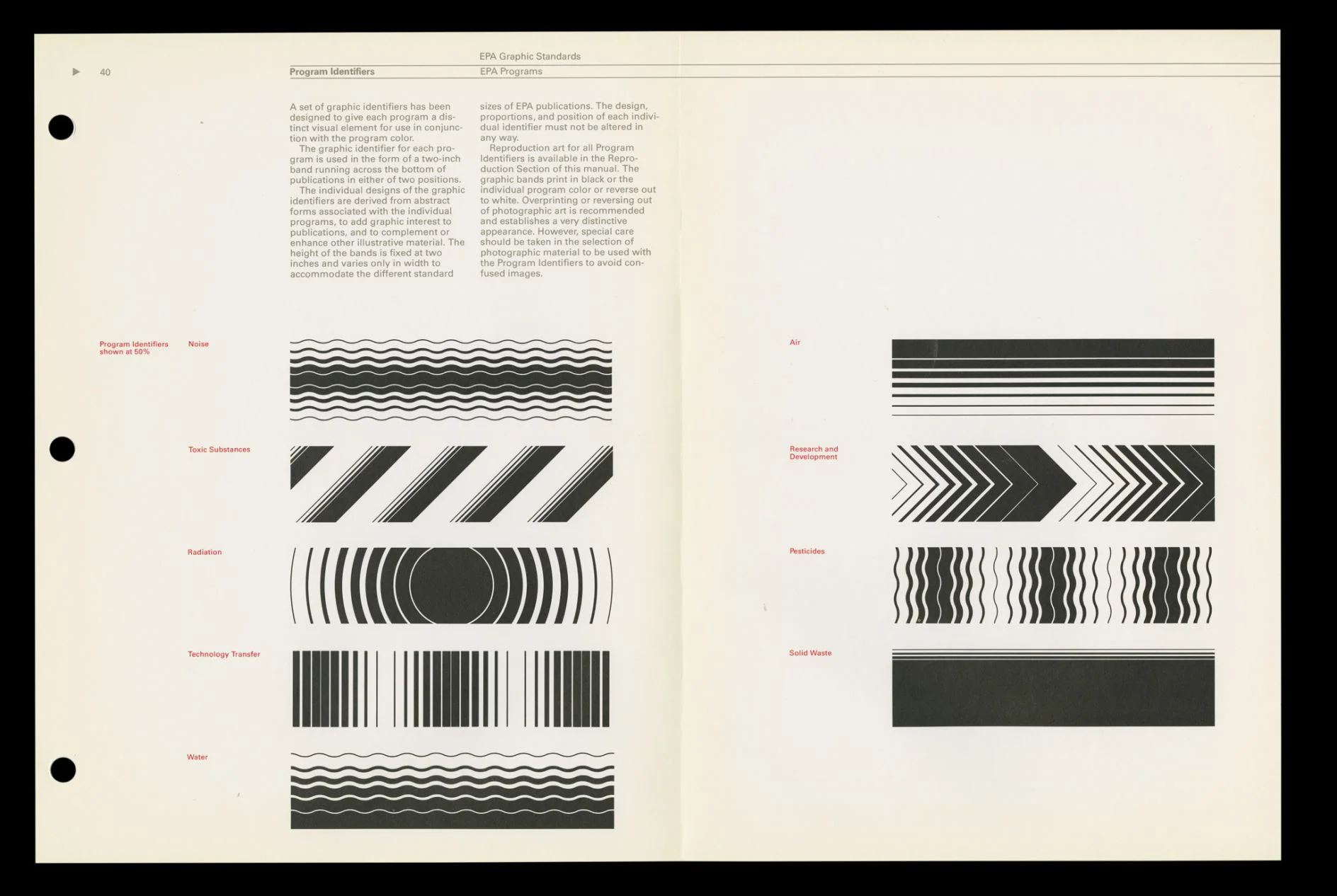
I tried to spread my net as wide as I could when researching employee manuals, looking at various government and corporate communications across the decades, including more modern offerings that emulated the 20th century aesthetics. Some manuals were too dry to work in the context of this fictional setting, but there were some key design elements that I liked. In particular the use of typography and colour. The older examples often only used one or two spot colours. This economical approach intrigued me, and I wondered if less could also be more for my purposes as well.
I did wonder how I was going to blend the clean design of a lot of these examples with having linework that had more weight and energy.
Punk, Grunge & rebellion
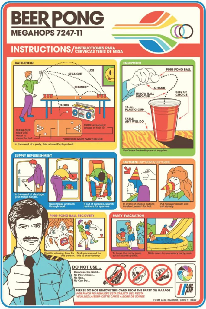
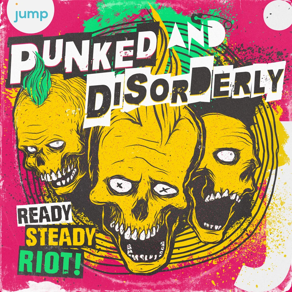
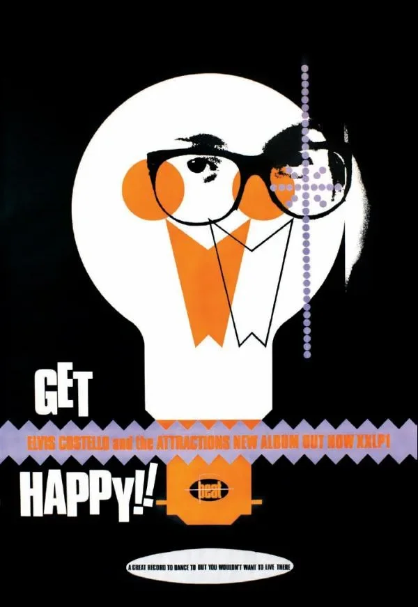
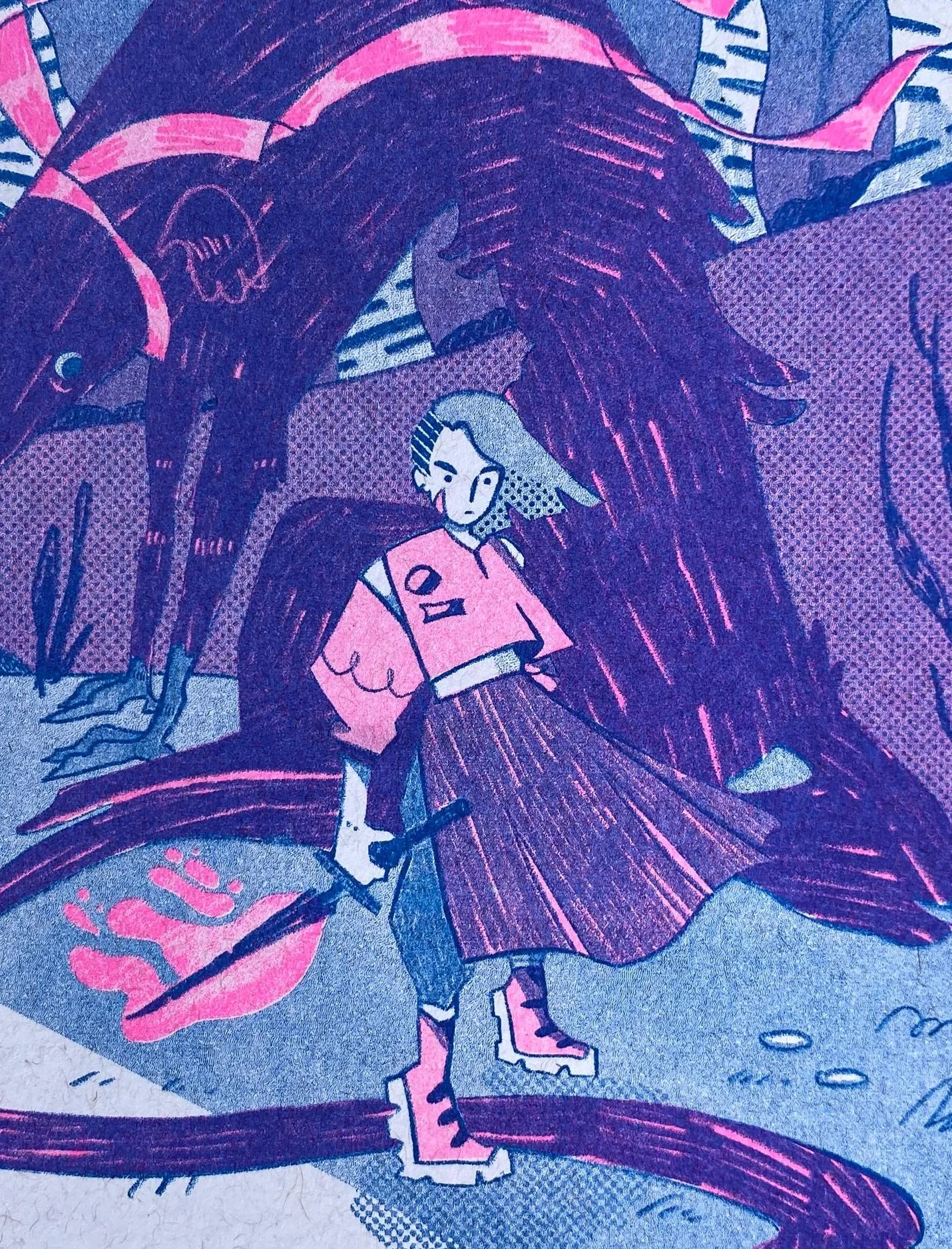
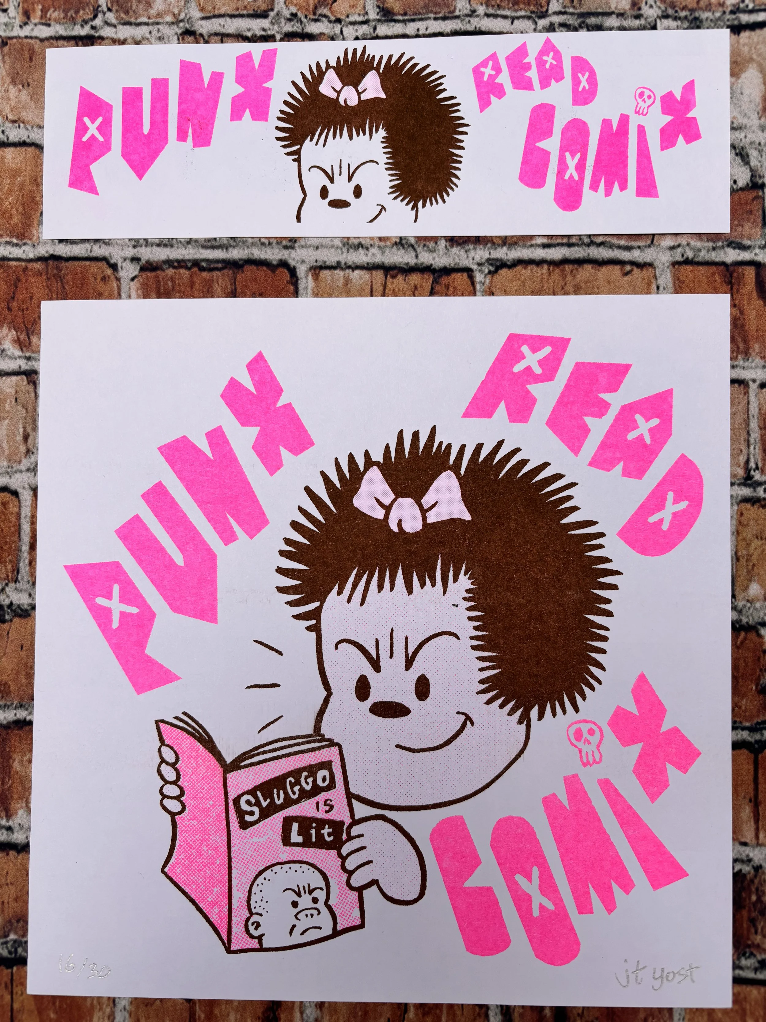
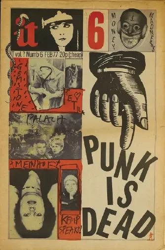
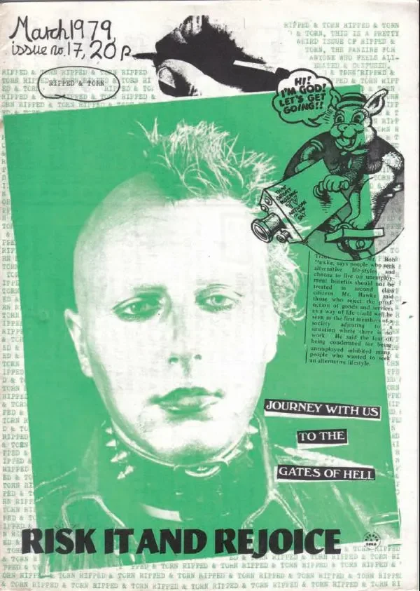
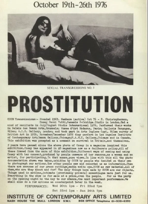
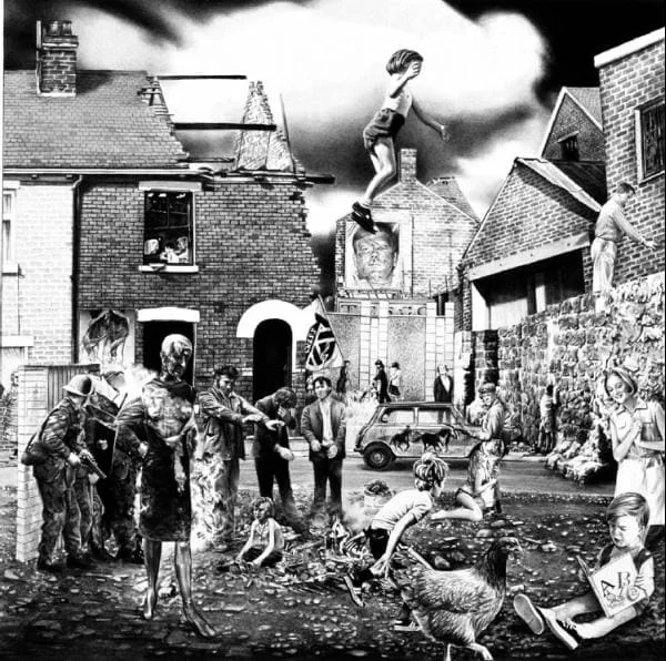
I selected a few examples of rebellious artwork that encompassed the vibe of what I wanted to incorporate into my blended approach. This included material from different time periods, and approaches. I didn't want my approach to be a pastiche of the punk spirit of rebellion. I liked more modern approaches; they seemed to blend aspects of Grunge culture into the aesthetic (these felt like they might work well with looser and/or heaver line work. I also liked the use of typography that was different to the usual cut/collage people associate as 'punk. There was an interesting use of photo collage, which reminded me of Terry Gilliam's work - and an additional link to the surreal rebellious comedy of Monty Python that was an inspiration to the world I was building.
References
ccplusadmin (2016). Discovering Design Aesthetics in the Aircraft Safety Cards. [online] Ccplusmedia.com. Available at: https://www.ccplusmedia.com/safety-cards/ [Accessed 1 Feb. 2026].
Central Office of Information (1980). Protect and Survive. [online] London: Her Majesty’s Stationery Office. Available at: http://www.roc-heritage.co.uk/uploads/7/6/8/9/7689271/protectandsurvive.pdf.
Marcelo, M. (2010). Beer Pong Safety Card Shirt Art. [online] Flickr. Available at: https://www.flickr.com/photos/melmarcelo/4361675860/in/photostream/ [Accessed 1 Feb. 2026].
May, T. (2017). Classic ’70s design manual brought back to life. [online] Creative Boom. Available at: https://www.creativeboom.com/resources/classic-70s-design-manual-brought-back-to-life/ [Accessed 1 Feb. 2026].
Omahas Surplus (2024). Care And Use Field Manual 21-15. [online] Omahas Army Navy Surplus. Available at: https://www.omahas.com/shop/care-and-use-field-manual-21-15/ [Accessed 1 Feb. 2026].
Schaefers, F. (2023). HISTORY OF SAFETY CARDS, Part 5: Maturing (1970s-1980s) - World Airline Historical Society. [online] World Airline Historical Society. Available at: https://wahsonline.com/2023/09/history-of-safety-cards-part-5-maturing-1970s-1980s/ [Accessed 1 Feb. 2026].
Valve Corporation (2012). Valve Handbook for New Employees. 1st ed. [online] Bellvue, WA: Valve Press. Available at: http://cdn.flamehaus.com/Valve_Handbook_LowRes.pdf.




Comments