
Practice & Research - Research 1.1: What do I like about my influences?
- Dan Woodward

- May 21, 2025
- 4 min read
Before I started playing and experimenting practically, I thought it would be a good idea to critically inspect the influences I had added to my mind map and interrogate what exactly appealed to me. I thought this would give me better insight into my own tastes and help me understand the choices my influences made when creating their work. This opportunity would also let me start to think about how they construct their images.
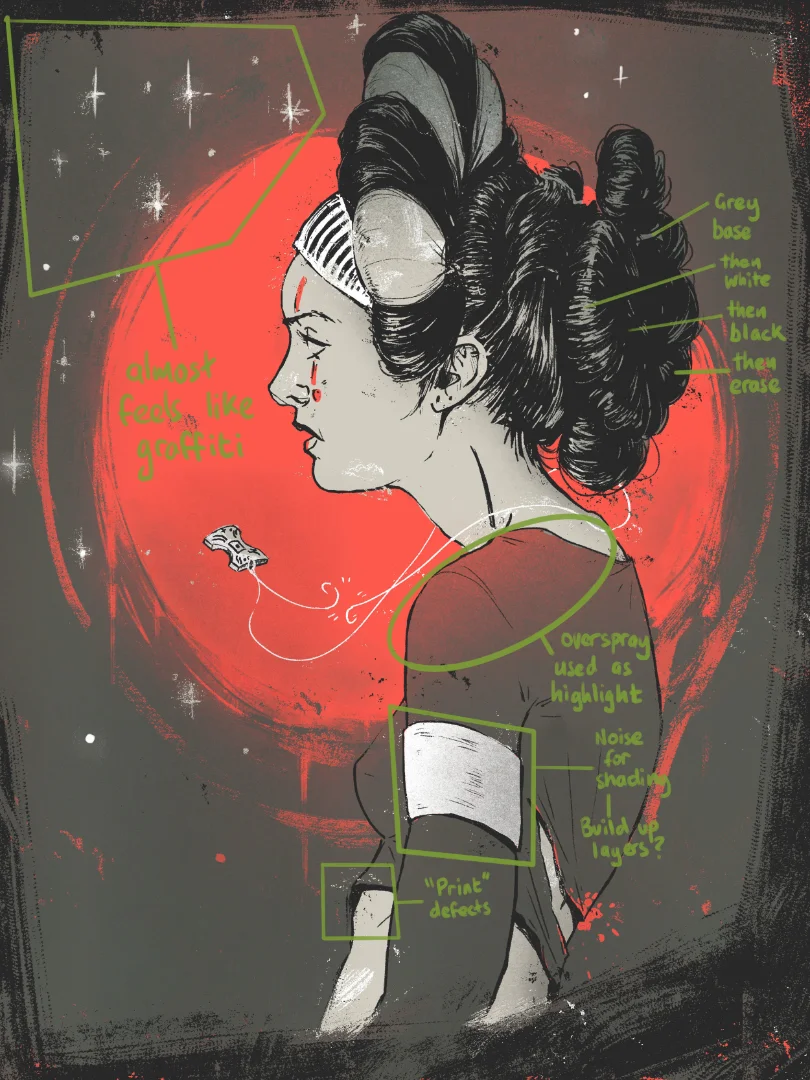
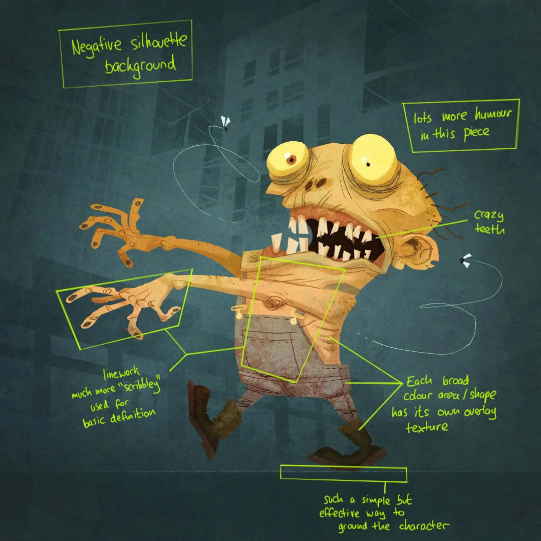
Brett Parsons
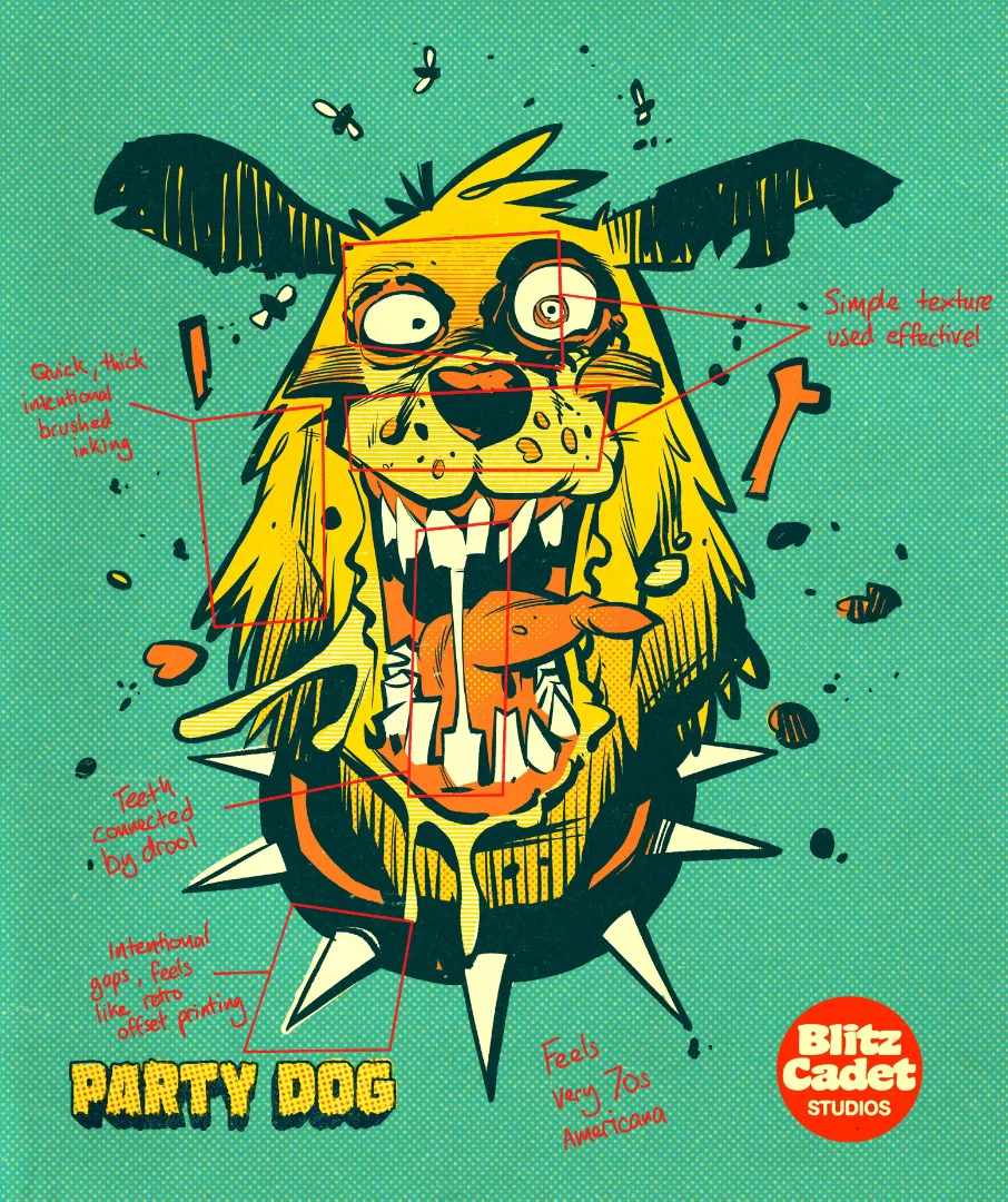
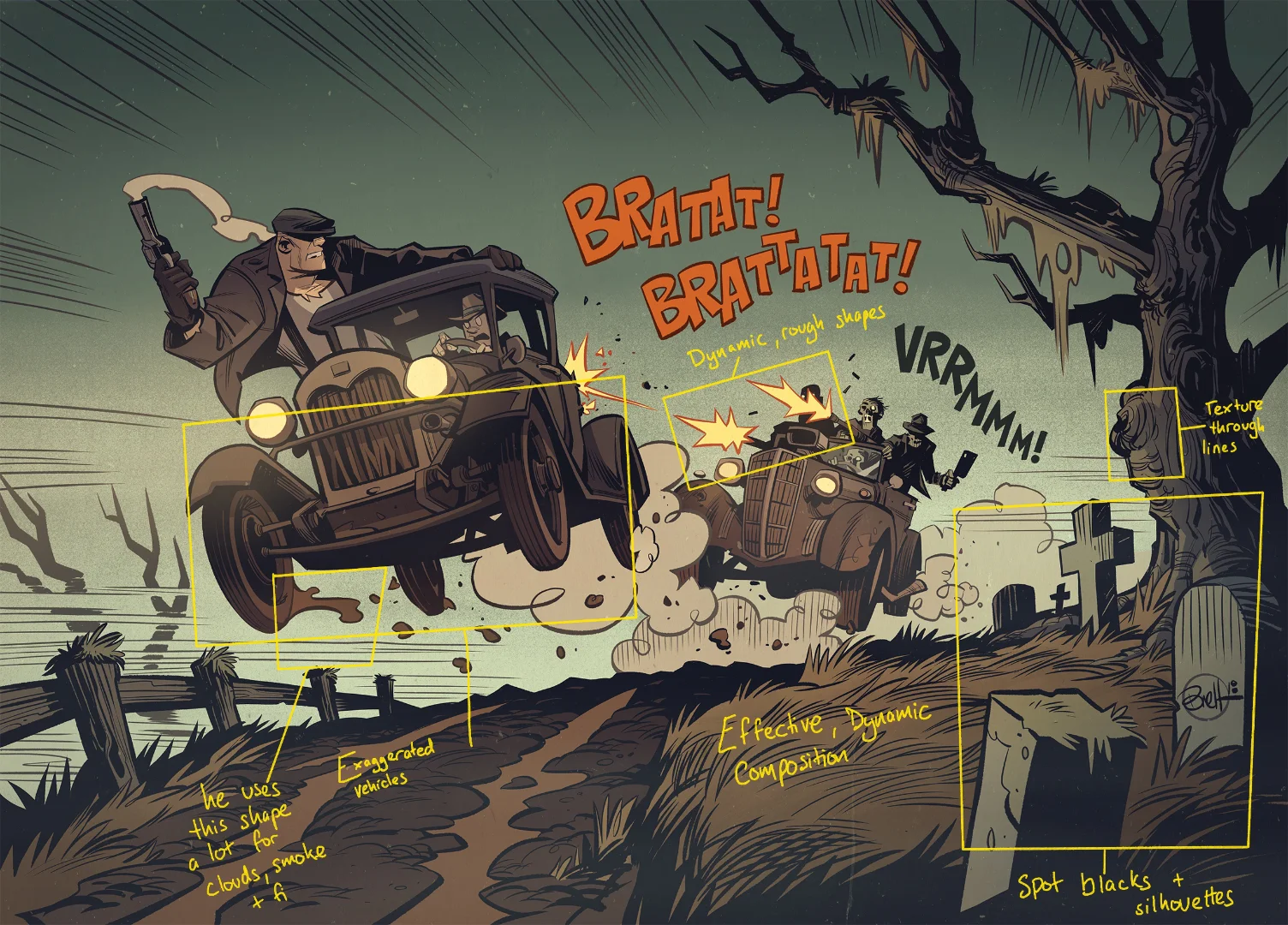
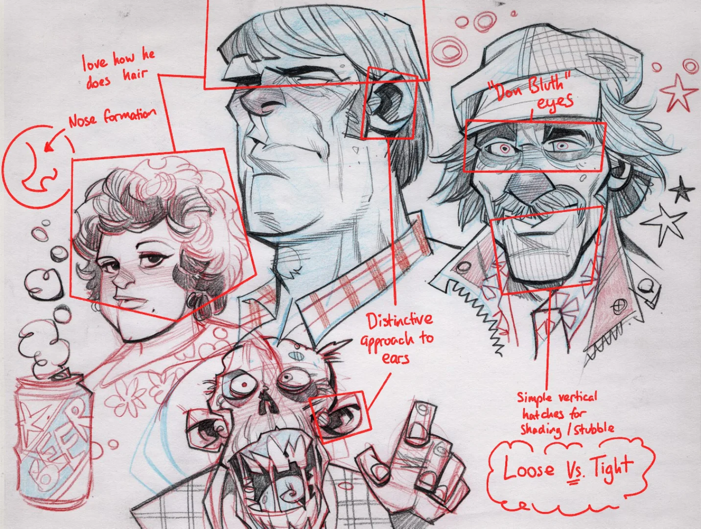
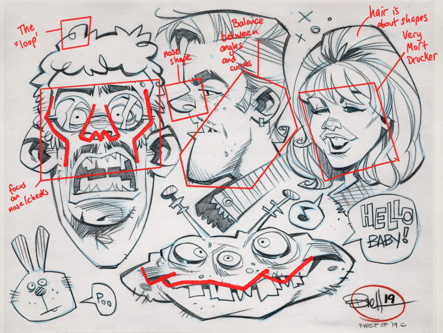
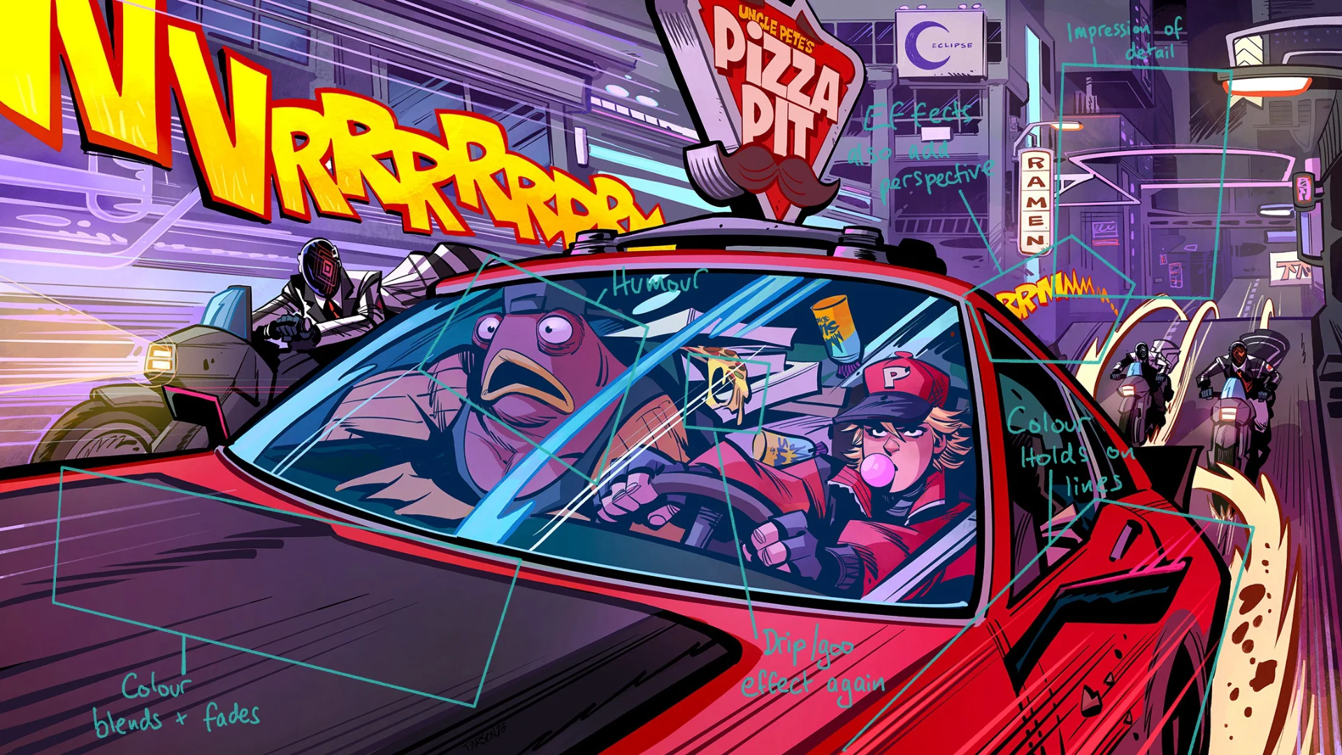
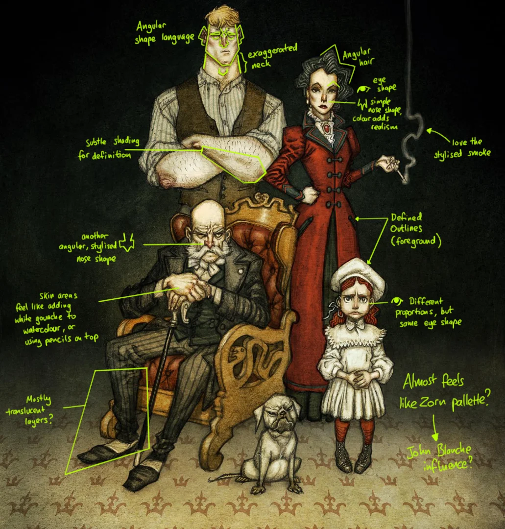
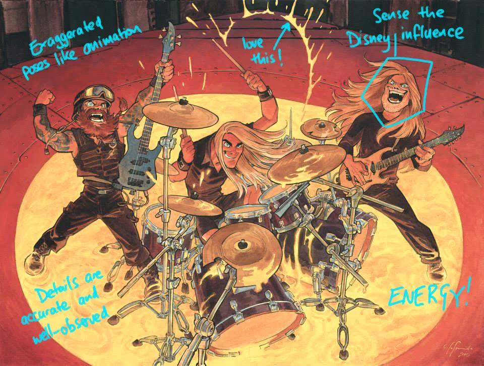
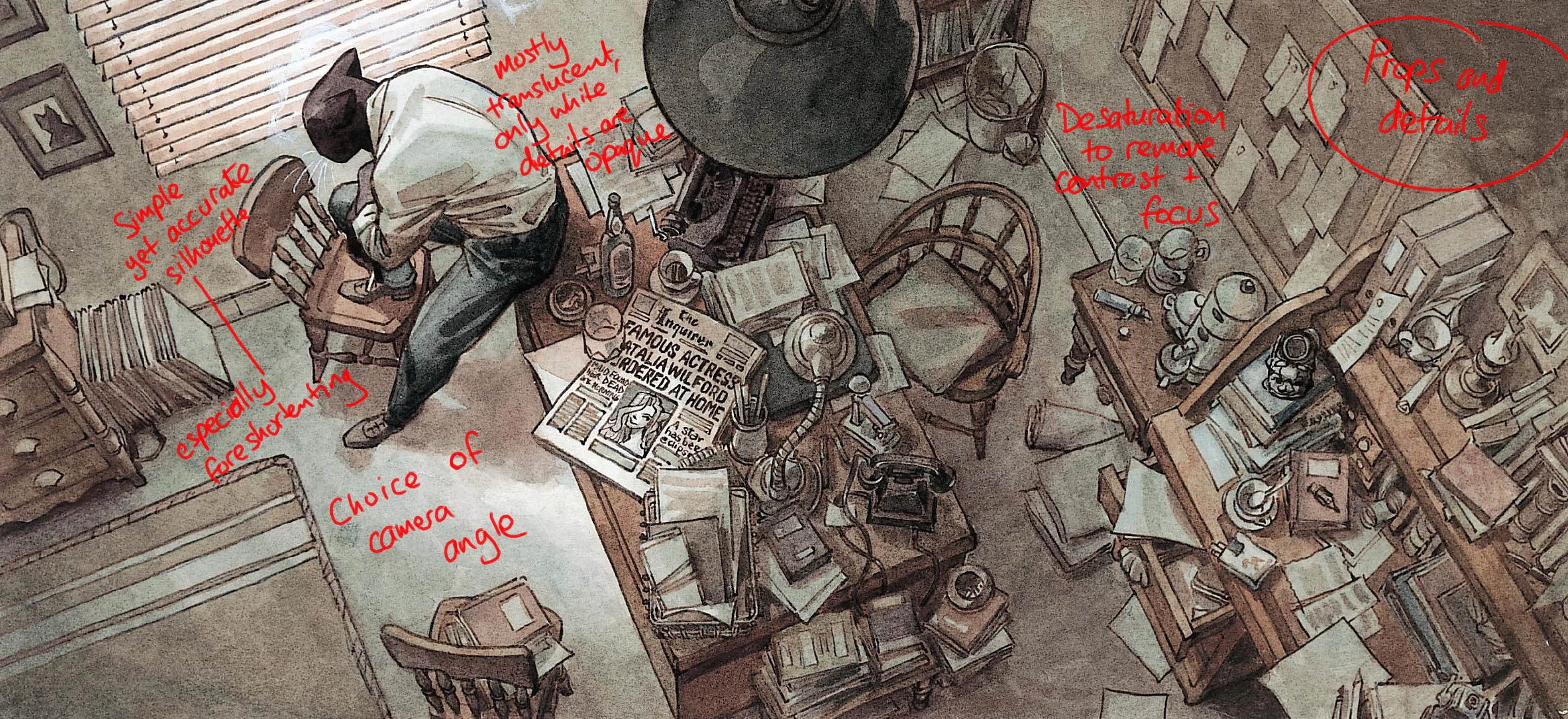
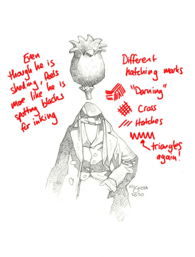
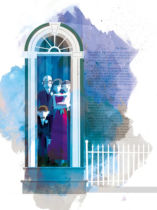
I started with Brett Parsons as I enjoy his work's humour and energy. So that I could digest the approach as well as what I liked aesthetically, I decided to annotate a selection of images, which you can see above (and for the following artists in their own sections).
Brett's inking approach is brush-focused, and I enjoy the variation of line weight he uses. He can take a stylistic approach to how he draws that allows him to create images that can feel realistic, but also abstracted if needed. I used some sketches for my review in addition to finished items to get an idea of what he does when playing around. He has a great way of capturing hair - something I struggle with. Because he works with a brush for his line work, he uses a lot of fine hatching for softer edges.
What I find interesting is that he can produce a wide variety of unusual face types, but when it comes to thinner, or more generic characters (particularly women), he suffers from 'same face syndrome'. This is something I want to avoid, so I need to be conscious not to fall into that trap when I am drawing.
Heather Vaughan
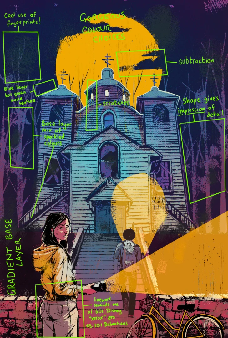
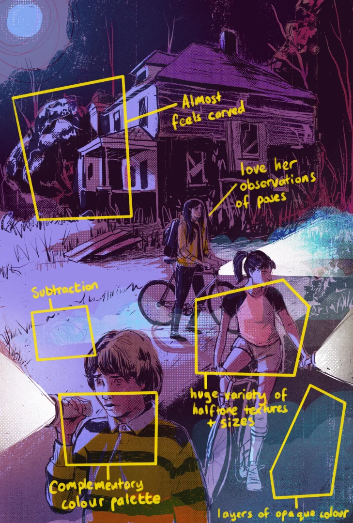
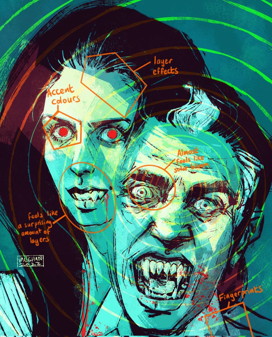
Heather Vaughan seems to use a lot of layers in her work. It gives the impression of screen printing, and she uses distressing effects to give the impression of printing defects/inconsistencies. Her ink work feels more realistic and has a scratchy quality. This feels like it has a good fit with spooky or horror-related content, which is not something I relate to a lot.
However, I love how she combines her lines and colour choices. There is a simplicity to it, but when you look at the images closely, there is also a lot of complexity in how the layers are arranged. I particularly like how she uses subtraction in combination with the layers to draw with negative space.
In general, what I want to take away from her work is:
The use of saturated colour palettes
Print-like artefacts and making it feel analogue
Using layers, subtraction and negative space
Using texture to make things feel organic
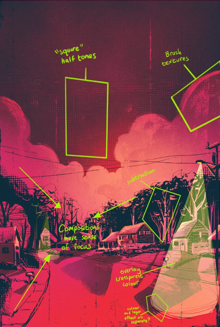
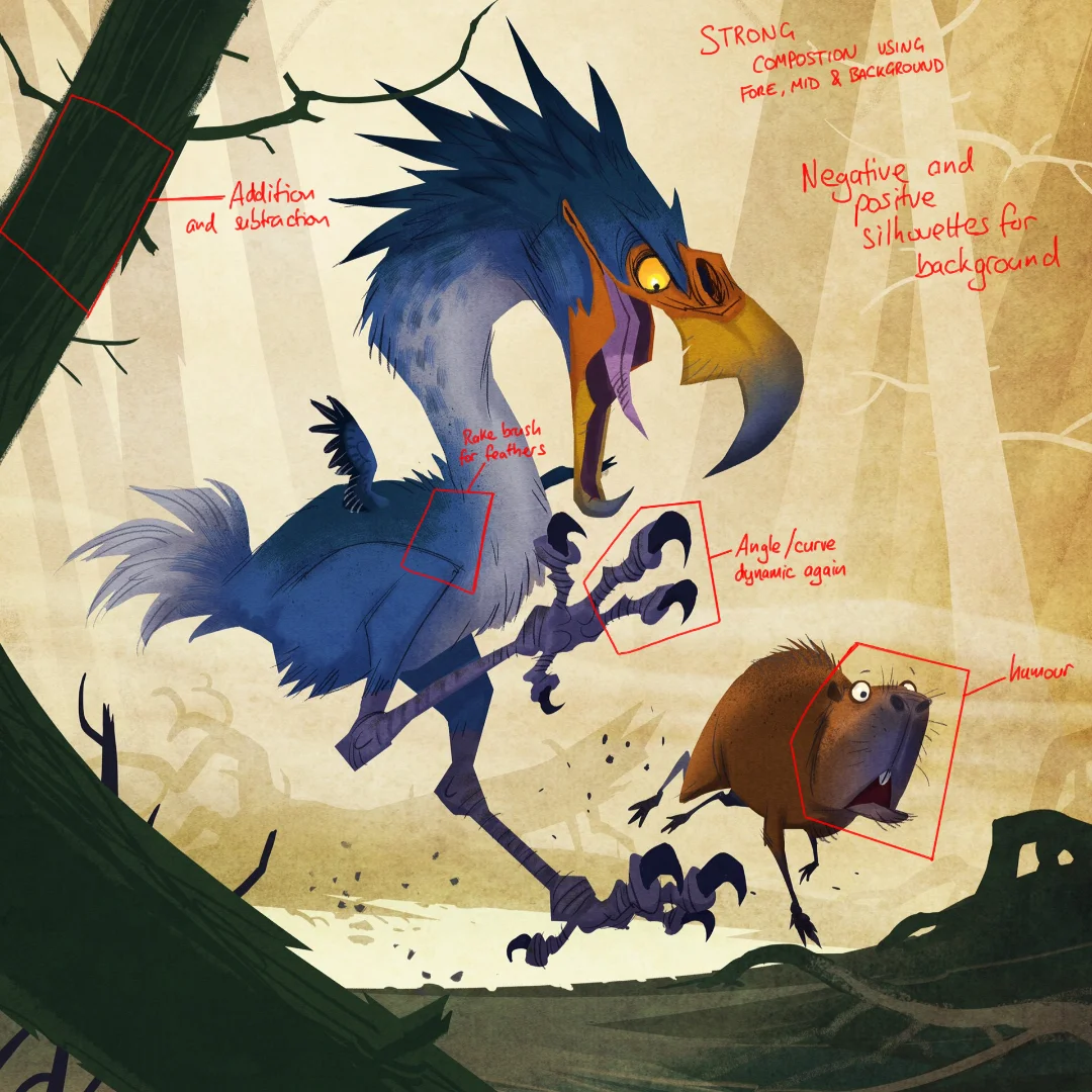
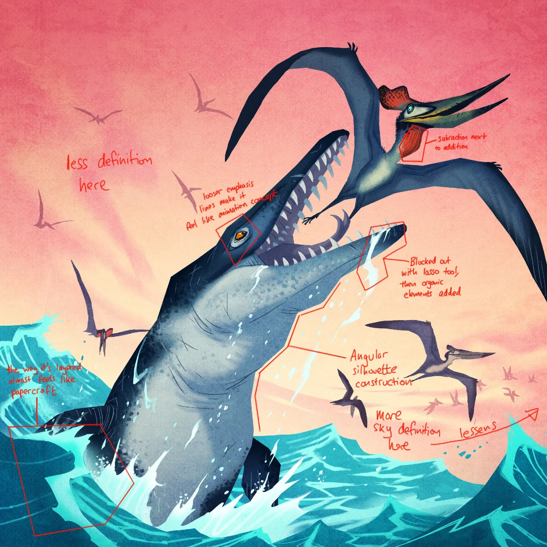
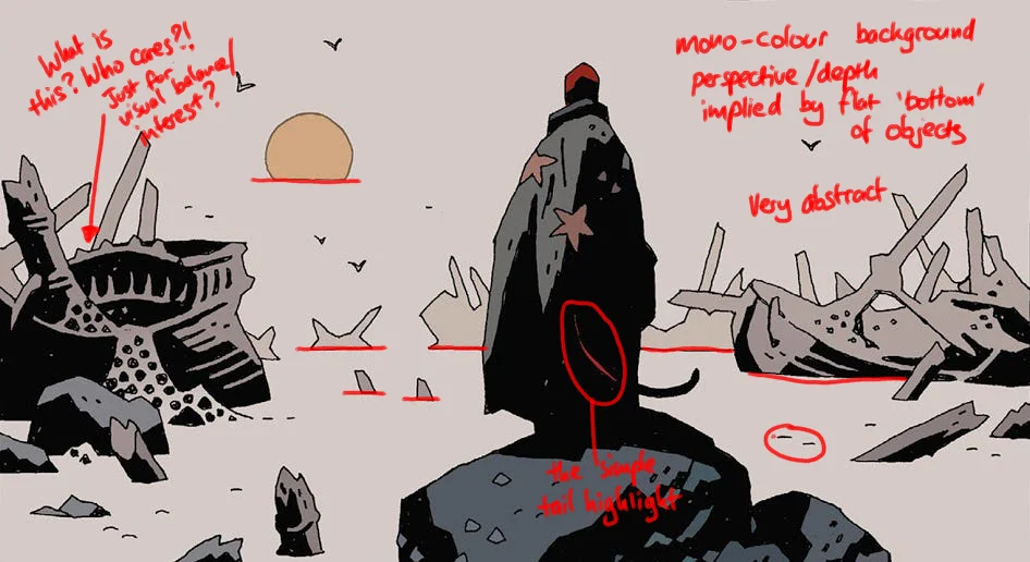
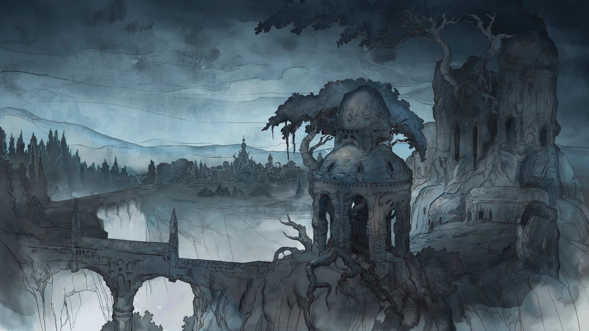
Johan Egerkrans
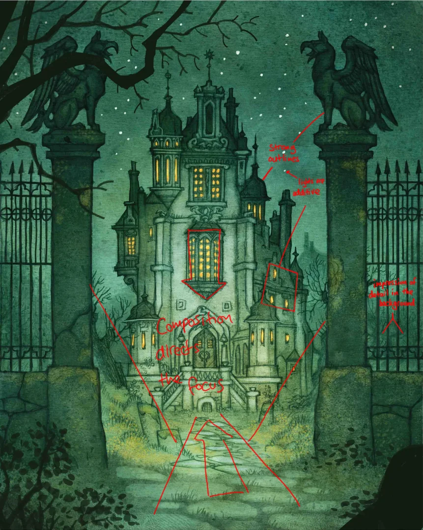
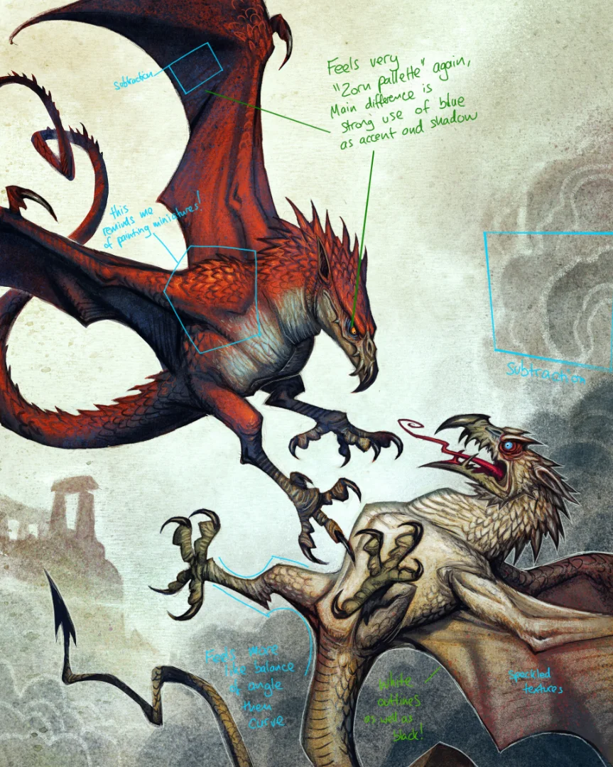
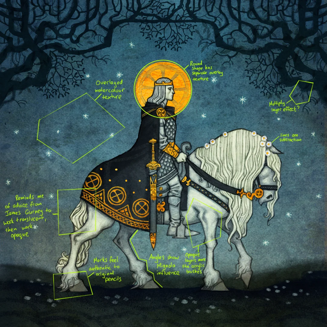
Johan Egerkrans doesn't worry about realistic perspective in his images. They are laid out more like a stage, with distinct planes for background, mid and foreground. A large body of his work has supernatural aspects, which leans on a darker gothic aesthetic.
However, for some of his work (like the dinosaurs), which is aimed at a younger audience, the images have a sense of humour and a different energy. I enjoy how he uses his layers as well as textures to give the work an analogue watercolour feel.
In my research, I discovered that the illustrator is (like me) a fan of Warhammer and painting miniatures. You can see in his work how some of it is constructed in a similar way to how you might paint a model, using texture and 'multiply' layers to add shadow, much like one would use ink washes on a figurine. Then he builds up colour and highlights with more opaque marks.
While he's inspired by Mike Mignola, I noticed that he has his own shape language, particularly in how he constructs his head shapes. His images are built up on top of a pencil drawing, which can still be seen if you look closely at some of his images. I think that his drawing approach is more integral to the overall effect than I had considered previously.
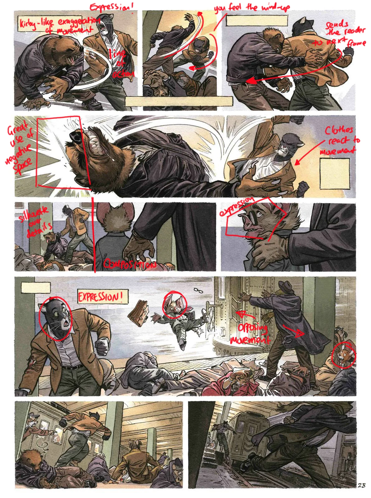
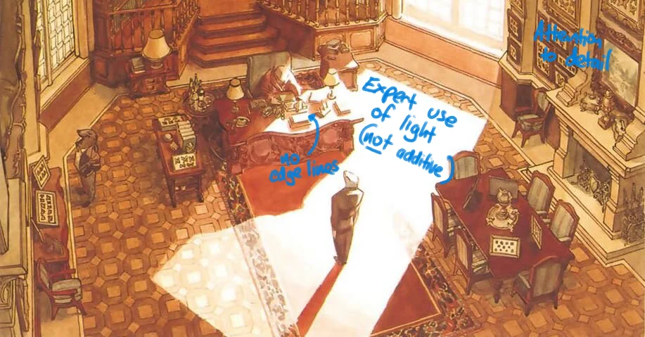
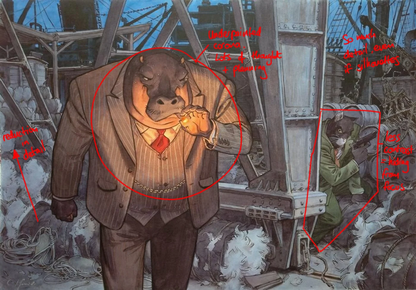
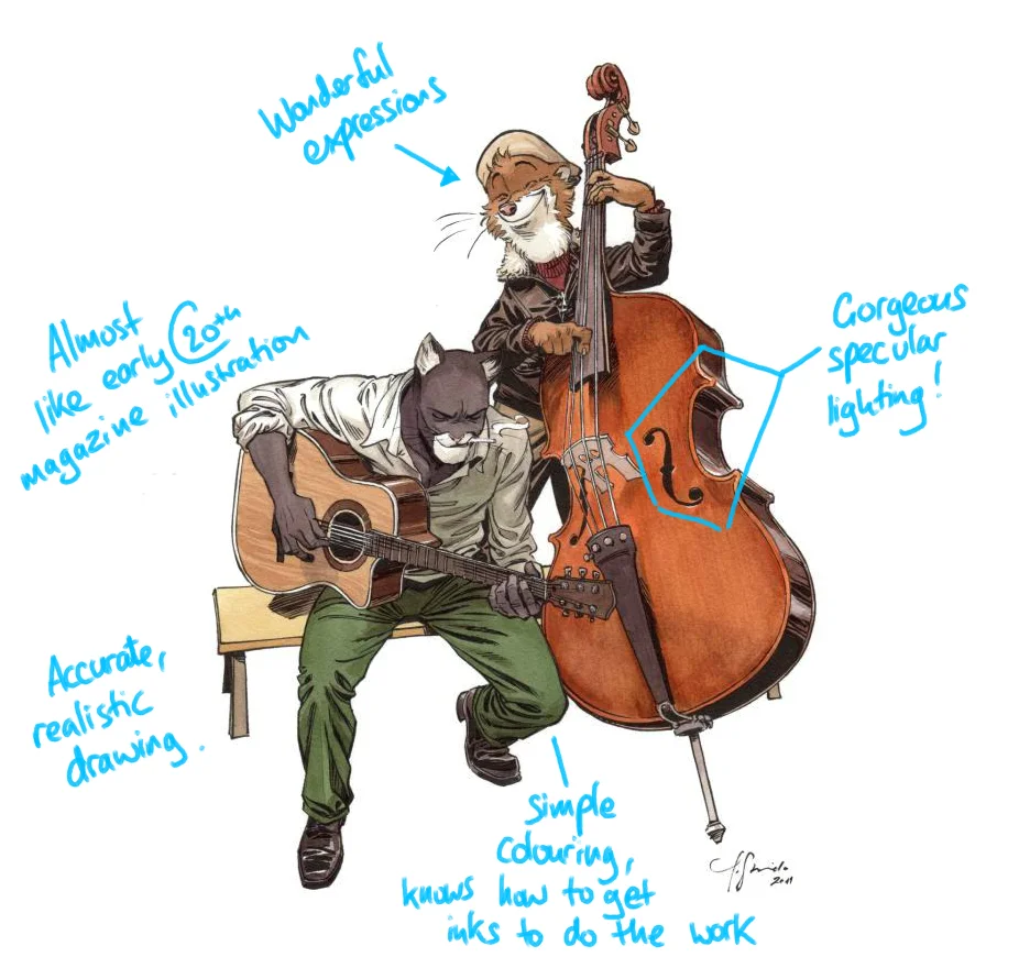
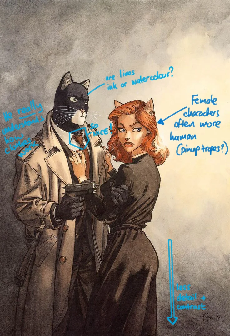
Juanjo Guarnido
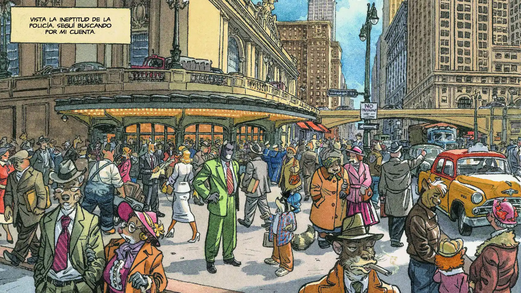
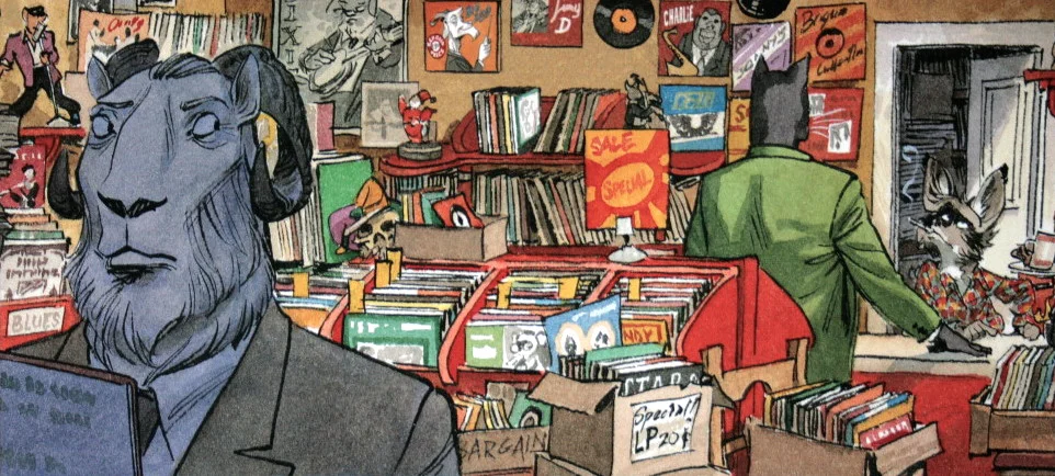
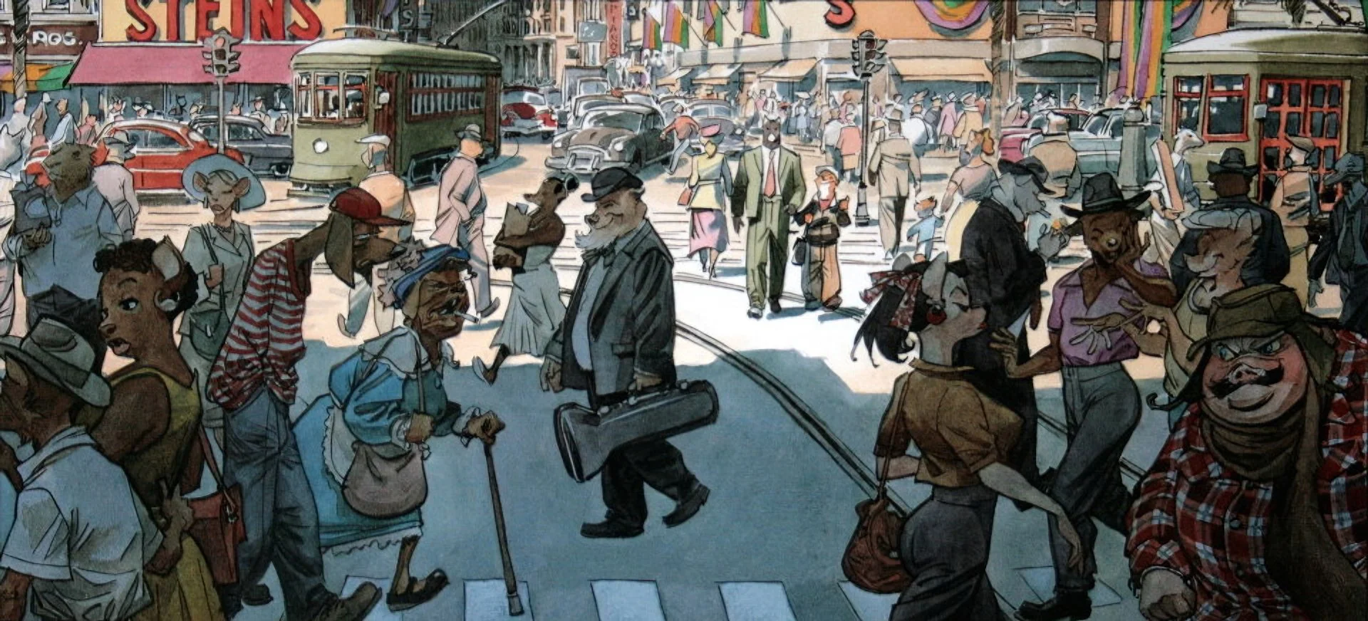
Guarnido's mastery of watercolour is breathtaking. I am not sure if I will every be able to get close. I enjoy how he visually tells stories, with impressive crowd scenes that have so much detail but never feel too busy.

He is able to convey an amazing range of emotions through his anthropomorphic characters. His composition and panel layout are brilliant for pace and storytelling.
There is a feeling to how he uses watercolour that reminds me of early 20th century advertising illustrations in the way that it uses the medium in a realistic way, but with a sense of simplicfication and curation of marks in order for it to be created relatively quickly.
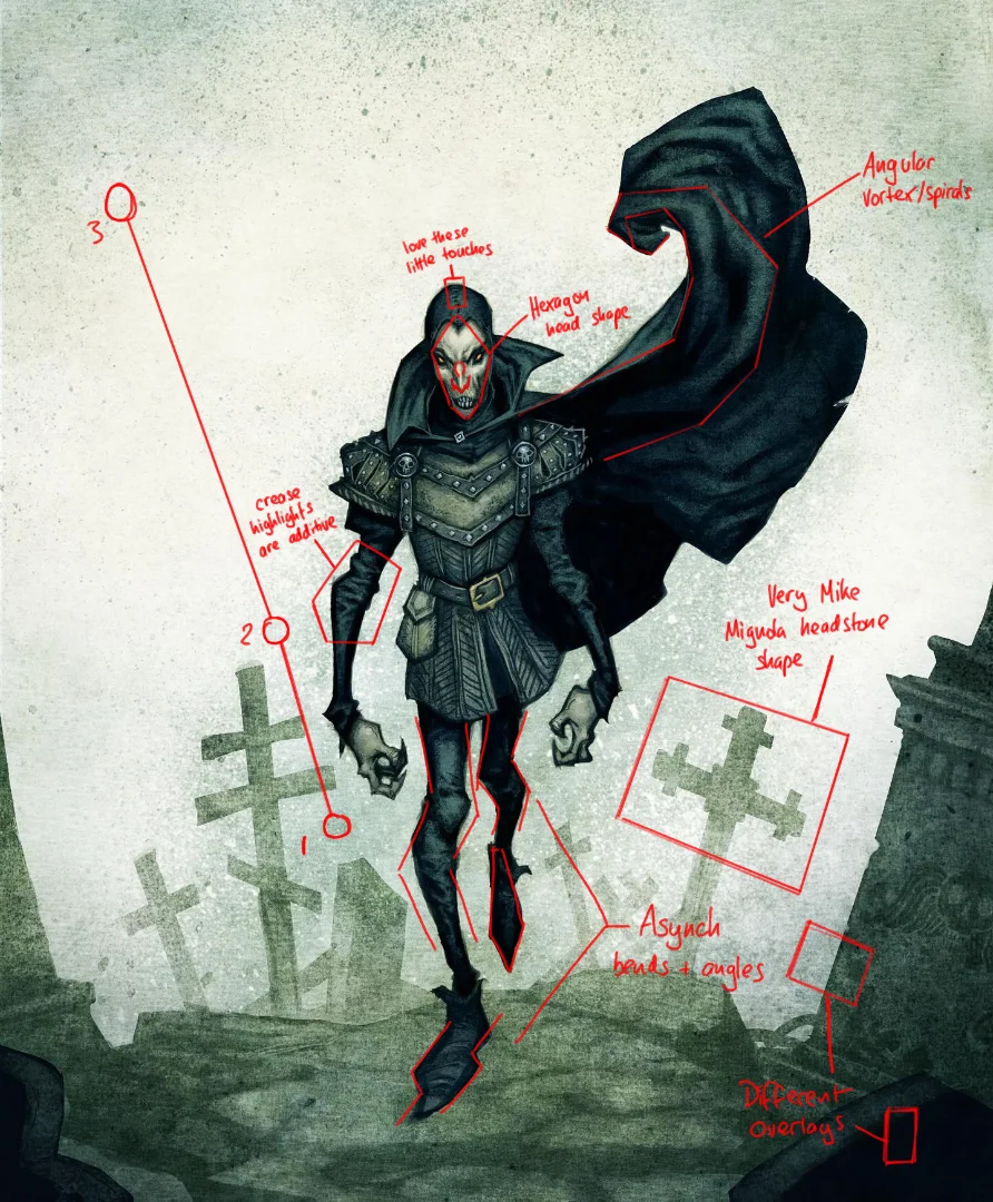
Mike Mignola
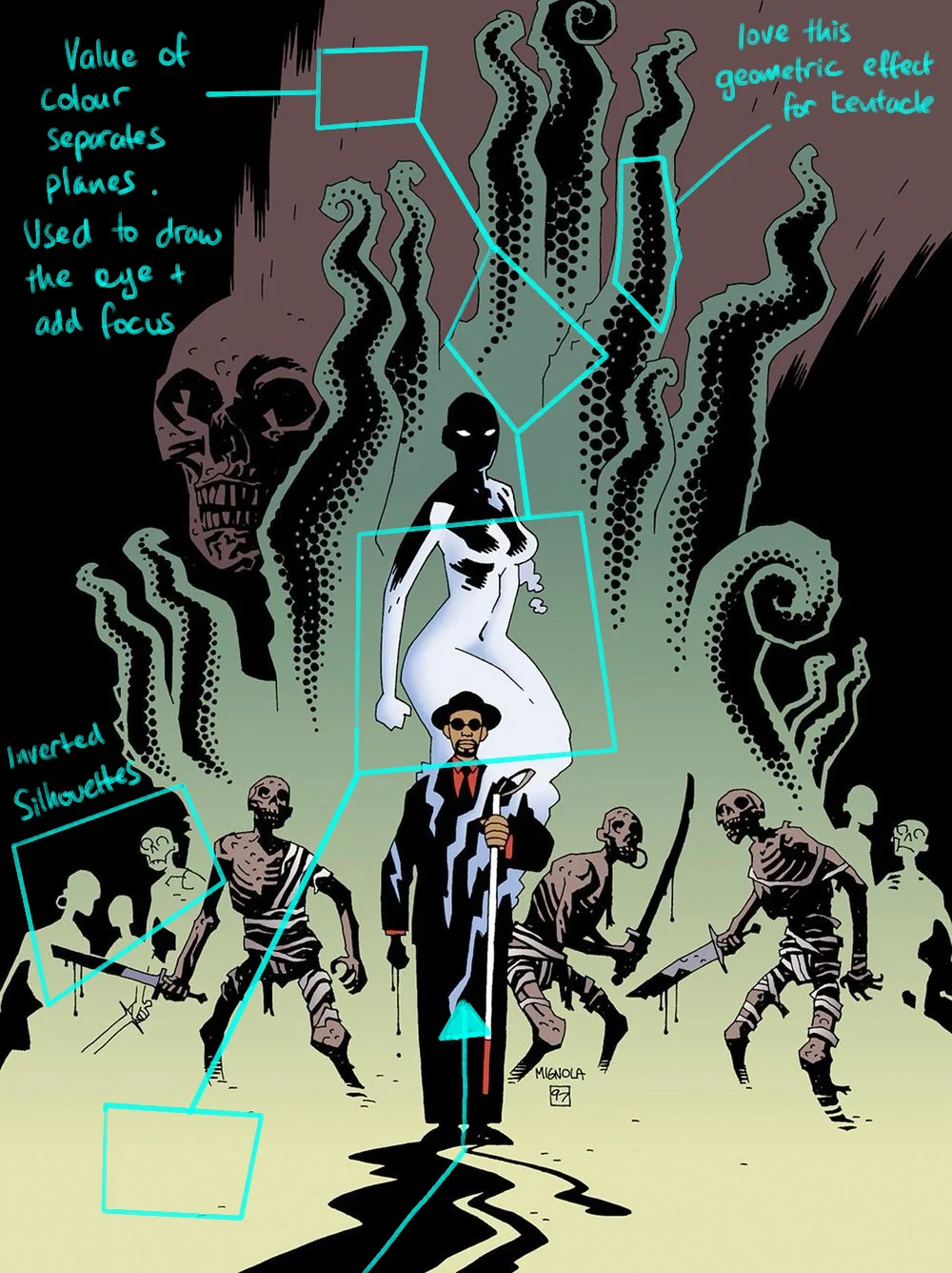
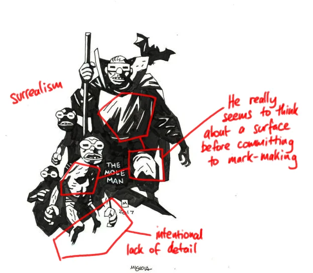
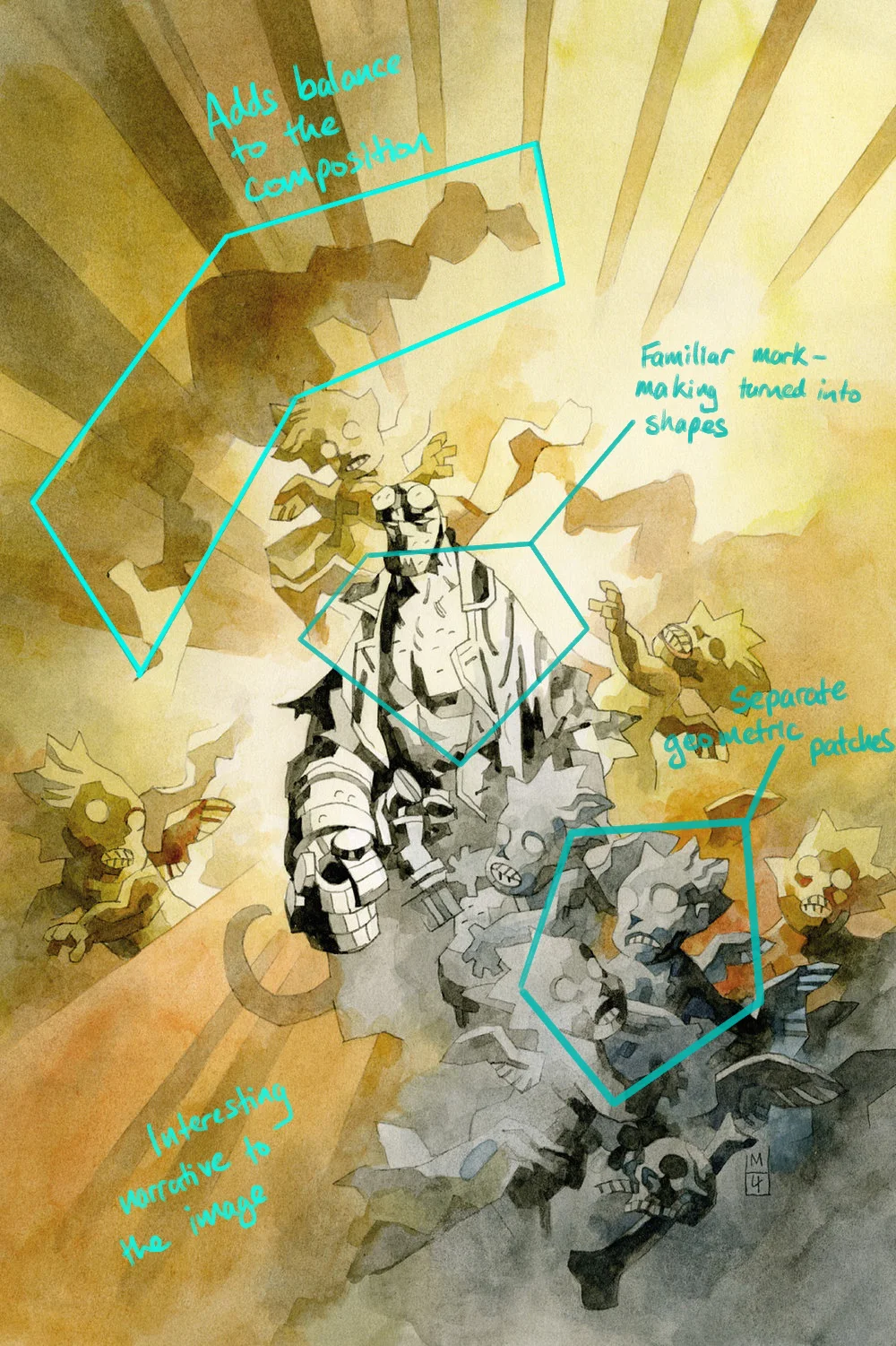
Mignola has inspired entire generations of artists. HE doesn't really vary line weight, instead relying on exaggerated chiascuro to relate light and form. The aspects I enjoy the most are:
His stylistic and surreal approach to drawing.
How much he can say through the absence of visual information.
His angular approach to drawing.
Norm Konyu

Konyu's approach is very stylistic. His images are graphic and angular, almost giving the impression of being paper-cut at times. There is a similar multi-plane approach I recognise from Egerkrans's work. Likewise, I also note the use of scanned textures and using subtraction in the layers.
"Avowed" Game Loading Screen Art
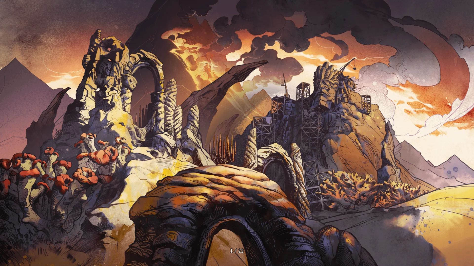
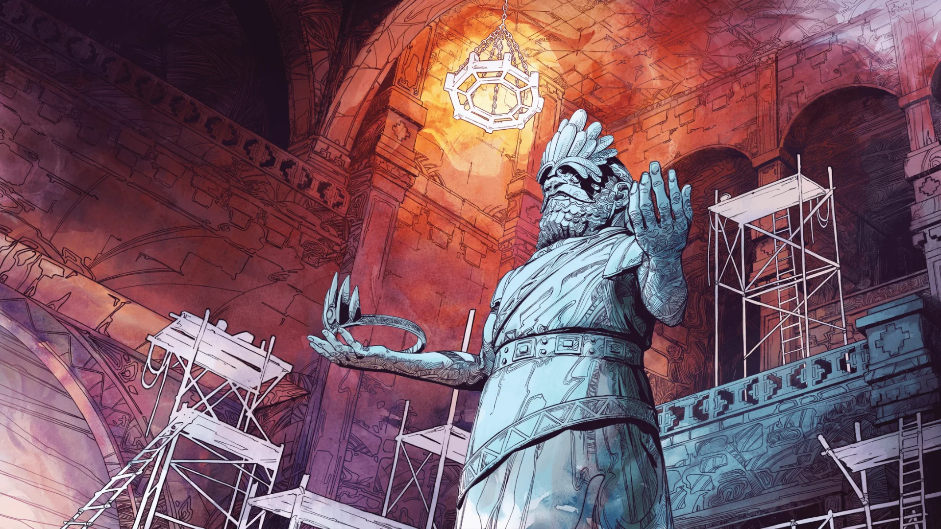
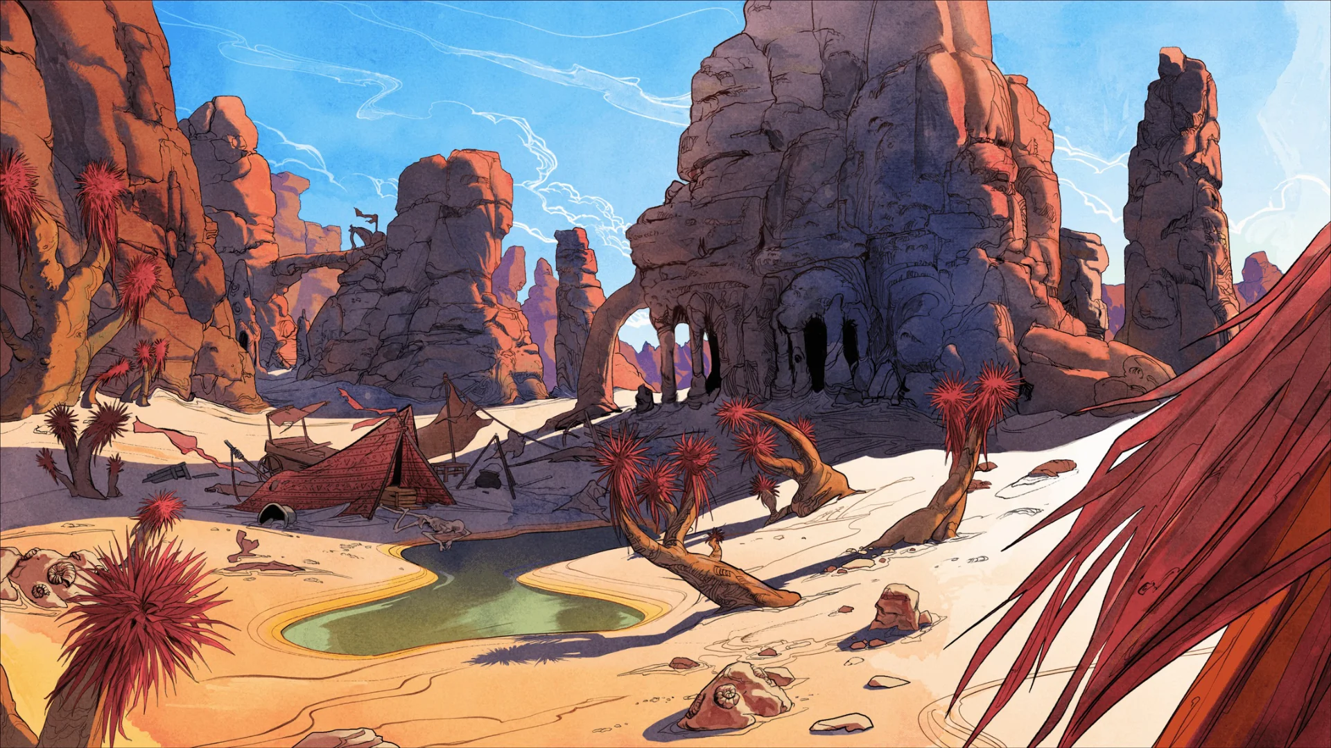
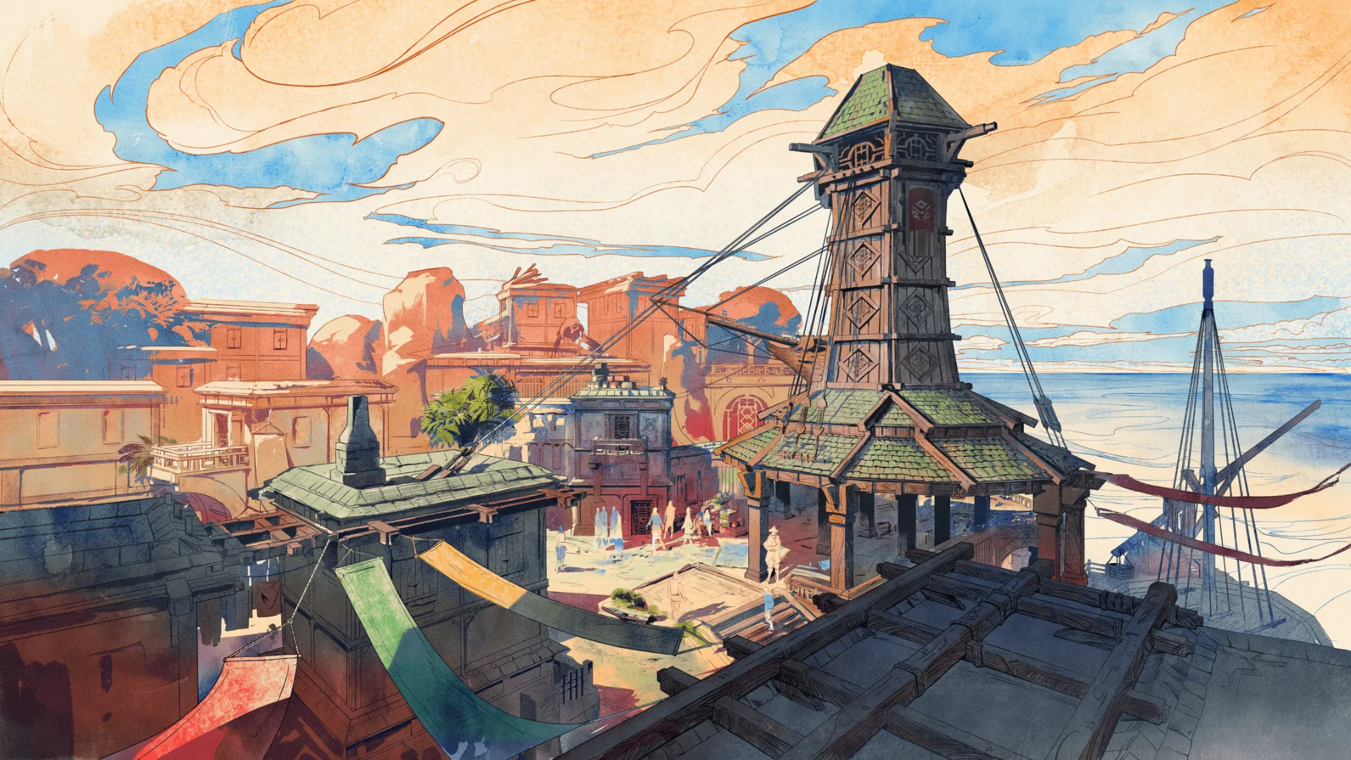
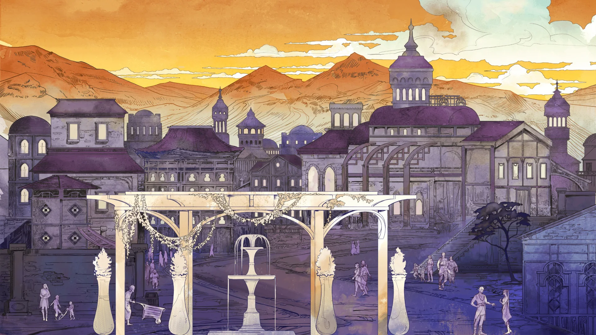
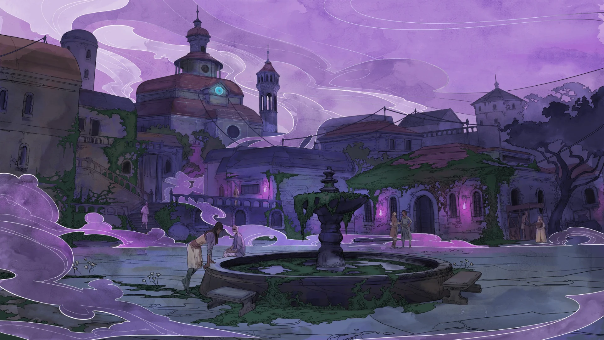
A more recent source of inspiration has been a computer game titled "Avowed". The loading screens, in particular, feature a distinctive art style that seems to employ layered watercolour with line work. There is sometimes an oriental feel to the way things are composed. What I found interesting was the way that shadowed hatching didn't worry about trying to convey shape, instead opting for a patterned approach. In places, this hatching almost feels influenced by vorticism.


Comments