
Practice and Research - Feedback Point 2: Best Laid Plans
- Dan Woodward

- May 21, 2025
- 8 min read
The first main project, and already I have managed to get myself stuck! My original plan for the project was to do a 'master study' for each of the influences I had selected in my research. Doing the annotated images worked well, but it also meant that when it came to writing up the research, my brain felt like it had already 'done it'. So I had a complete block on writing things up, which then compounded the feeling my brain had about the tasks I had created for the master studies.

It just felt too much like 'work'. My brain could tell that the 'organised' part had created the plan based on a recommended approach to study the working approach of other artists. The problem was that the rest of my brain just didn't think it was fun enough to let me start on it. Which of course then made me feel increasingly anxious and ashamed the more time elapses and the further I drifted away from my original planned timelines.
Playing Live
On the side, I was about to start playing with a new Dungeons and Dragons group with my son to help him feel comfortable playing with others and getting the hang of the rules. I had created a new character, and needed to create some artwork to represent it on the online tabletop we'd be using to play. So I thought that maybe instead of doing a master study of all the other artists, I could try and incorporate different aspects that I had learned into this character art.
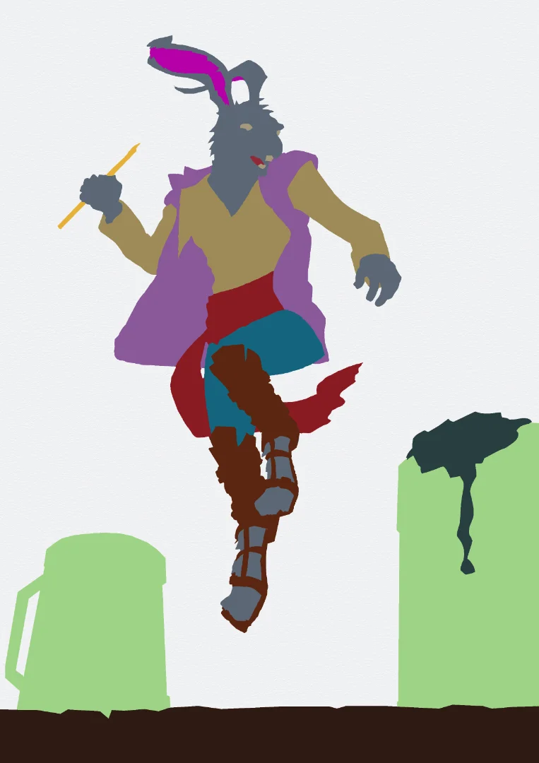
I had a deadline (urgency), and I enjoyed the character (novelty). This was what my brain needed to activate. I allowed myself to break all the 'shoulds' about process. I didn't bother to use my sketchbook, and did all of my sketching and exploration 'live' on my digital tablet. I used some photographic reference to get the general dancing pose, and then adapted it to fit the clothing and details of the character. I came up with the following roughs for the composition, which I liked.

Time was running out before the first session, and I didn't have enough time to complete a full image. So I first concentrated on the character himself in isolation. I cleaned up the rough pencils first. Making adjustments and tweaks as I went. I tried to have more angles in my drawing, and used references to understand the details of the medieval-style clothing. The original head didn't work for me, so I researched rabbits and hares to come up with my own anthropomorphic take on things.

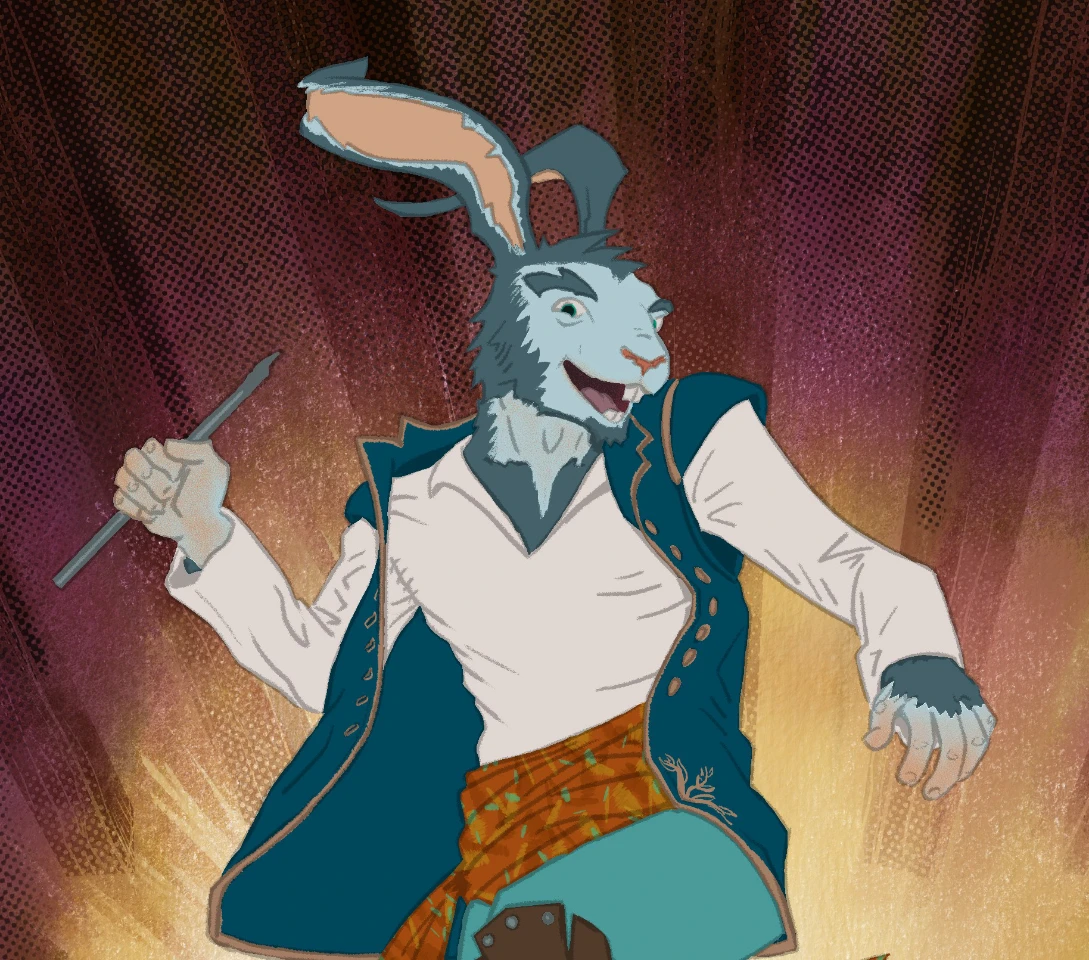
I wanted to add colour as well. As usual, this is where I got myself stuck. There are so many ways to 'render' things digitally. A lot of roleplaying art takes a more painterly approach, where lines are rarely seen. There are established comic-colouring approaches which I am familiar with, but they are not the kind of look I wanted either. I felt like I just wanted someone to be able to sit down next to me and explain how to go about achieving different rendering approaches, so I could adapt a personal approach to doing it!
Time was pressing again, so I chose to try an approach that felt similar to ones I had seen in my research, but in reverse. I added base colour, then added a multiply layer filled with a dark blue on top of the image, masking it to the coloured area. Then, instead of adding shadow, I approached it in reverse, stripping it away. Immediately, it felt fun again; it felt like I was painting with light. I used a rough, painterly brush to do this, which gave it a more organic, painted feel.

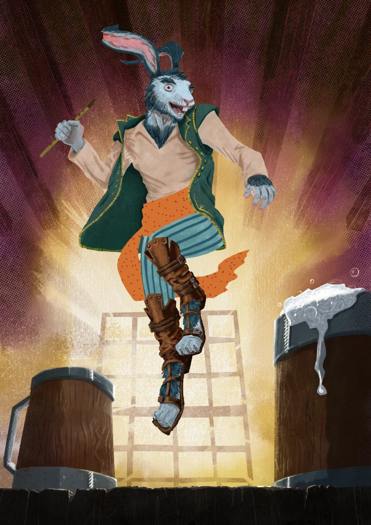
It was good enough to get going with the game, but I wanted to finish the image, so I came back to it to complete the background. I took inspiration from my influences and wanted to try and get that watercolour feel to things. I didn't have the time or space to get my watercolour pans out, so I decided to use Rebelle to do it digitally, as it has an excellent watercolour engine to replicate the way the water changes things and adds an element of chaos!
I wanted the image to be back-lit, so I decided to create a watercolour texture that had a coronal gradient. I normally do this as an underpainting for certain plein air paintings, but in this case it would form the structure to add layers onto in a more stylistic way.

It was a pretty successful background, so I then played with how to overlay it onto the background image. At this point, I reminded myself that I could break the rules. Why did I have to make it fully realised? Why couldn't I allude to the structure and layout of the scene? I gave myself permission to play around and try things out. I opted to represent the wooden rafters and window panes with simple graphical shapes. I used subtraction on this semi-opaque layer to represent wood grain. I used halftones in the light and dark areas to give a hint of a printed comic and to help with creating a subtle vignette effect.
So far, so good, I moved to adding in the foreground elements, blocking in shapes before I added in details. I tried to use angular shapes where I could, and added in the highlights in a way that almost felt like adding pencil on top of a watercolour painting.
I was really happy with the background. It had the general energy that I was going for, and I could see how I had unconsciously incorporated elements from many areas of my research. However, once I placed the character on top, the two elements didn't gel together.

So I decided to redo the rendering aspect of the main character. I first created a flatting layer so that I could easily make selections if I needed to iterate my approach. Then I tried another style for the character's local colours.
I wasn't really happy with this either. I could tell by my procrastination on what approach to take to add light and shadow that something didn't work for me. I spent hours and hours trying to research different approaches (both from the researched influences and other sources like tutorials and instructional videos). Nothing was working for me. I felt so frustrated and stuck. The only way forward for me was to try a third pass at the local colours.
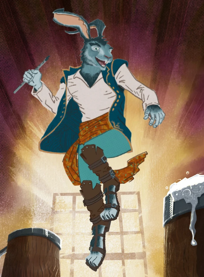
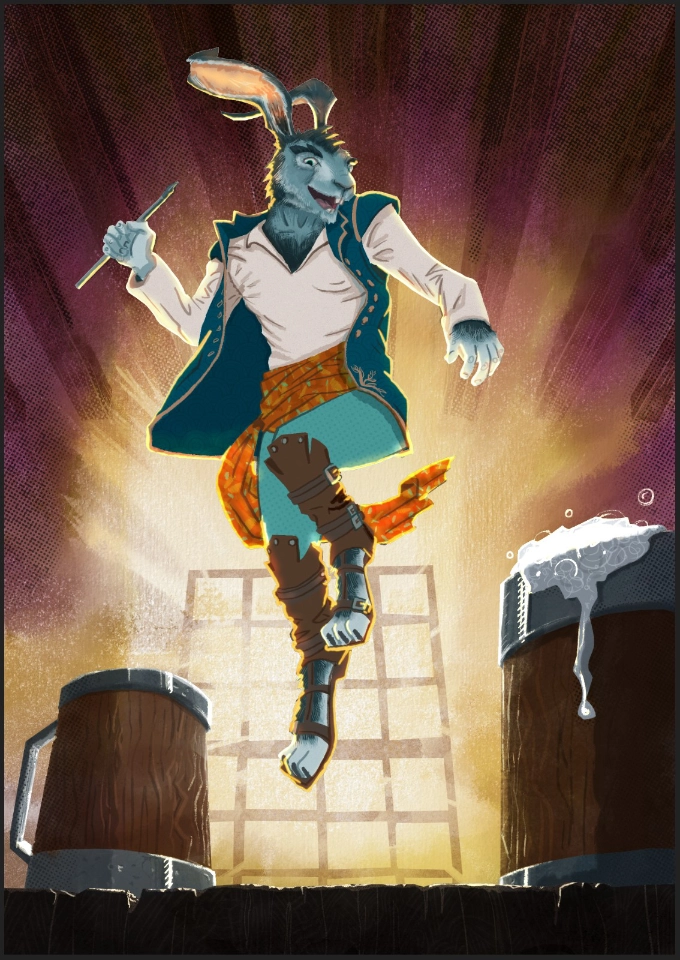
The local colours felt a lot better. I wondered how I would go about lighting the character, given that the main light is coming from behind. I did a small experiment to play around with rim lights and transparency, which gave me enough confidence to acknowledge that while this was also not perfect, it was good enough to proceed, generally matched the background elements, and would allow me to finish. So I got rid of the lighting experiment and started doing occlusion shadows to give the image shape without using contour lines. I also adjusted the composition slightly, moving the character down to get a better balance and be slightly more aligned with the implied perspective of the piece. Once I was happy with that stage, I factored in the cast light and shadows.
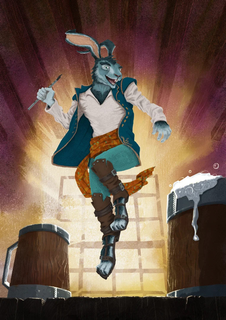
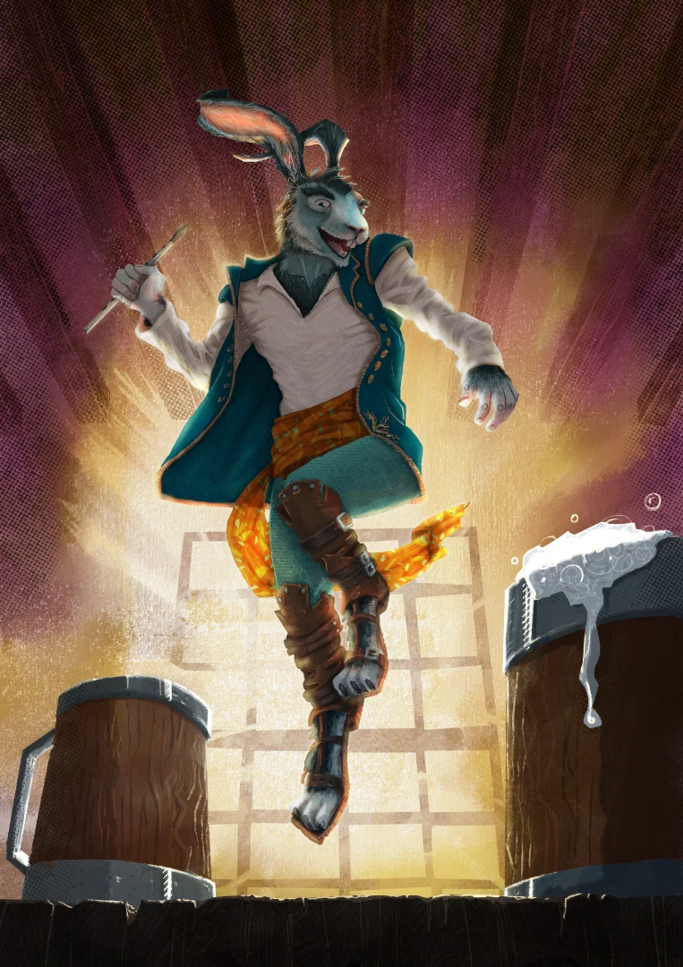
At this point, elements of the picture still felt like they were fighting between a more graphical and painterly approach. However, I was generally really pleased, and I had learned a lot by doing the cast light and shadow. Being a fantasy setting of magic and wonder, I wanted to add some final touches to the image. I used layer effects to give the impression of the character's dance having magical effects. This added a different light source, which added visual interest. After refamiliarising myself with the art books from the 'Into the Spider-Verse' films, I took inspiration from the way they blended visual styles to add in some stars in a similar hand-drawn style to the froth on the beer mugs. This really helped to pull the image together more cohesively.

Whilst not perfect, I am very happy with this final image, and it definitely channels more of my personality. Whilst it may not have been the most efficient route, and I essentially re-did this image a number of times working with it 'live', I found that it was the most effective way to get me to 'play' with the image.
A Second Character
Not long after, I tried to use the momentum I had gathered by creating another character portrait for a player in a Star Wars roleplaying game I run each week. He had given me a description, so I used this information to, again, work live on my digital tablet. Using references and inspiration from other media I came up with the following roughs:

I like the composition and it seemed to fit what I knew about the character, so I decided to take it further. I wanted to create some neater linework, and decided to use a rougher pen brush for the next stage, to try and give it more of an organic feel.

I started the render stage by adding in flats and local colours as I had with my first character image.

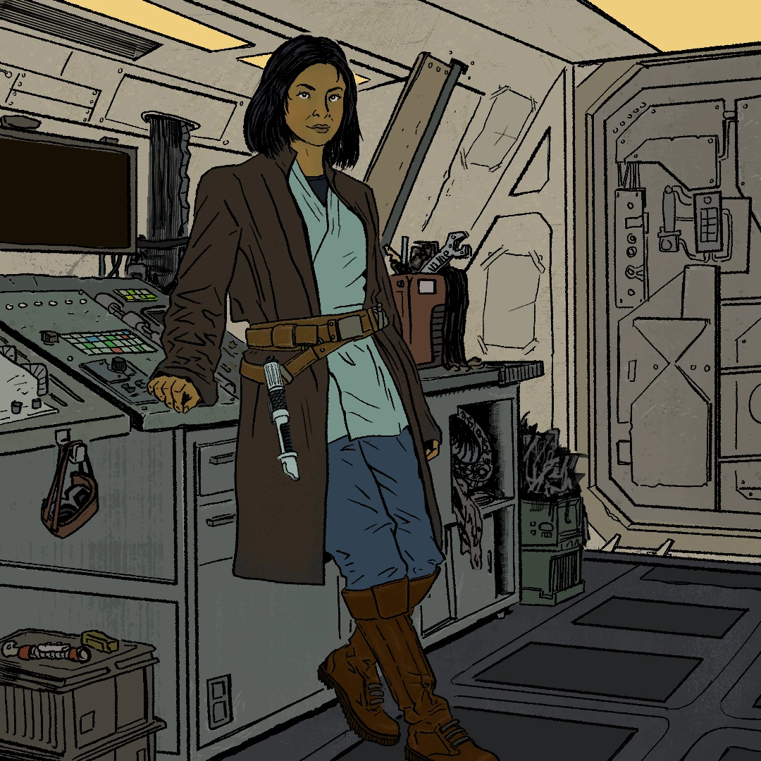
However, I wasn't happy with the linework now that it was coloured. Everything felt heavy. I could manage some of this by colouring the lines themselves to knock them back, but I didn't like what was there. So I decided to scrap the linework and redo it.

I tried to adopt a principle of only using lines for contours that were 'inside' a shape, not the edges. I think overall it gave a lighter feel to things, but I still wasn't happy. It felt like I had gone back to playing things safe. I wondered if adding in the lighting might help, so started to experiment with that aspect of the rendering.

The lighting was certainly working from an accuracy point of view, but it didn't have the graphic, textural, 'punkiness' that I have been trying to channel. Frustrated, I resolved to just use the flat version of the image for now; I may come back and finish the image in the future. However, after chatting things through with my tutor, I realised that the drawing itself has a big part to play. It's hard to render something with the punky, graphic style I have been going for if the drawing is trying to do something else.
Reflections
While the project did not go as I had planned, I did come to some realisations which I can take forward to further cultivate and refine my practice:
Painterly might be an approach that is used a lot in the tabletop and entertainment industries, but that doesn't mean that I should be beholden to that approach. If I try to be like every other person trying to be in those industries, then I either become a cog in the machine (easily replacable) or worse I don't stand out enough against all the noise of younger, hungrier artists.
I can learn to embrace the line - it's obviously a big part of how I interpret the world, so I should stop fighting it, and should focus my research and practice towards embracing it.
If I want a punky, urban aesthetic which can incorporate satire and humour, then my drawing needs to facilitate it first, before I worry about rendering. I need to focus my efforts on both doing more gestural and anatomical drawing so that I learn the rules, but also to draw in a way that forces me to break the rules and not care about accuracy. To let myself go and embrace it when I get proportions wrong, or make mistakes. These are all exaggerations that I can work with to help push my drawing approach to be more expressive and joyful.
My next steps will be to try and work in my sketchbook in a way that lets go of expectations, while I work out how to direct myself towards a new project.


Comments